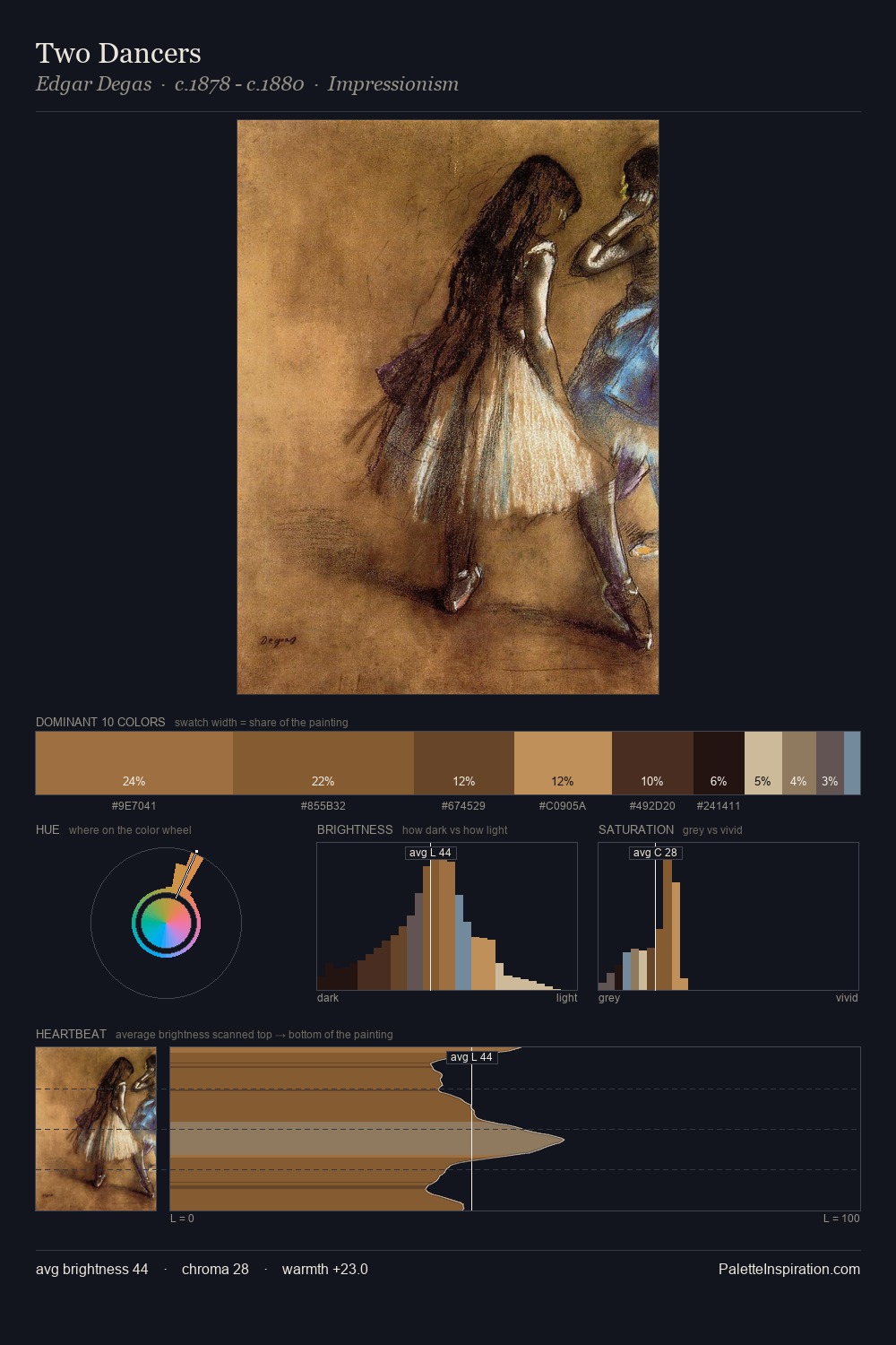
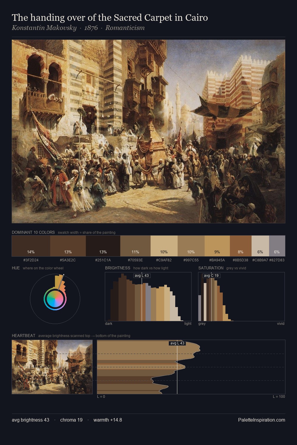
Classicism Palette 4
Penumbral Caramel
Penumbral Partial shadow - the transitional zone between light and full dark, soft-edged.
Caramel Warm mid-brown - the color of cooked sugar, smooth and amber-toned.

Palette Analysis
Classicism keeps values measured and balanced, a hallmark of tonal restraint. Warm hues command this palette; it favours the reds, oranges, and yellows of firelight and earth. Chroma is moderate: colours carry enough saturation to be read as colour, but the palette stops well short of garish intensity. 26.3% of the palette belongs to #5E4428, a concentration that makes it the unmistakable visual centre. The most saturated colour, #D5C696, is reserved to 5.8% of the surface, where it acts as a focal punctuation. Value range is moderate at 50 units - enough contrast for legibility, not so much as to fragment the tonal unity.
Example use cases
- theater design
- jewelry brands
- tobacco-adjacent retail
- event branding
- film & entertainment
I Love This!
Use This Palette
Copy, export, or download for your project
Copy, export, or download for your project
Copy:
Download:
Share: