Christina Robertson Palette 5

Palette Analysis
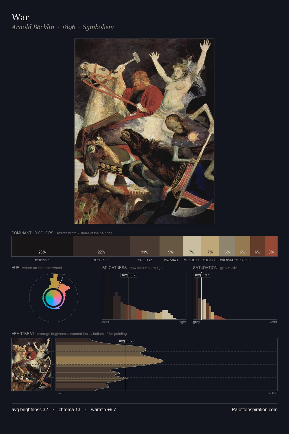
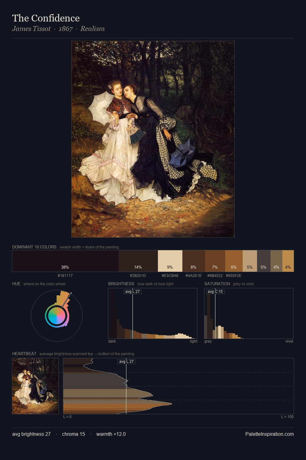
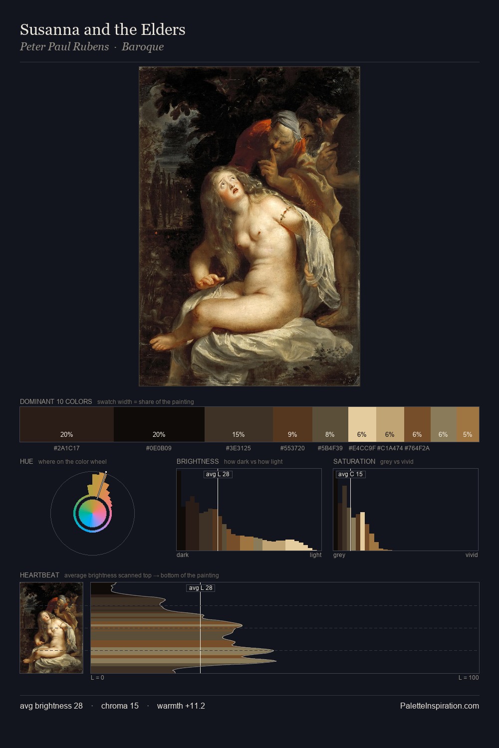
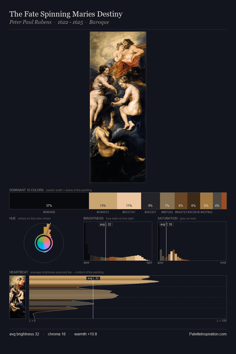
Values in Christina Robertson rest in the mid-range - neither dramatically lit nor steeped in shadow. Warm hues command this palette; Christina Robertson favours the reds, oranges, and yellows of firelight and earth. Chroma is kept low across all colours, producing the soft, enveloping quality that characterises tonal painting. 32.7% of the palette belongs to #1B1418, a concentration that makes it the unmistakable visual centre. The saturated accent, #954E2F, registers at 2.5% - sparse enough to feel like a deliberate surprise. From deepest dark to palest light, the palette traverses 68 units of the value scale - a span that creates natural depth. Christina Robertson's palette 5 carries its own internal logic while remaining in conversation with the artist's broader colour intelligence.
Example use cases
- theater design
- jewelry brands
- tobacco-adjacent retail
- event branding
- film & entertainment
I Love This!
Copy, export, or download for your project