Christina Robertson Palette 4
Shadowed Sienna
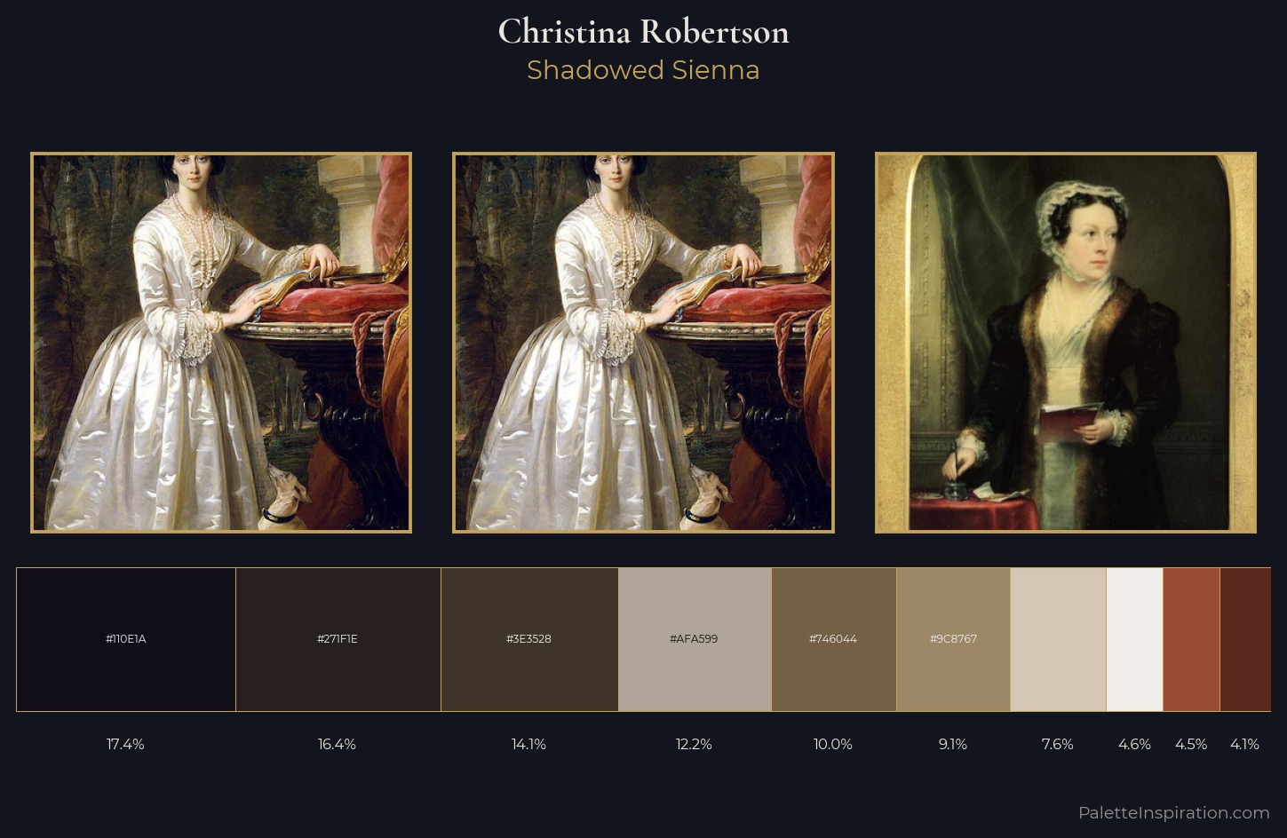
Shadowed Low-key - values weighted toward shadow, the palette of dim interiors and overcast skies.
Sienna Warm red-brown earth - named after the Sienese pigment, a fundamental artist earth color.
Palette Analysis
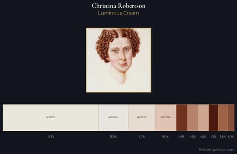
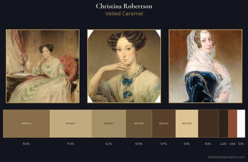
Values in Christina Robertson rest in the mid-range - neither dramatically lit nor steeped in shadow. Christina Robertson keeps warm and cool in parity, a balance that lends the work a perceptual shimmer. Saturation is deliberately withheld - the beauty here lies in the near-monochromatic gradations rather than colour difference. The saturated accent, #746044, registers at 10.0% - sparse enough to feel like a deliberate surprise. 78 units of value range underpin the palette's structural clarity: the eye always knows where light falls. Christina Robertson's palette 4 carries its own internal logic while remaining in conversation with the artist's broader colour intelligence.
Example use cases
- music labels
- luxury hospitality
- editorial photography
- leather goods
- premium streaming
I Love This!
Use This Palette
Copy, export, or download for your project
Copy, export, or download for your project
Copy:
Download:
Share: