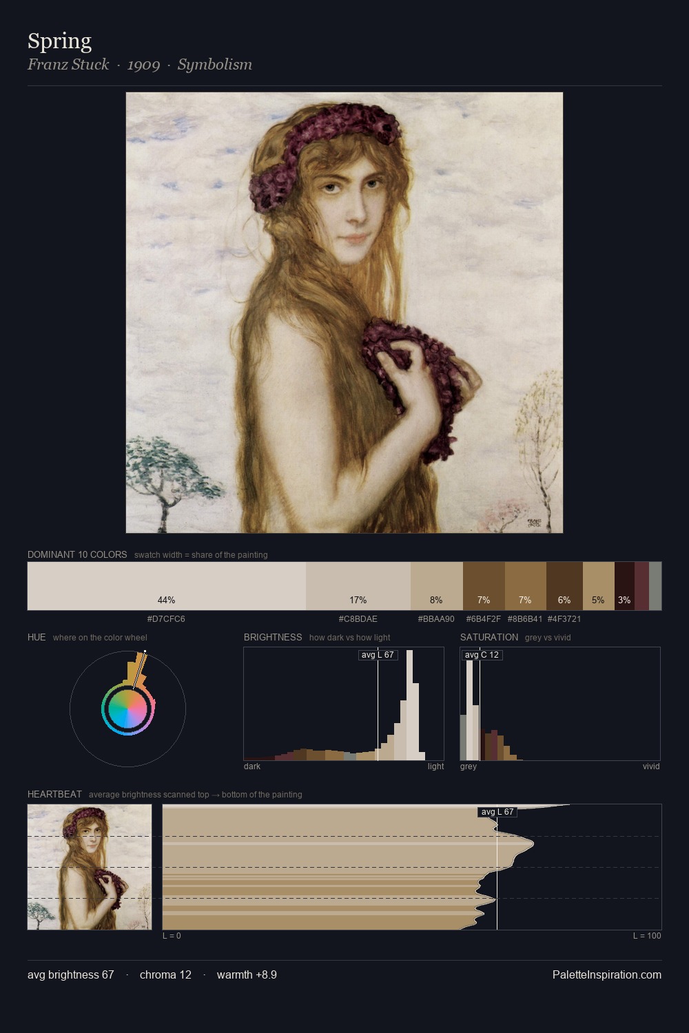
Chauncey Bradley Ives Palette 1
Luminous Ivory
Luminous Self-illuminated feeling - high-key values with an inner glow quality.
Ivory Warm creamy white - the color of natural ivory, warmer than pure white.

Palette Analysis
Chauncey Bradley Ives is strongly light-biased - shadow is suggested rather than declared. Warm hues command this palette; Chauncey Bradley Ives favours the reds, oranges, and yellows of firelight and earth. Chroma is kept low across all colours, producing the soft, enveloping quality that characterises tonal painting. #745437 functions as the palette's exclamation mark: highest chroma, lowest percentage (4.3%). The full value range is 62 units: broad enough to build convincing three-dimensional form. Palette 1 sits within the larger chromatic argument that Chauncey Bradley Ives's complete body of work advances.
Example use cases
- ceramics & pottery
- boutique hospitality
- menswear
- heritage food brands
- craft & artisan brands
I Love This!
Use This Palette
Copy, export, or download for your project
Copy, export, or download for your project
Copy:
Download:
Share: