Charles Sprague Pearce Palette 2

Palette Analysis
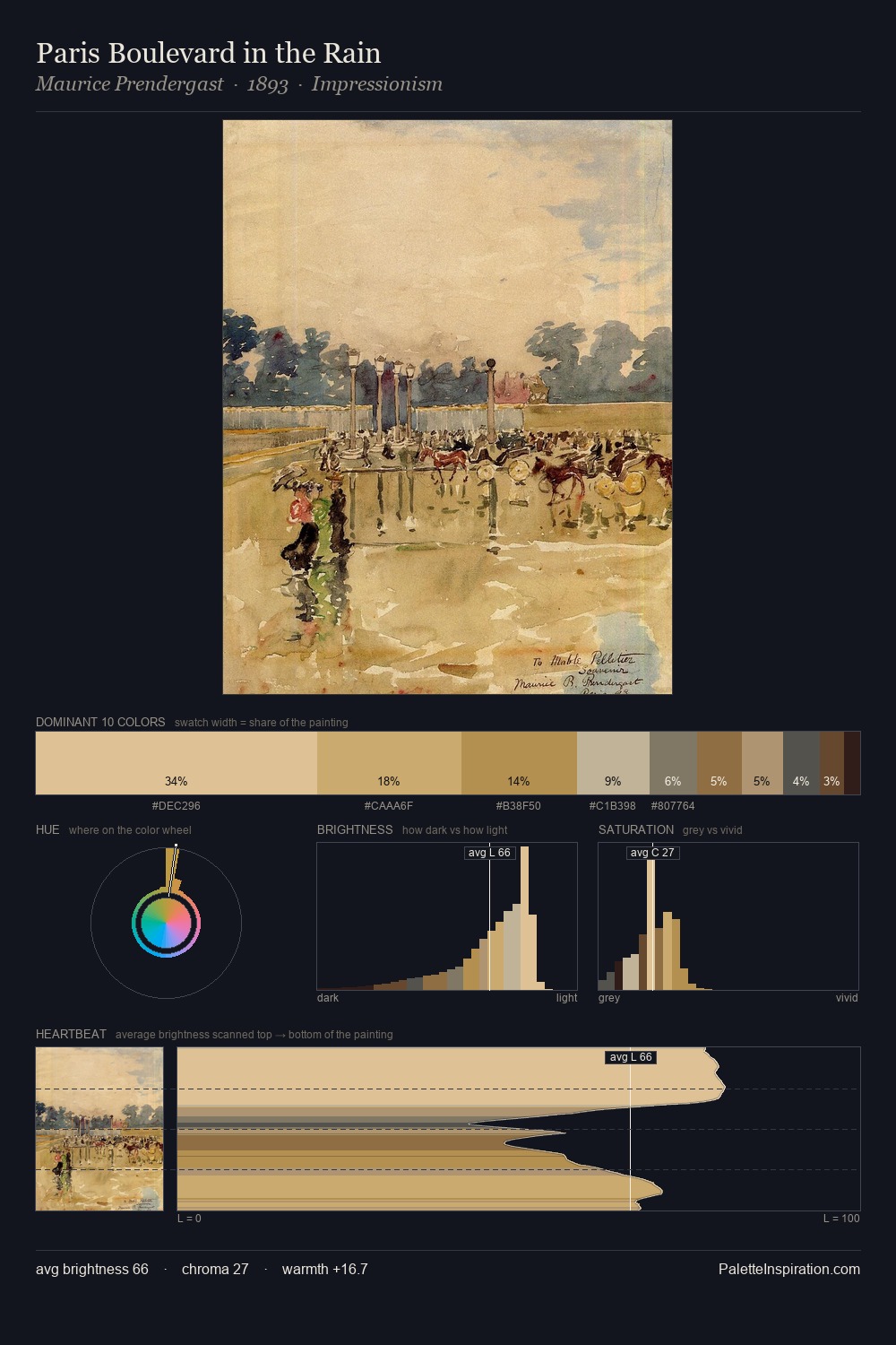
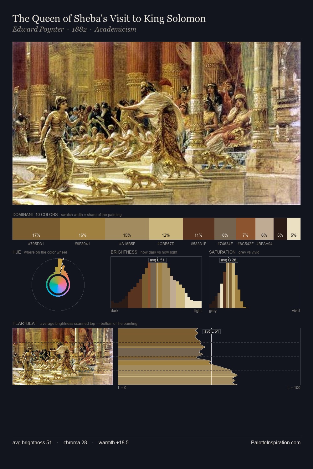
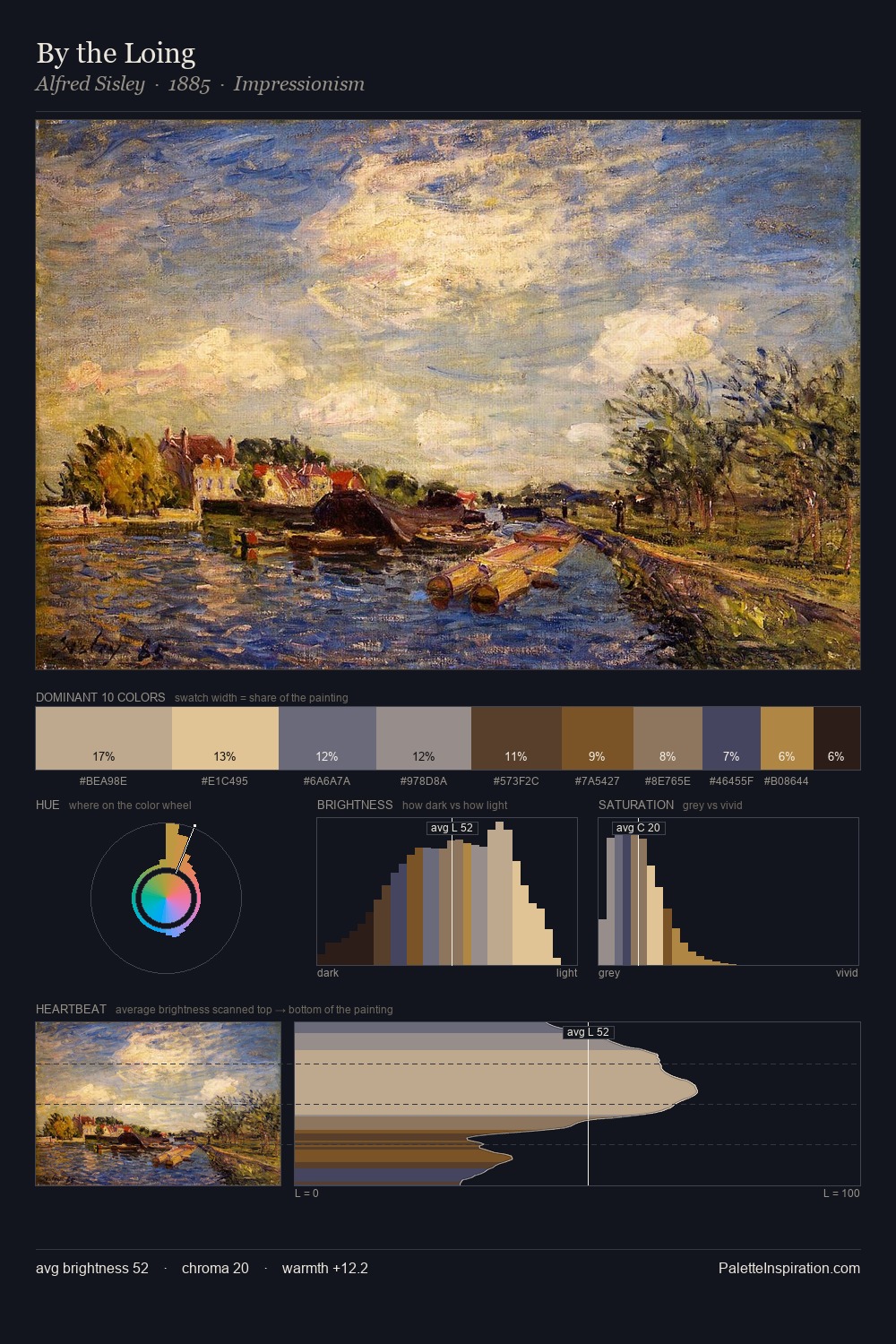
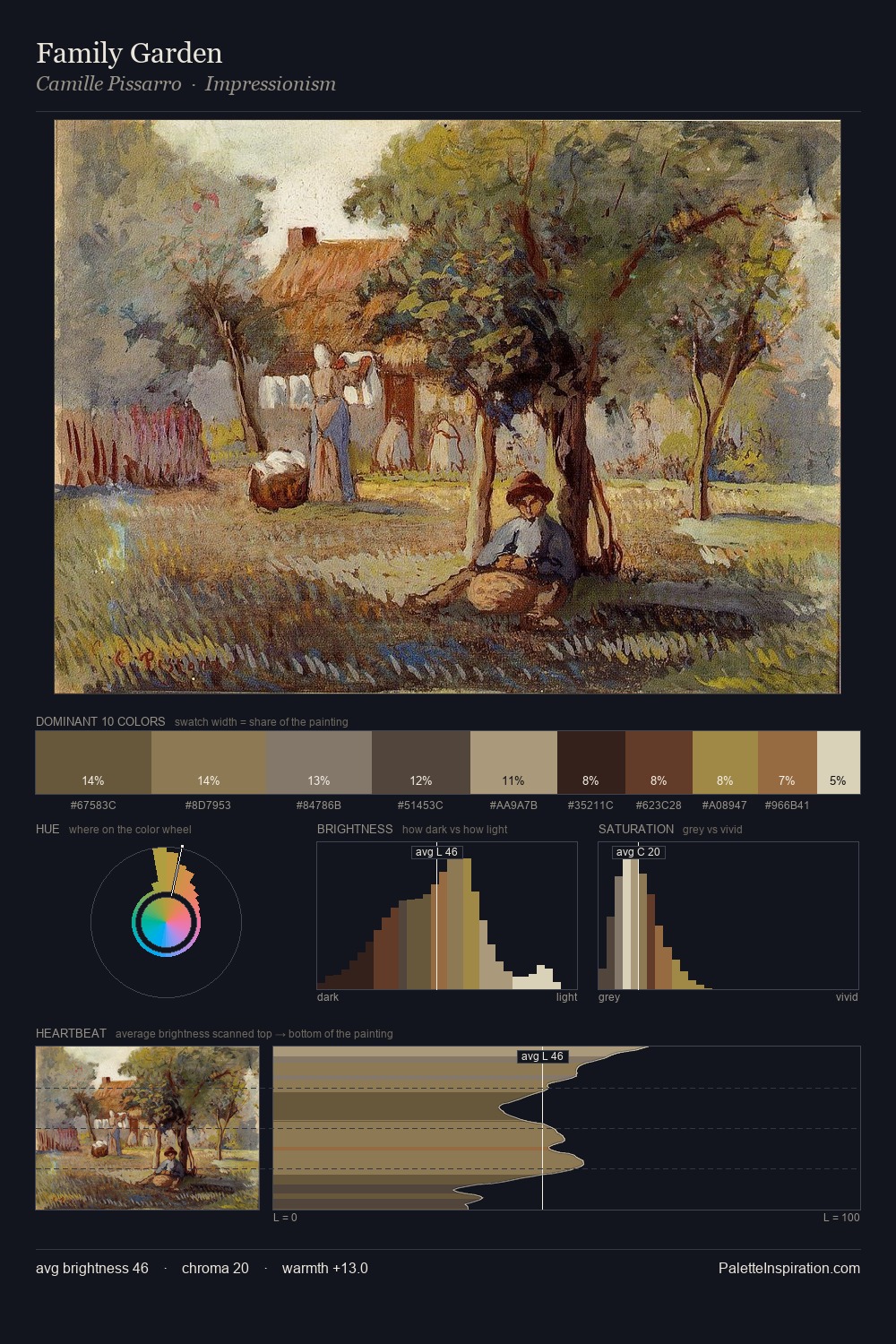
Values in Charles Sprague Pearce tilt decisively toward white, giving the palette its luminous character. Charles Sprague Pearce tilts toward cool - blues and silver-greys carry the structural weight. Saturation is measured and controlled, giving the palette presence without visual aggression. The chromatic peak belongs to #261310, and at 4.0% it dominates, not decorates. A value spread of 68 units gives the palette both depth and air - shadows are genuinely dark, lights genuinely light. The mid-to-high key, cool bias, and moderate chroma point to outdoor observation - sky and diffused daylight as the dominant light source. In the context of Charles Sprague Pearce's full range of palettes, group 2 represents one movement in an ongoing chromatic dialogue.
Example use cases
- ceramics & pottery
- boutique hospitality
- menswear
- heritage food brands
- craft & artisan brands
I Love This!
Copy, export, or download for your project