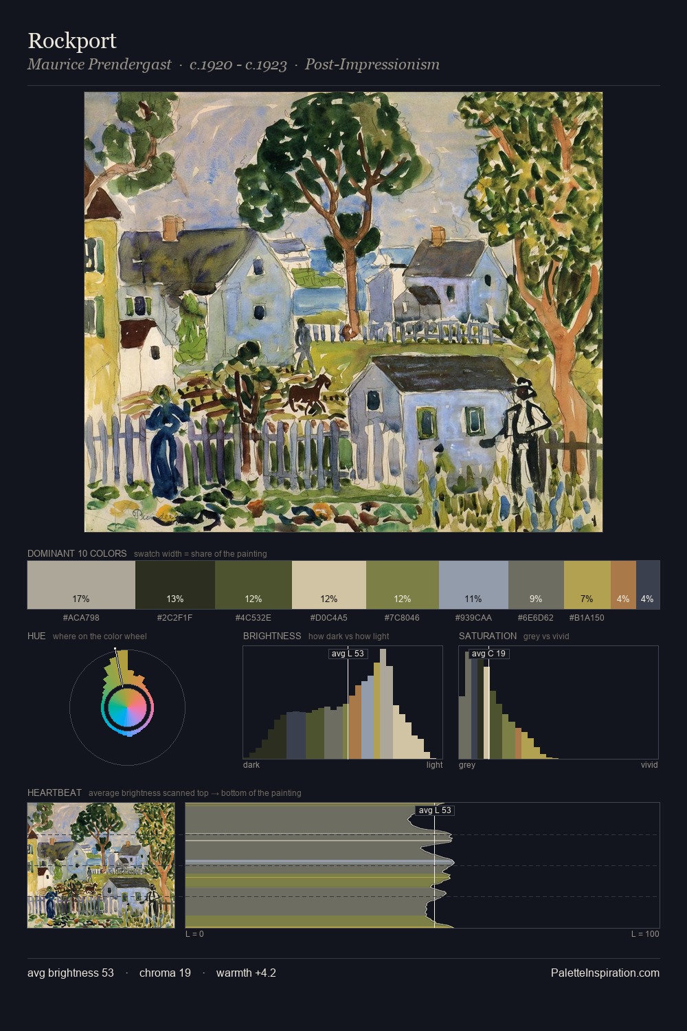
Charles Robinson Master Palette
Veiled Tawny
Veiled Partially obscured light - mid-dark with a hazy, scrim-filtered quality.
Tawny Warm orange-brown - a traditional term for the color of tanned leather or lion fur.

Palette Analysis
Charles Robinson occupies the comfortable middle of the value scale, avoiding both extremes to hold the eye in a sustained middle grey. Charles Robinson keeps warm and cool in parity, a balance that lends the work a perceptual shimmer. The absence of saturated colour is itself an expressive choice: this is a palette of restraint and atmosphere. The most saturated colour, #3B582A, is reserved to 5.9% of the surface, where it acts as a focal punctuation. Spanning 53 units on the value axis, the palette achieves the balance between tonal flatness and fragmentation. The palette is recognisably Charles Robinson's own: particular in its temperature, chroma, and the economy of its brightest note.
Example use cases
- ceramics & pottery
- boutique hospitality
- menswear
- heritage food brands
- craft & artisan brands
I Love This!
Use This Palette
Copy, export, or download for your project
Copy, export, or download for your project
Copy:
Download:
Share: