Charles Robinson Palette 5

Palette Analysis
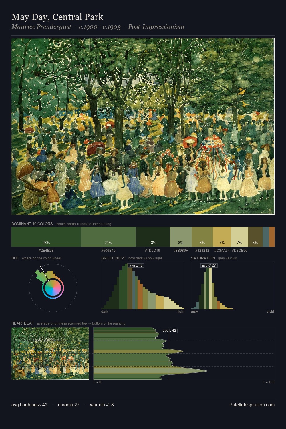
Charles Robinson keeps values measured and balanced, a hallmark of tonal restraint. Charles Robinson tilts toward cool - blues and silver-greys carry the structural weight. Mid-saturation across the board: the palette has colour character without chromatic excess. The dominant colour, #223E16, takes 31.8% of the total area, establishing the overall mood before any other hue is introduced. At 2.5%, #BDC992 carries the palette's sharpest chromatic charge: an accent that earns its place precisely because it is withheld. The value range spans 59 units across the palette, providing the full gamut from deep shadow to near-white and ensuring clear tonal hierarchy. The mid-to-high key, cool bias, and moderate chroma point to outdoor observation - sky and diffused daylight as the dominant light source. Palette 5 sits within the larger chromatic argument that Charles Robinson's complete body of work advances.
Example use cases
- theater design
- jewelry brands
- tobacco-adjacent retail
- event branding
- film & entertainment
I Love This!
Copy, export, or download for your project