Charles Cooper Henderson Palette 1

Palette Analysis
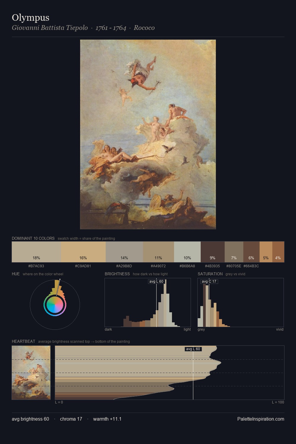
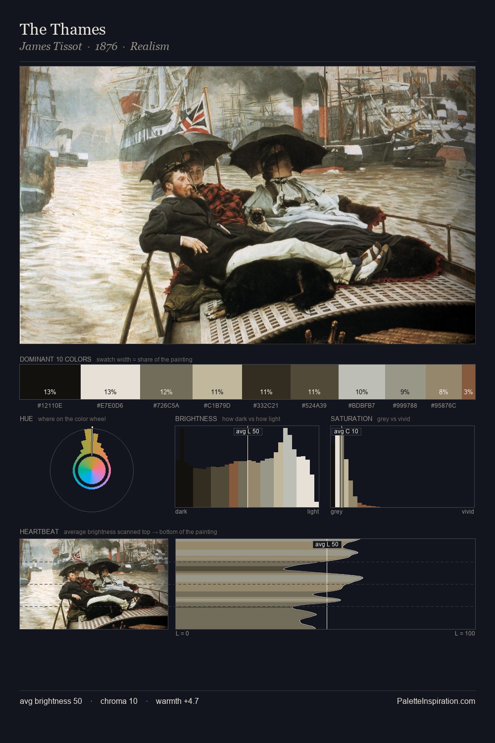
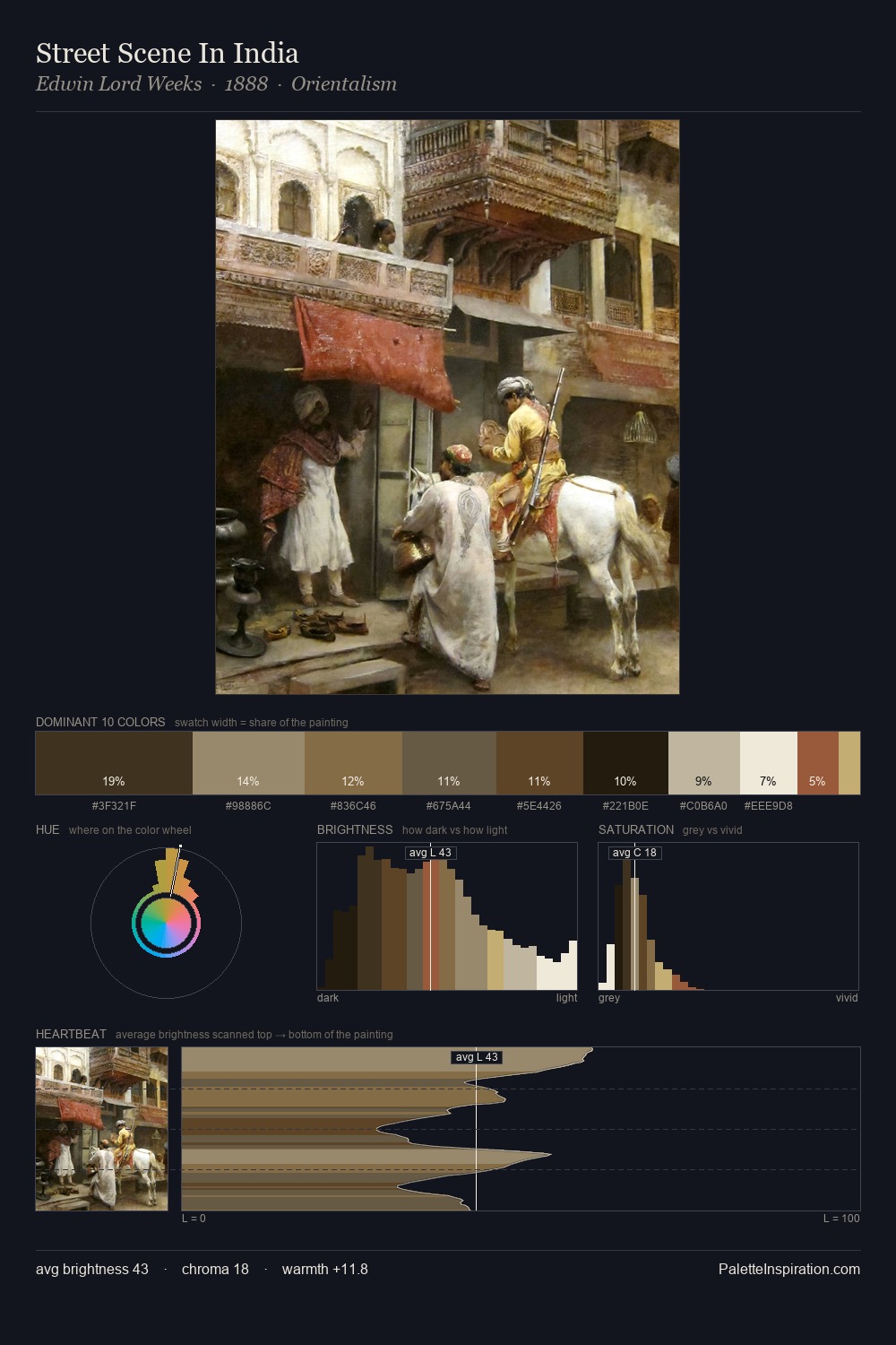
Charles Cooper Henderson is high-key - luminous, open, and weighted toward light. Cool hues prevail: blues, greens, and greys anchor the palette's emotional temperature. Chroma is kept low across all colours, producing the soft, enveloping quality that characterises tonal painting. At 27.9%, #C9BA9F functions less as a colour accent and more as a complete atmospheric environment. Only 4.8% is devoted to #826F50, yet that small allocation delivers the palette's entire chromatic tension. The palette spans 48 value units: a measured range that delivers coherence over drama. The mid-to-high key, cool bias, and moderate chroma point to outdoor observation - sky and diffused daylight as the dominant light source. Charles Cooper Henderson's palette 1 carries its own internal logic while remaining in conversation with the artist's broader colour intelligence.
Example use cases
- food packaging
- leather accessories
- travel & outdoor
- natural cosmetics
- interior design
I Love This!
Copy, export, or download for your project