Caspar David Friedrich Palette 3

Palette Analysis
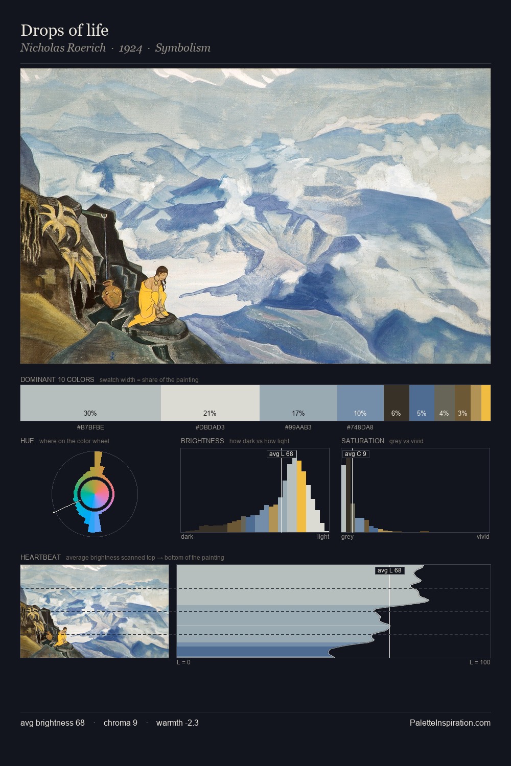
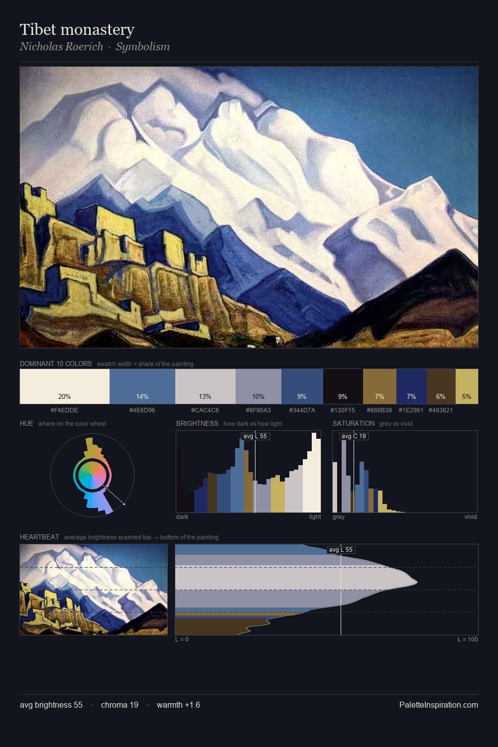
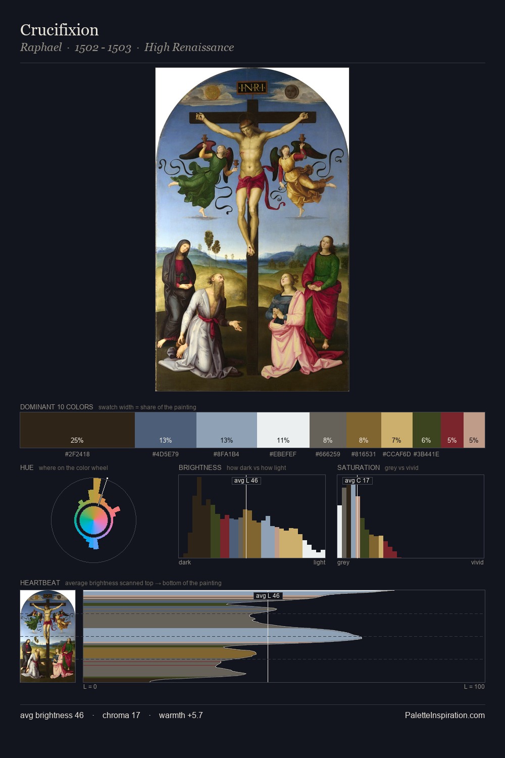
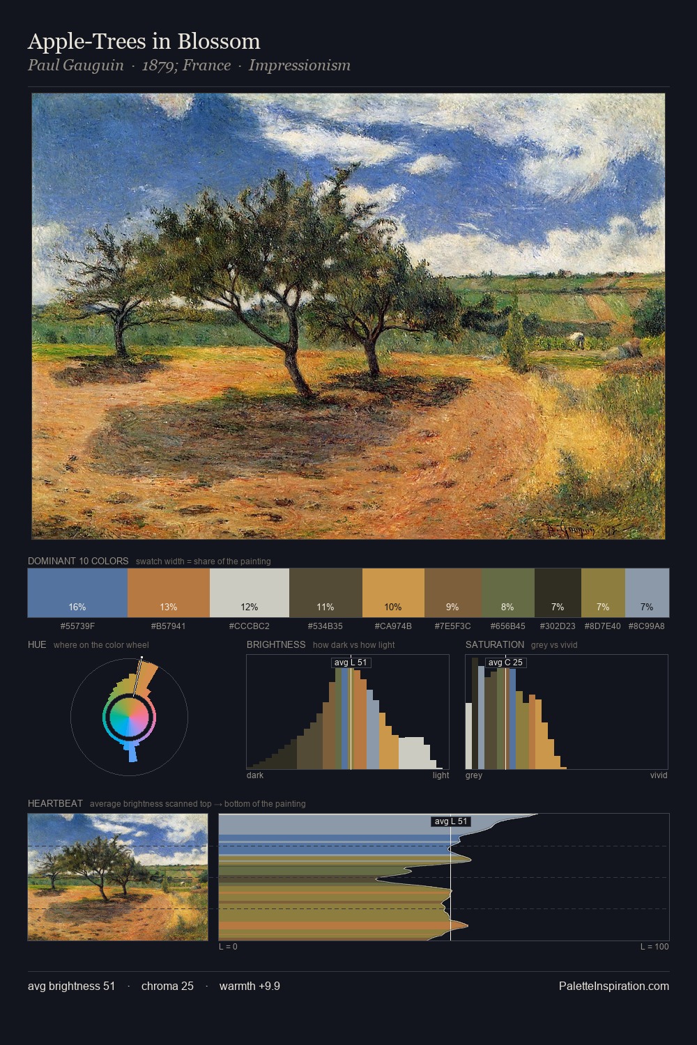
Light floods Caspar David Friedrich; the palette keeps values pale and airy across its range. Temperature is cool-dominant, with blue and green families claiming the largest areas. The absence of saturated colour is itself an expressive choice: this is a palette of restraint and atmosphere. The dominant colour, #C4C3C7, takes 26.8% of the total area, establishing the overall mood before any other hue is introduced. #745A2A functions as the palette's exclamation mark: highest chroma, lowest percentage (5.7%). From deepest dark to palest light, the palette traverses 63 units of the value scale - a span that creates natural depth. The palette has the character of outdoor light: cool, mid-bright, with colour rendered faithfully rather than expressively. This is palette 3 of Caspar David Friedrich's sequence - a single chapter in a chromatic story told across many works.
Example use cases
- food & beverage
- wedding stationery
- lifestyle brands
- interior design
- fashion retail
I Love This!
Copy, export, or download for your project