Carl Wenig Master Palette

Palette Analysis
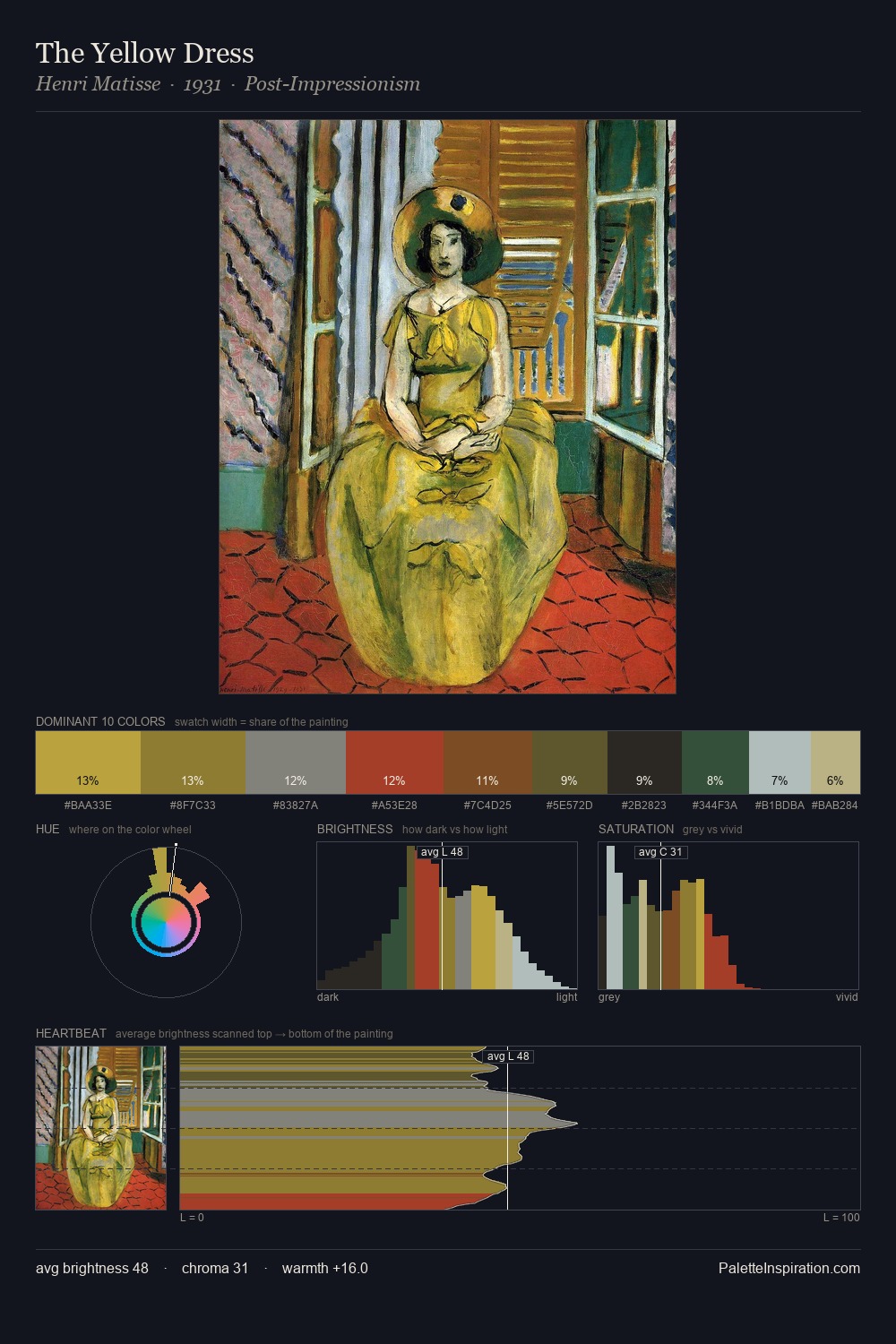
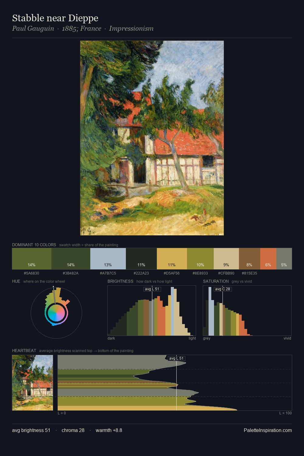
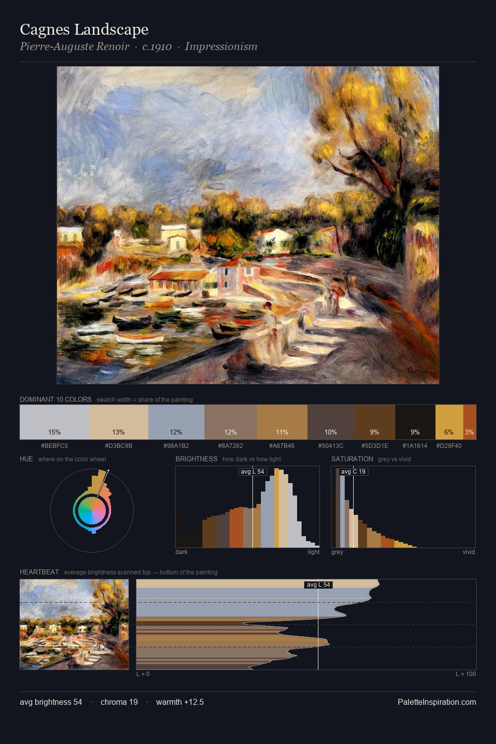
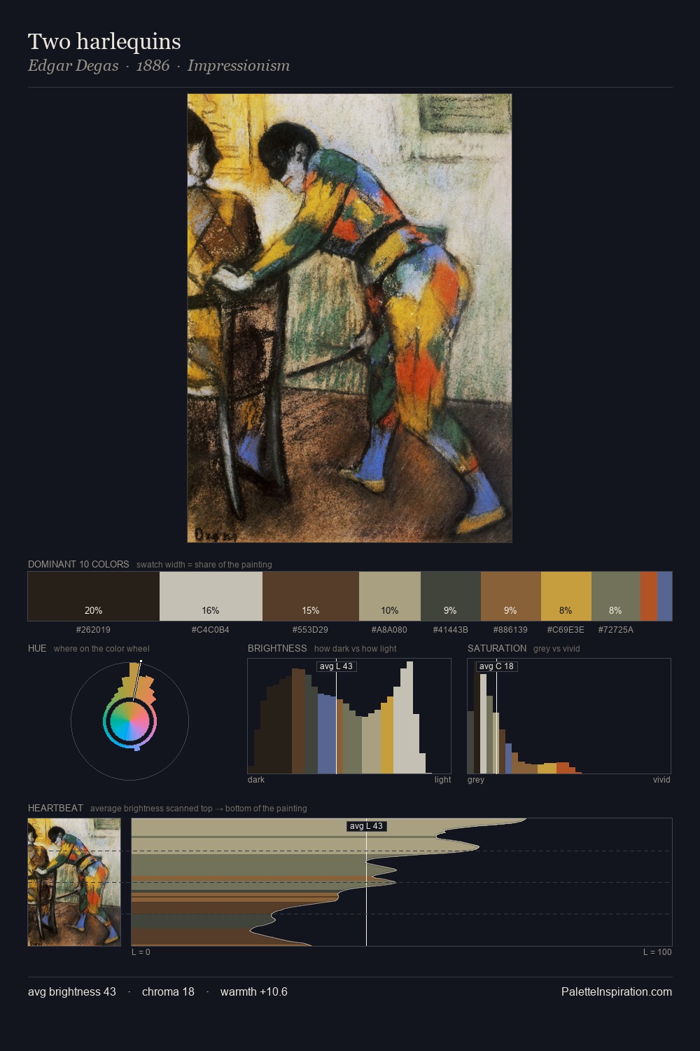
The value structure of Carl Wenig is mid-key: quiet, controlled, and cohesive. Cool hues prevail: blues, greens, and greys anchor the palette's emotional temperature. Muted throughout, the palette achieves its effects through value and temperature rather than chromatic force. The dominant colour, #634127, takes 25.5% of the total area, establishing the overall mood before any other hue is introduced. The saturated accent, #C24622, registers at 3.9% - sparse enough to feel like a deliberate surprise. The full value range is 59 units: broad enough to build convincing three-dimensional form. The mid-to-high key, cool bias, and moderate chroma point to outdoor observation - sky and diffused daylight as the dominant light source. These proportions encode Carl Wenig's instinctive sense of how much of each quality the eye can hold.
Example use cases
- theater design
- jewelry brands
- tobacco-adjacent retail
- event branding
- film & entertainment
I Love This!
Copy, export, or download for your project