Carl Wenig Palette 2
Palette Analysis
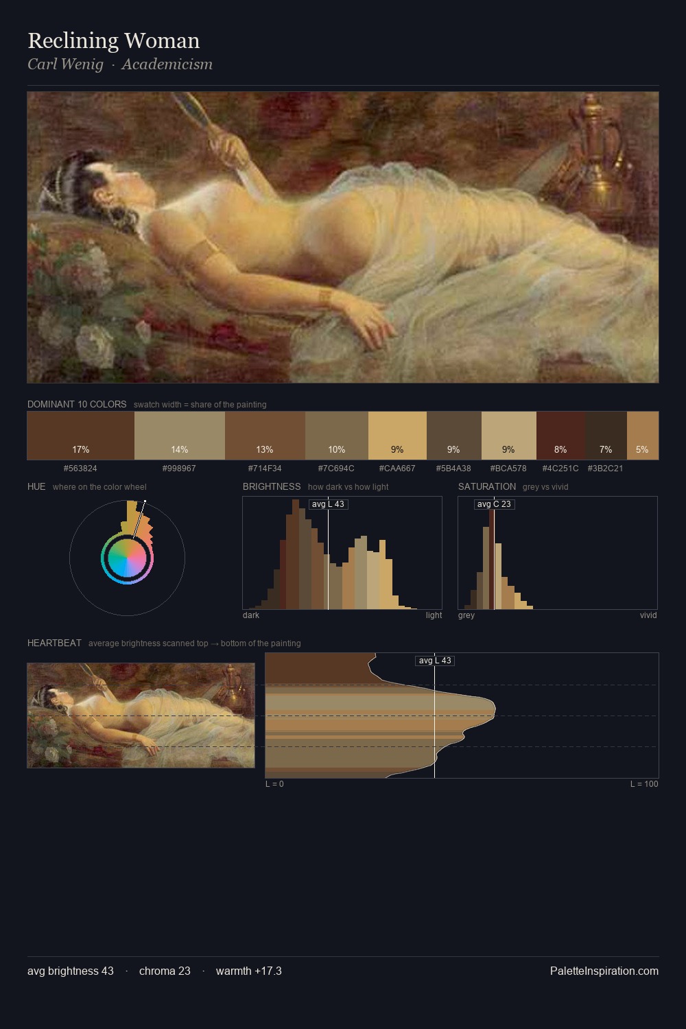
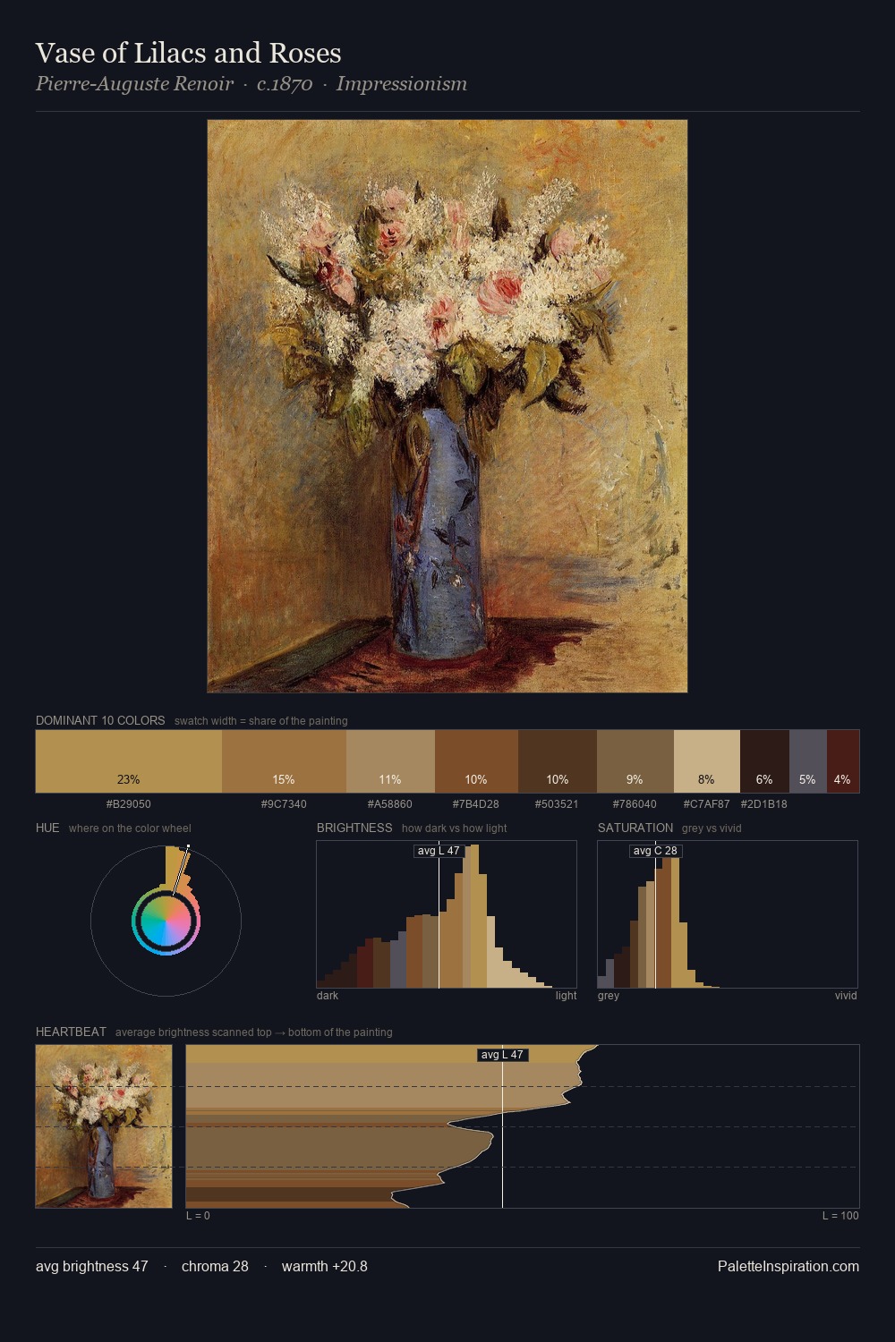
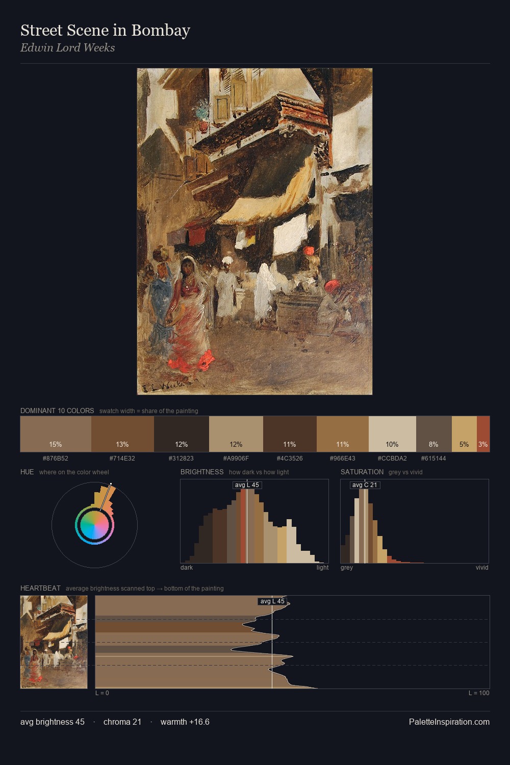
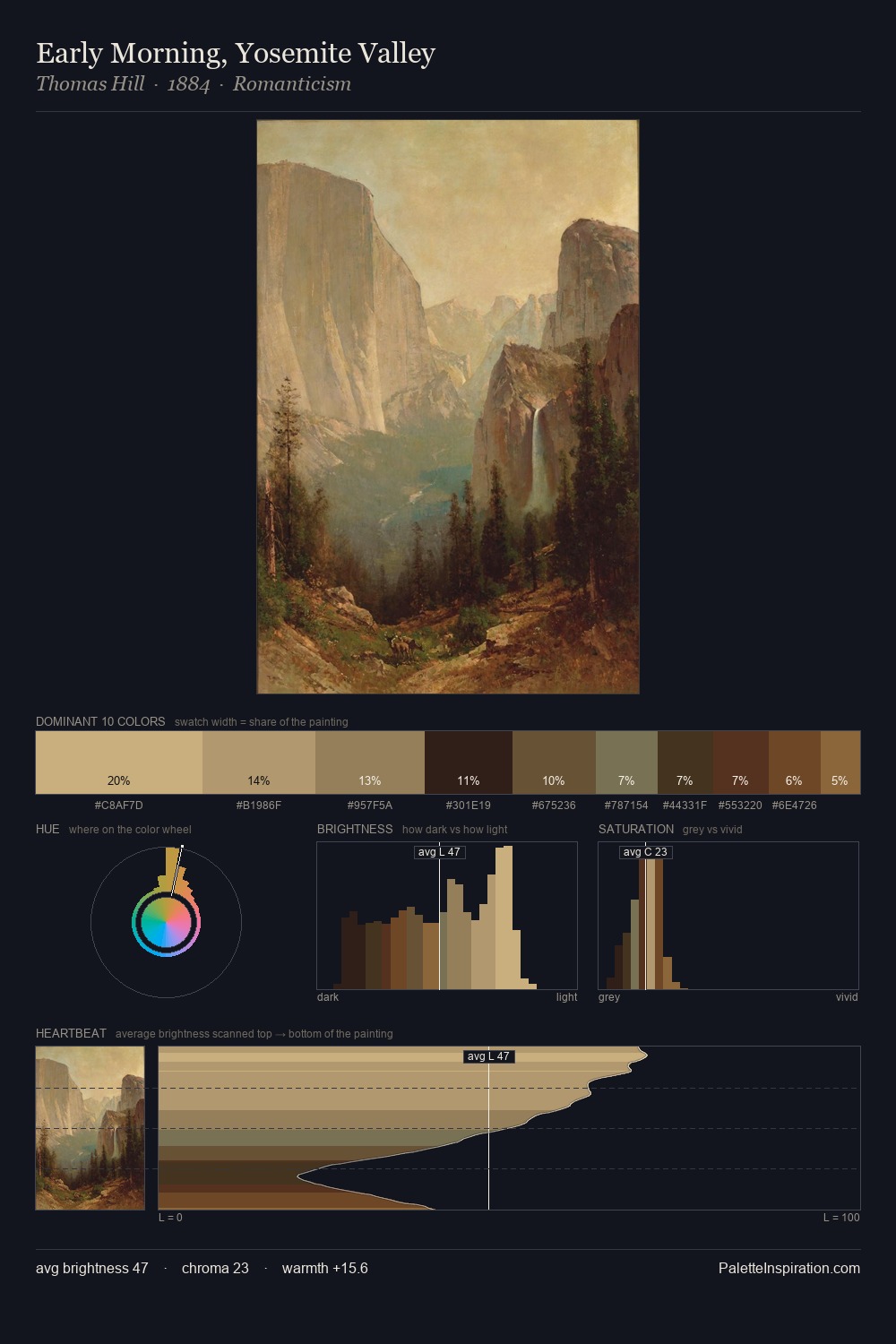
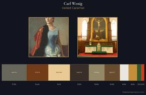
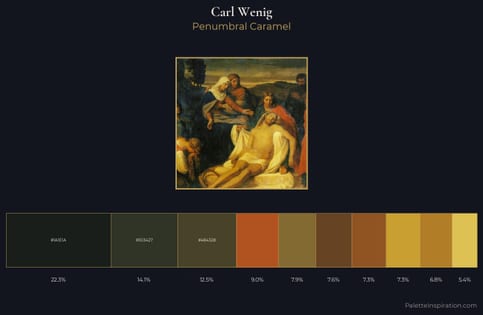
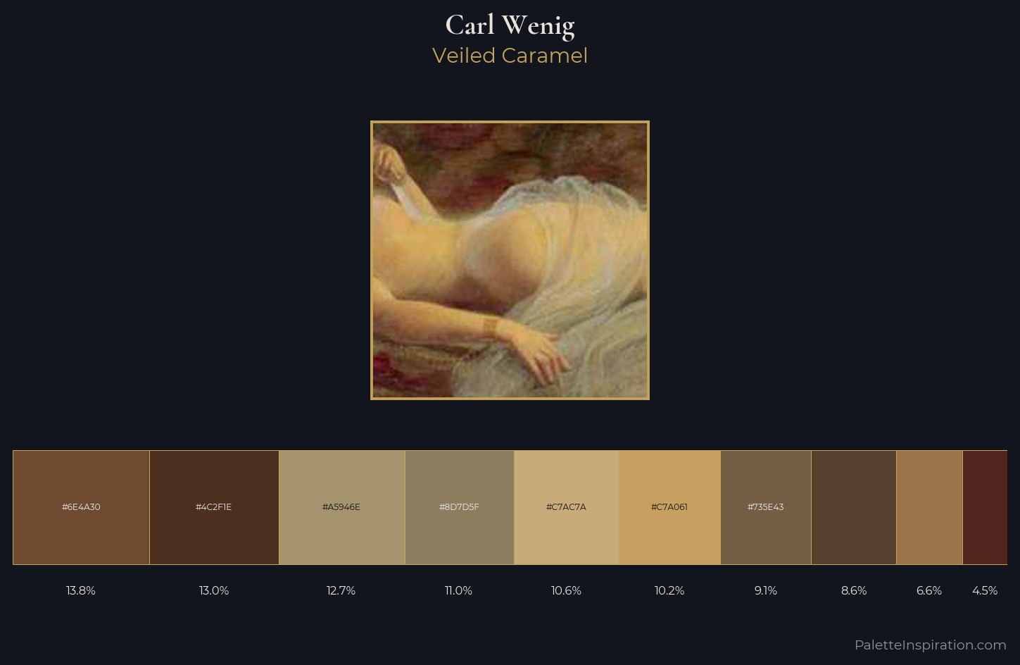
Carl Wenig occupies the comfortable middle of the value scale, avoiding both extremes to hold the eye in a sustained middle grey. Warm and cool are kept in productive tension, creating the kind of chromatic harmony that sustains the eye. Colours are neither washed out nor blazing; they occupy the productive middle ground of the chroma scale. At 10.6%, #C7AC7A carries the palette's sharpest chromatic charge: an accent that earns its place precisely because it is withheld. The palette spans 44 value units: a measured range that delivers coherence over drama. The palette reads as an Impressionist one - light-biased, chromatically direct, and built on temperature contrast rather than value opposition. In the context of Carl Wenig's full range of palettes, group 2 represents one movement in an ongoing chromatic dialogue.
Example use cases
- craft & artisan brands
- specialty coffee
- home goods
- lifestyle retail
- ceramics & pottery
I Love This!
Copy, export, or download for your project