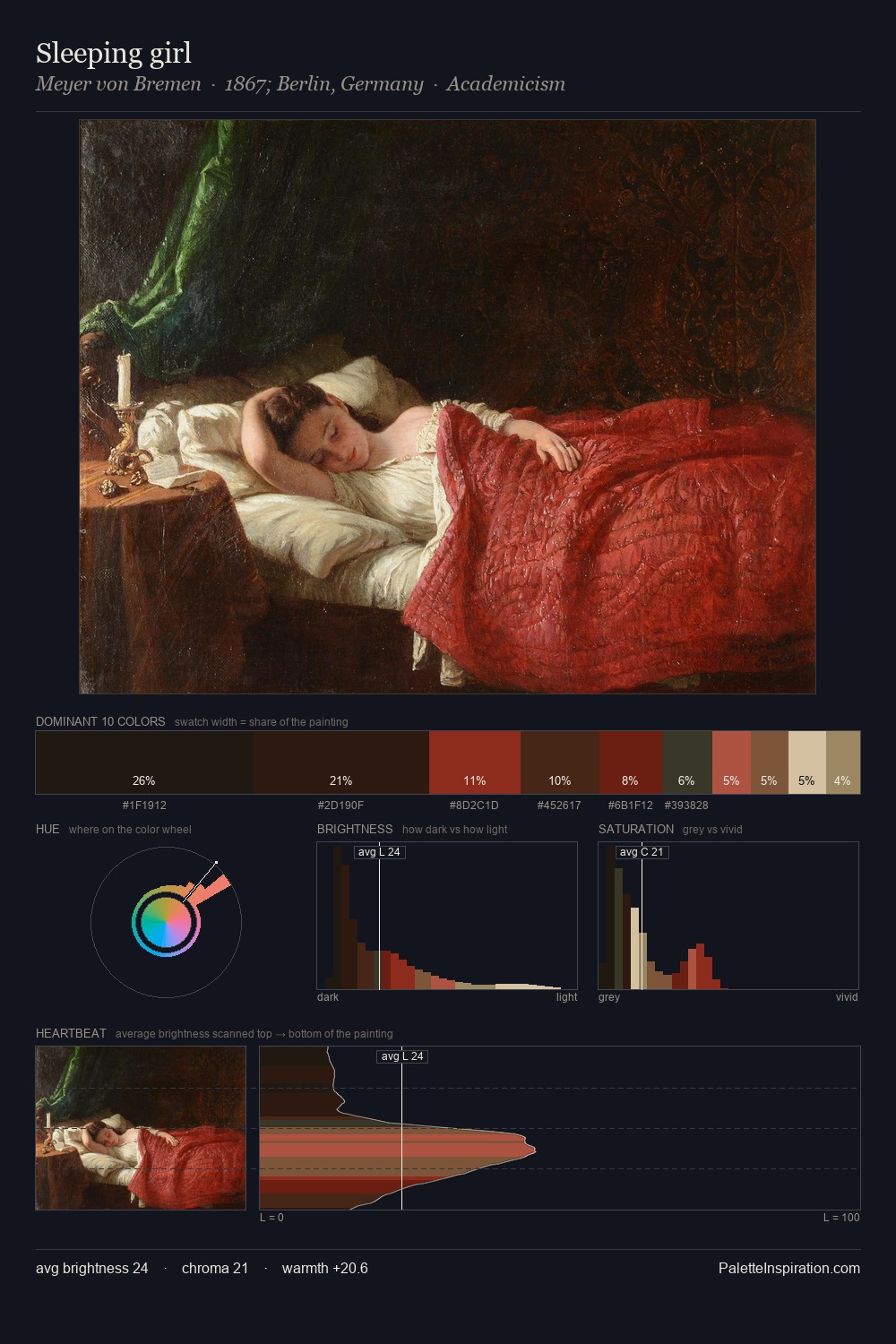
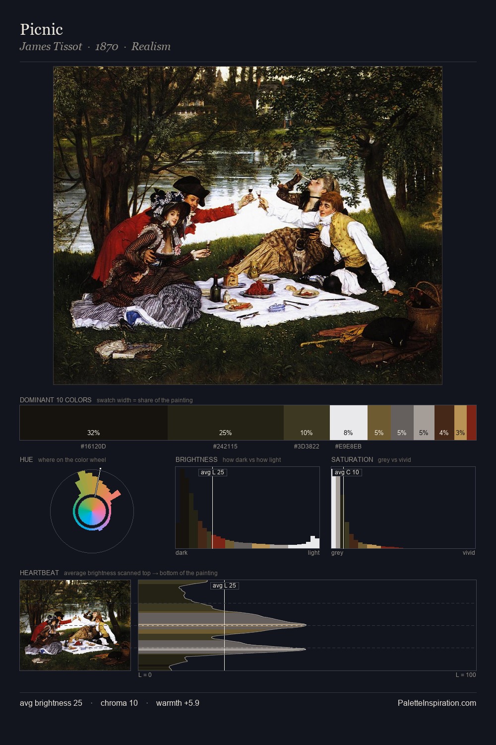
Carl von Bergen Palette 5

Palette Analysis
The palette of Carl von Bergen sits in the lower register of the value scale - dense, contained, and weighted. Blues and teal-greys govern the palette, lending it an aquatic or atmospheric quality. Chroma is kept low across all colours, producing the soft, enveloping quality that characterises tonal painting. Only 6.0% is devoted to #855A3C, yet that small allocation delivers the palette's entire chromatic tension. At 47 units across the value scale, the palette keeps contrast readable without letting it dominate. This tonal restraint is characteristic of the Carl von Bergen approach: colour serves light, not the reverse. Carl von Bergen's palette 5 carries its own internal logic while remaining in conversation with the artist's broader colour intelligence.
Example use cases
- theater design
- jewelry brands
- tobacco-adjacent retail
- event branding
- film & entertainment
I Love This!
Copy, export, or download for your project