Carl von Bergen Palette 3
Penumbral Tawny
Penumbral Partial shadow - the transitional zone between light and full dark, soft-edged.
Tawny Warm orange-brown - a traditional term for the color of tanned leather or lion fur.

Palette Analysis
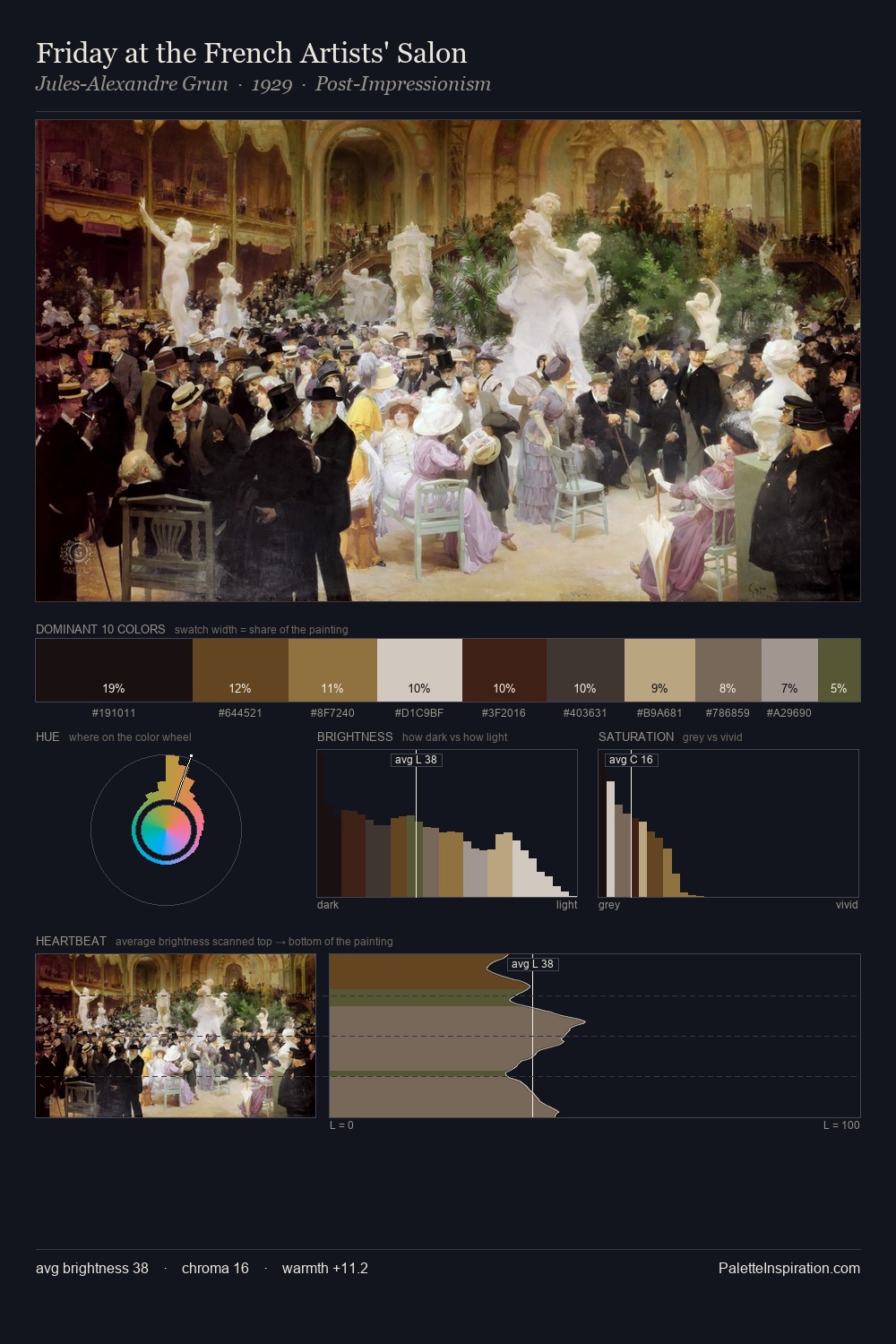
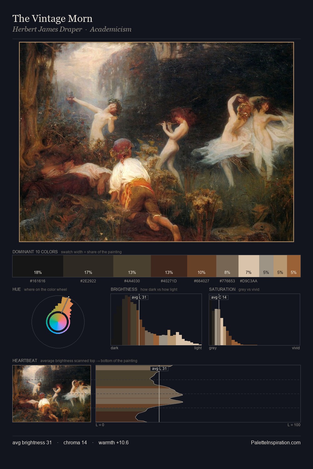
Values in Carl von Bergen rest in the mid-range - neither dramatically lit nor steeped in shadow. Warm and cool are kept in productive tension, creating the kind of chromatic harmony that sustains the eye. All colours lean toward grey, building depth through value rather than colour punch. The saturated accent, #96683E, registers at 4.4% - sparse enough to feel like a deliberate surprise. At 68 units of value range, the palette has the tonal breadth to sustain complex spatial readings. Palette 3 sits within the larger chromatic argument that Carl von Bergen's complete body of work advances.
Example use cases
- film & entertainment
- fine dining
- spirits branding
- menswear
- theater design
I Love This!
Use This Palette
Copy, export, or download for your project
Copy, export, or download for your project
Copy:
Download:
Share: