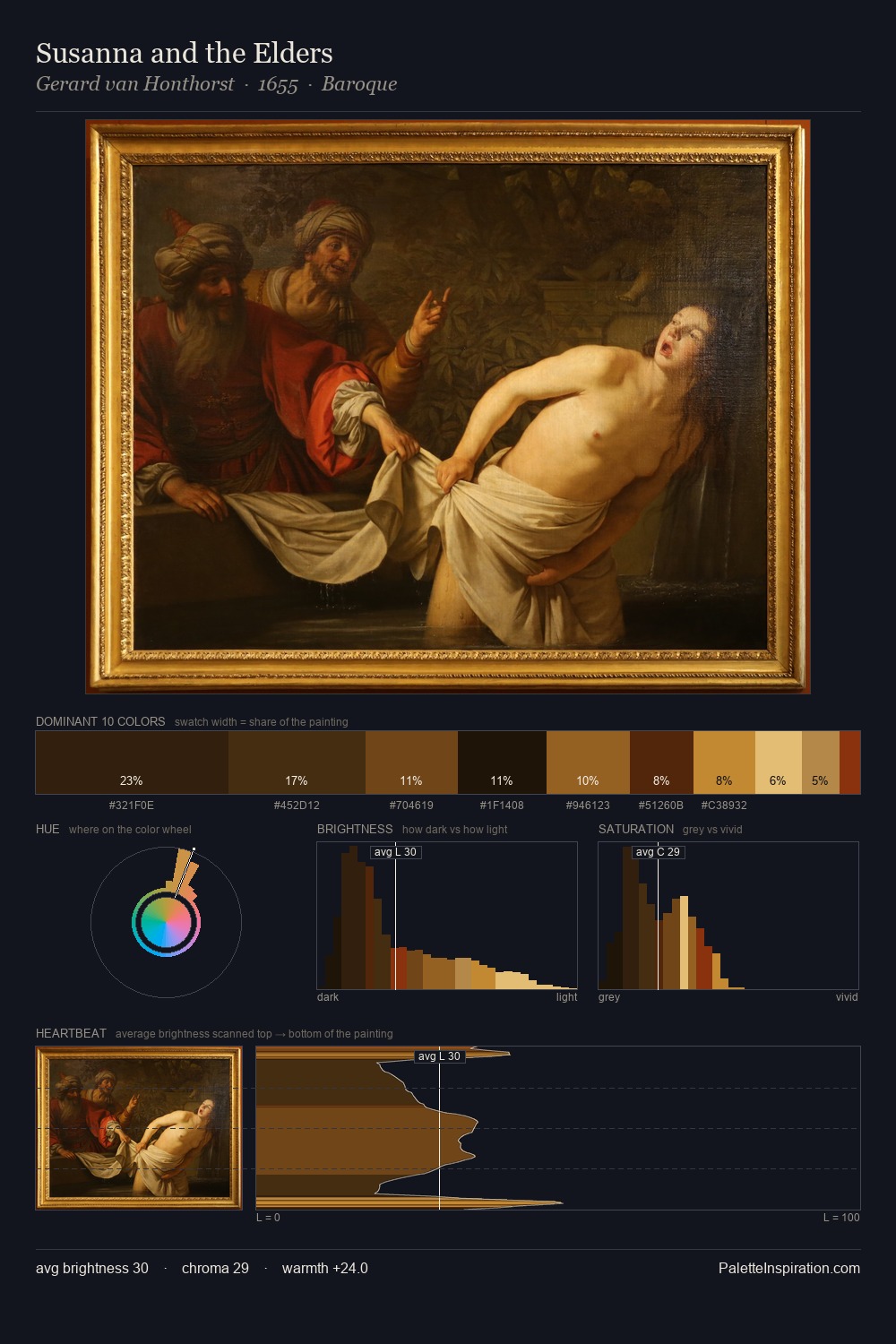
Carl Bloch Palette 9
Shadowed Rust
Shadowed Low-key - values weighted toward shadow, the palette of dim interiors and overcast skies.
Rust Oxidized red-brown - the color of iron corrosion, warm and earthy-red.

Palette Analysis
Carl Bloch occupies the comfortable middle of the value scale, avoiding both extremes to hold the eye in a sustained middle grey. Temperature reads distinctly warm: the reds and earth tones from Carl Bloch carry the compositional weight. Saturation is measured and controlled, giving the palette presence without visual aggression. The most saturated colour, #8F3B19, is reserved to 4.6% of the surface, where it acts as a focal punctuation. At 48 units across the value scale, the palette keeps contrast readable without letting it dominate. Palette 9 sits within the larger chromatic argument that Carl Bloch's complete body of work advances.
Example use cases
- theater design
- jewelry brands
- tobacco-adjacent retail
- event branding
- film & entertainment
I Love This!
Use This Palette
Copy, export, or download for your project
Copy, export, or download for your project
Copy:
Download:
Share: