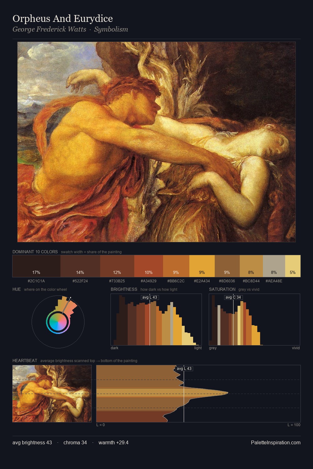
Adriaen Brouwer Palette 3
Shadowed Tawny
Shadowed Low-key - values weighted toward shadow, the palette of dim interiors and overcast skies.
Tawny Warm orange-brown - a traditional term for the color of tanned leather or lion fur.

Palette Analysis
Adriaen Brouwer keeps values measured and balanced, a hallmark of tonal restraint. Warmth dominates - the palette of Adriaen Brouwer leans heavily on the yellow-orange-red arc of the colour wheel. Chroma is moderate: colours carry enough saturation to be read as colour, but the palette stops well short of garish intensity. The saturated accent, #A57A2A, registers at 9.9% - sparse enough to feel like a deliberate surprise. 52 units of value spread create a palette that is varied but unified - contrast in the service of harmony. Palette 3 sits within the larger chromatic argument that Adriaen Brouwer's complete body of work advances.
Example use cases
- theater design
- jewelry brands
- tobacco-adjacent retail
- event branding
- film & entertainment
I Love This!
Use This Palette
Copy, export, or download for your project
Copy, export, or download for your project
Copy:
Download:
Share: