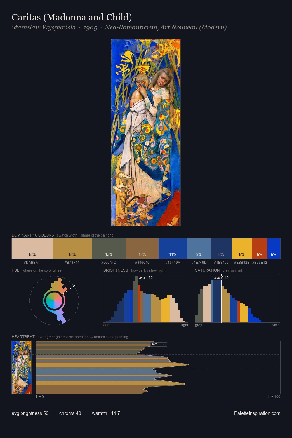
Boris Kustodiev Palette 10

Palette Analysis
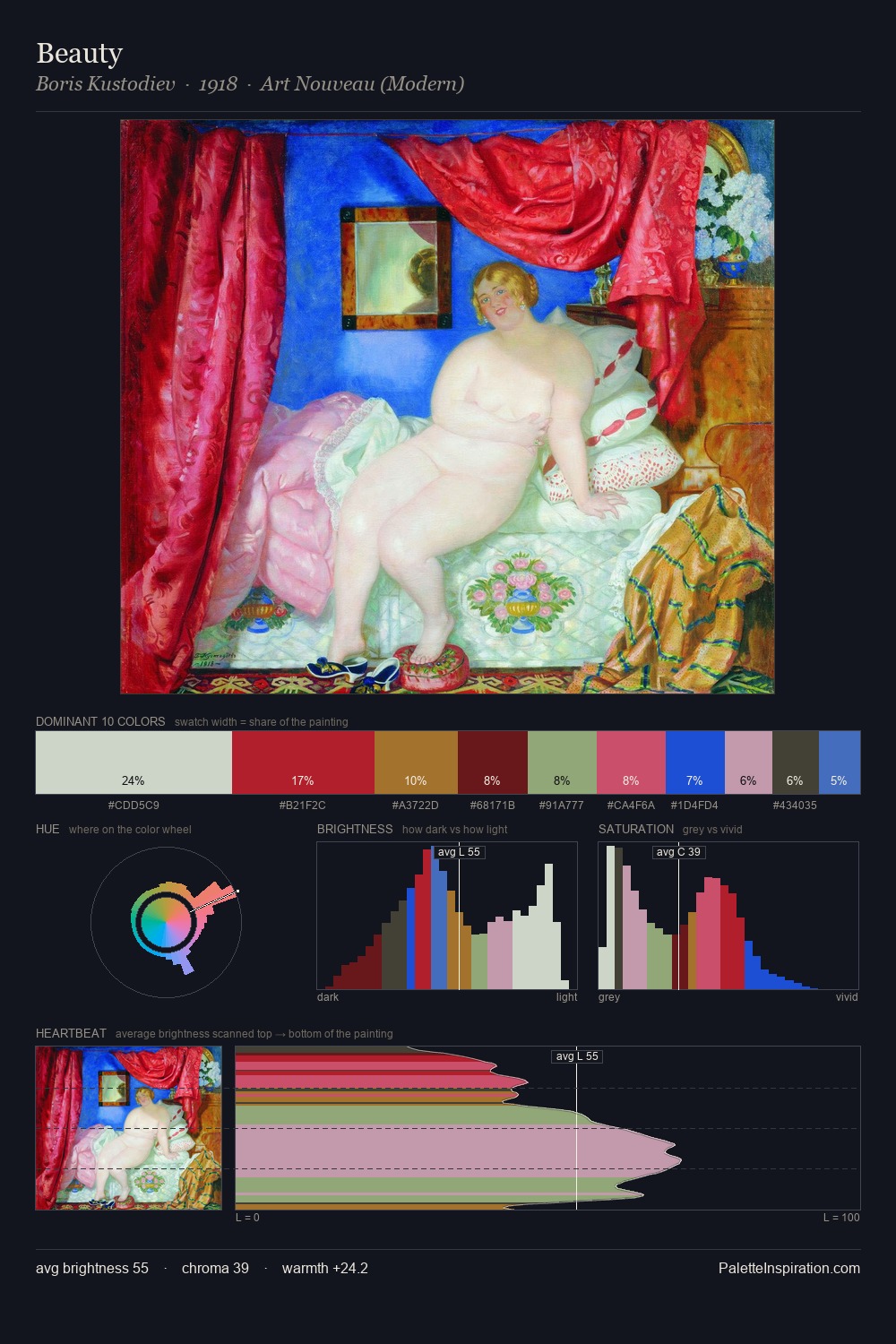
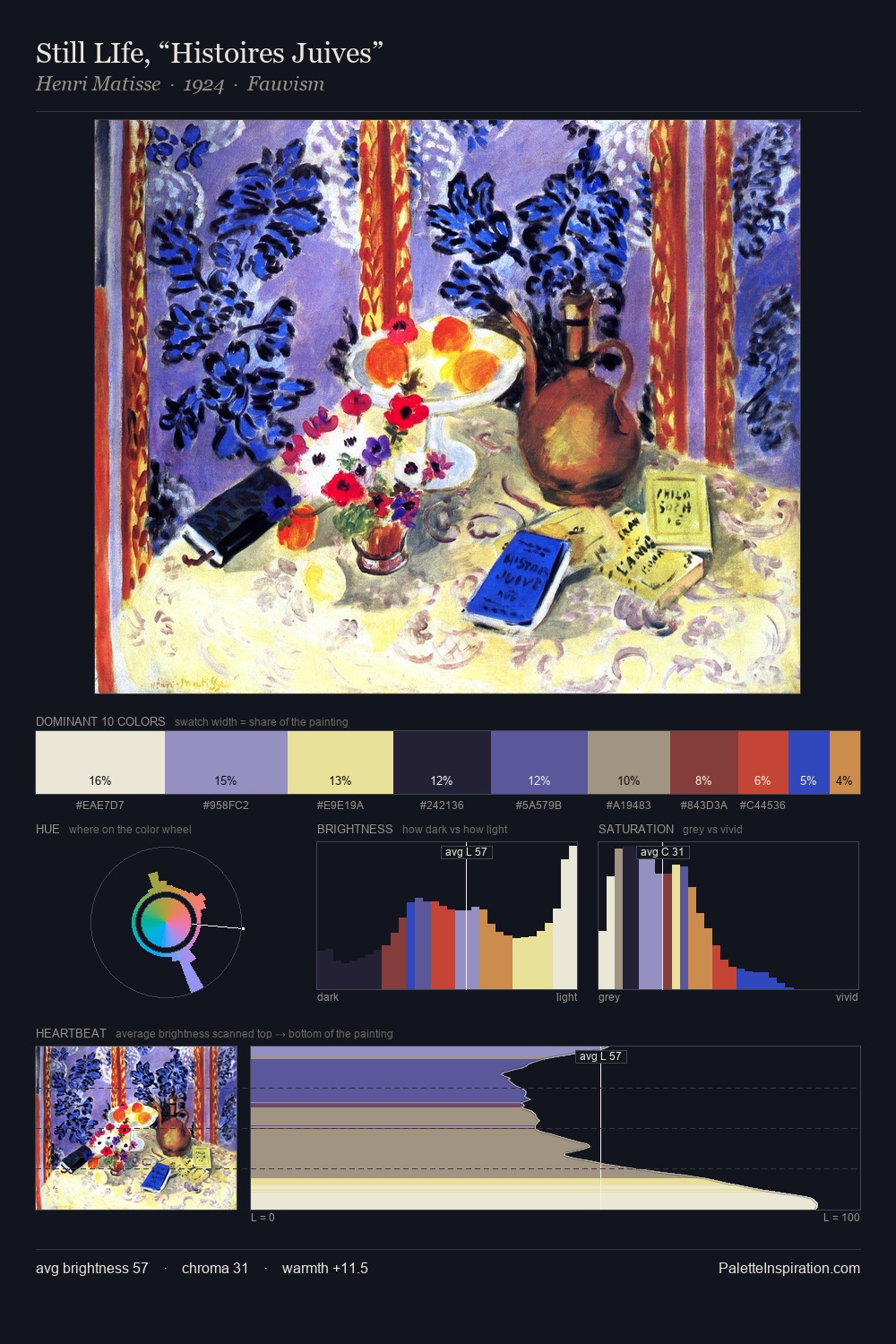
Boris Kustodiev works in the upper reaches of the value scale, creating an atmosphere of brightness and expansiveness. Blues and teal-greys govern the palette, lending it an aquatic or atmospheric quality. Saturation is measured and controlled, giving the palette presence without visual aggression. A single dominant - #D1E5CF at 39.1% - sets the character of the whole composition. #6F2819 at 3.4% is both the most chromatic and one of the largest colours in the palette - chroma as mass rather than as highlight. A value spread of 55 units gives the palette both depth and air - shadows are genuinely dark, lights genuinely light. The palette has the character of outdoor light: cool, mid-bright, with colour rendered faithfully rather than expressively. This is palette 10 of Boris Kustodiev's sequence - a single chapter in a chromatic story told across many works.
Example use cases
- publishing
- corporate identity
- consumer apps
- hospitality
- design agencies
I Love This!
Copy, export, or download for your project