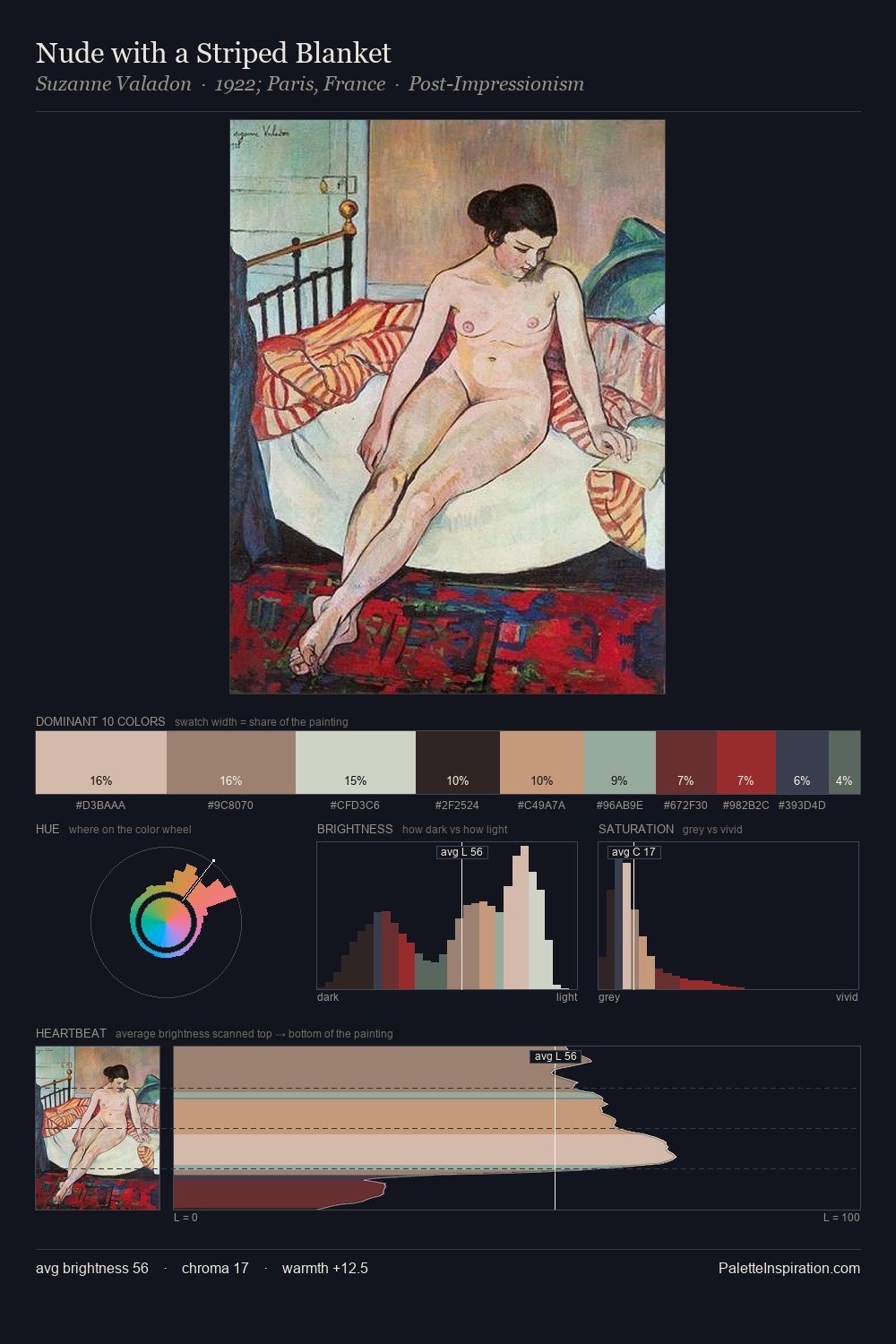
Bijinga Palette 9
Soft Tawny
Soft Low-contrast, gentle chroma - mid-key values and low saturation, approachable and calm.
Tawny Warm orange-brown - a traditional term for the color of tanned leather or lion fur.

Palette Analysis
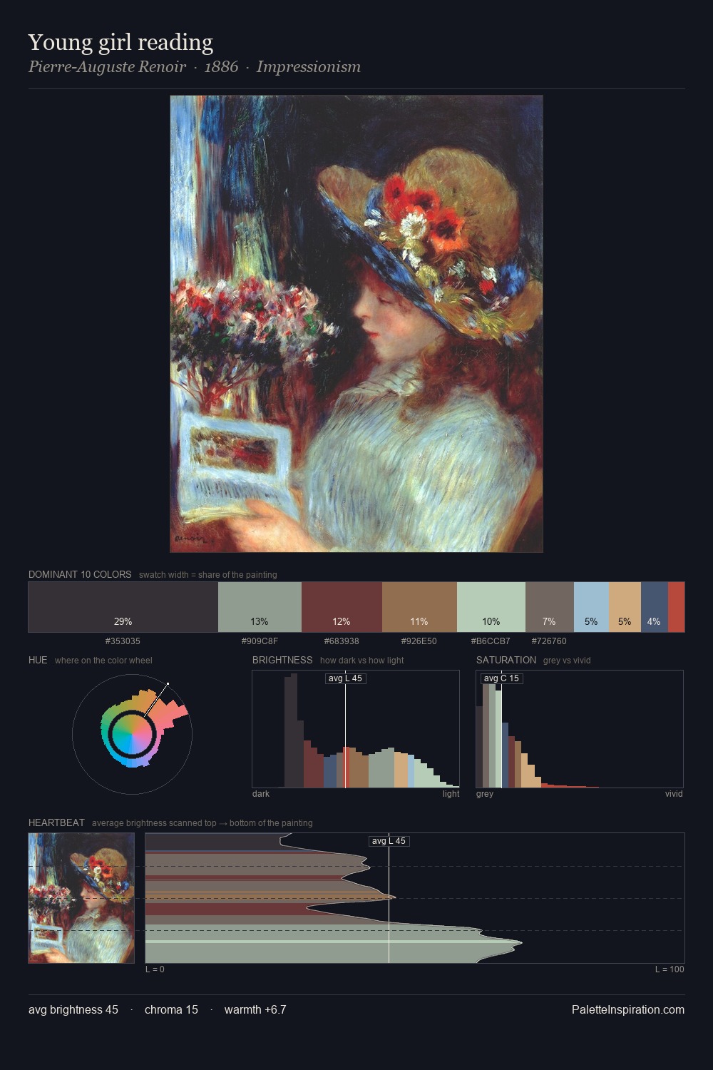
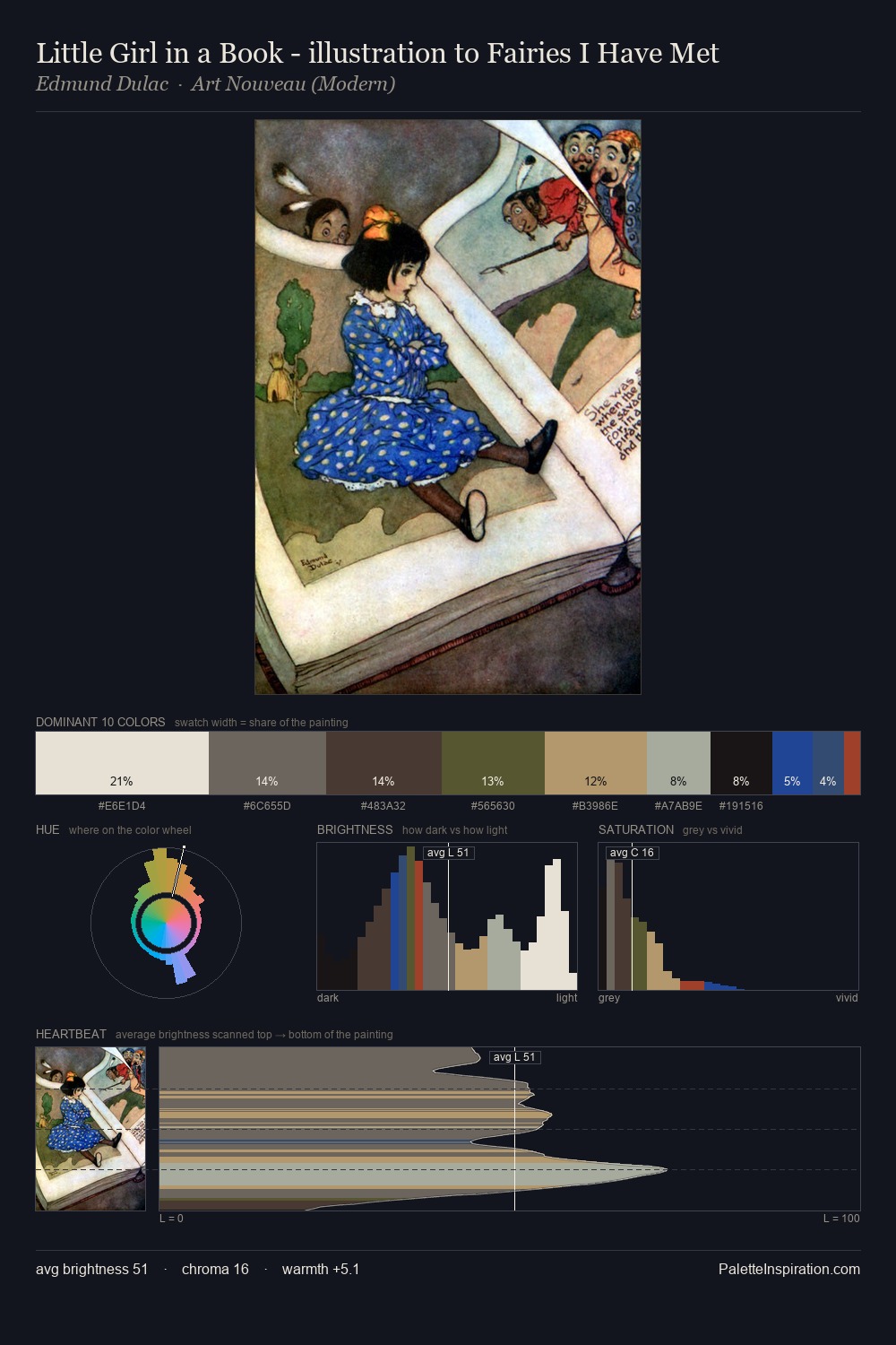
bijinga distributes its values across the middle register, creating harmony without high contrast. The palette tilts toward cool - blues and silver-greys carry the structural weight. Saturation is deliberately withheld - the beauty here lies in the near-monochromatic gradations rather than colour difference. Only 5.4% is devoted to #AC7C62, yet that small allocation delivers the palette's entire chromatic tension. 55 units of value range underpin the palette's structural clarity: the eye always knows where light falls. The palette has the character of outdoor light: cool, mid-bright, with colour rendered faithfully rather than expressively.
Example use cases
- exhibition design
- foundation branding
- estate management
- art education
- museums & galleries
I Love This!
Use This Palette
Copy, export, or download for your project
Copy, export, or download for your project
Copy:
Download:
Share: