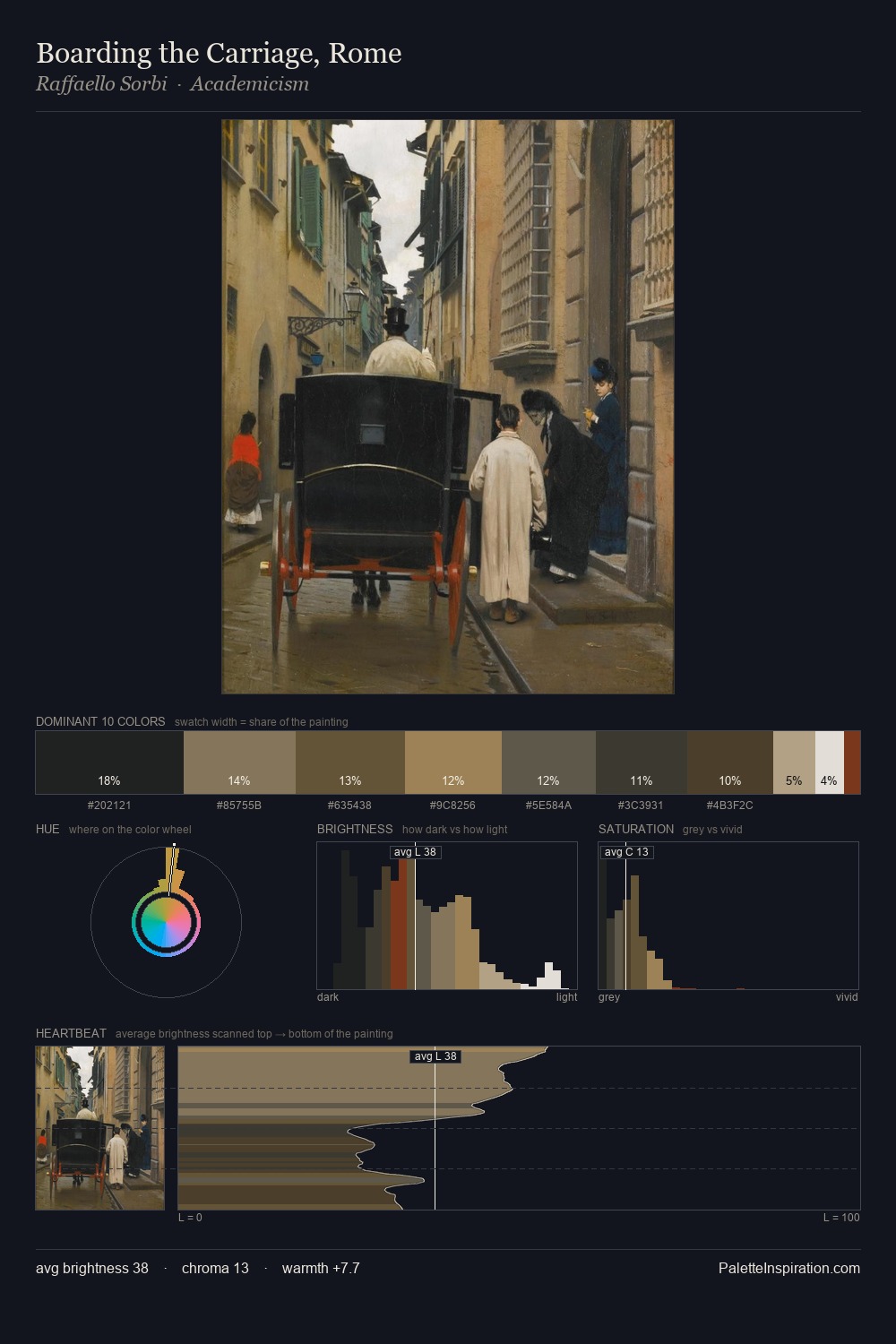
Berthold Woltze Palette 3

Palette Analysis
Darkness anchors Berthold Woltze; light is rationed, creating dramatic contrast rather than open air. Temperature reads distinctly warm: the reds and earth tones from Berthold Woltze carry the compositional weight. All colours lean toward grey, building depth through value rather than colour punch. #252221 claims 30.3% of the surface, functioning as the work's tonal foundation. #874327 functions as the palette's exclamation mark: highest chroma, lowest percentage (2.4%). The palette spans 50 value units: a measured range that delivers coherence over drama. The combination of low values, muted chroma, and compressed range is the signature of the Tonalist mode - painting as atmosphere. Palette 3 sits within the larger chromatic argument that Berthold Woltze's complete body of work advances.
Example use cases
- theater design
- jewelry brands
- tobacco-adjacent retail
- event branding
- film & entertainment
I Love This!
Copy, export, or download for your project