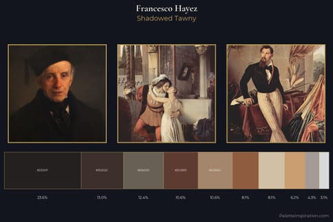
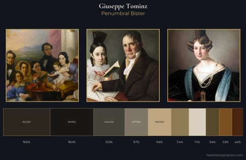
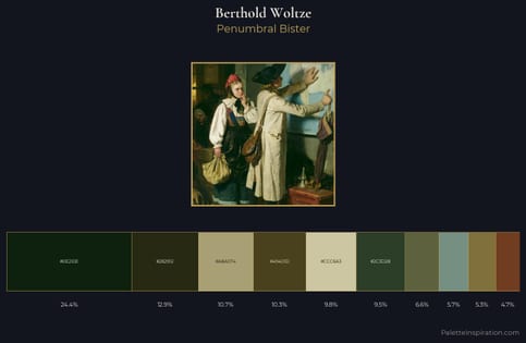
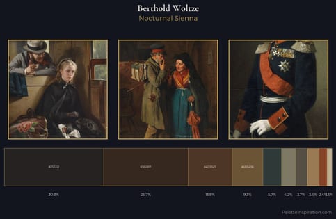
Berthold Woltze Palette 1
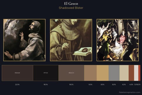
Shadowed Bister
Shadowed Low-key - values weighted toward shadow, the palette of dim interiors and overcast skies.
Bister Dark warm brown - a traditional ink and wash pigment made from wood soot.
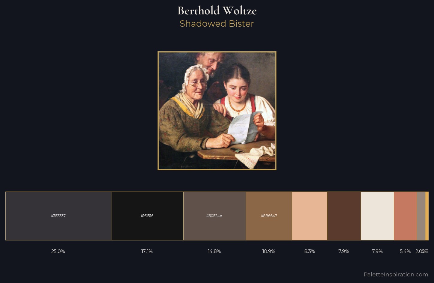
Palette Analysis
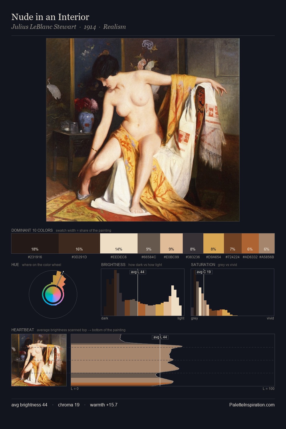
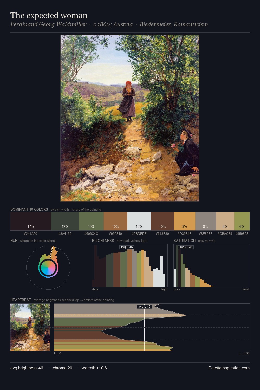
Berthold Woltze sits in the centre of the value range, lending the palette a sense of even, sustained light. Warm hues command this palette; Berthold Woltze favours the reds, oranges, and yellows of firelight and earth. All colours lean toward grey, building depth through value rather than colour punch. The saturated accent, #E4AD52, registers at 0.8% - sparse enough to feel like a deliberate surprise. From deepest dark to palest light, the palette traverses 72 units of the value scale - a span that creates natural depth. Berthold Woltze's palette 1 carries its own internal logic while remaining in conversation with the artist's broader colour intelligence.
Example use cases
- music labels
- luxury hospitality
- editorial photography
- leather goods
- premium streaming
I Love This!
Use This Palette
Copy, export, or download for your project
Copy, export, or download for your project
Copy:
Download:
Share: