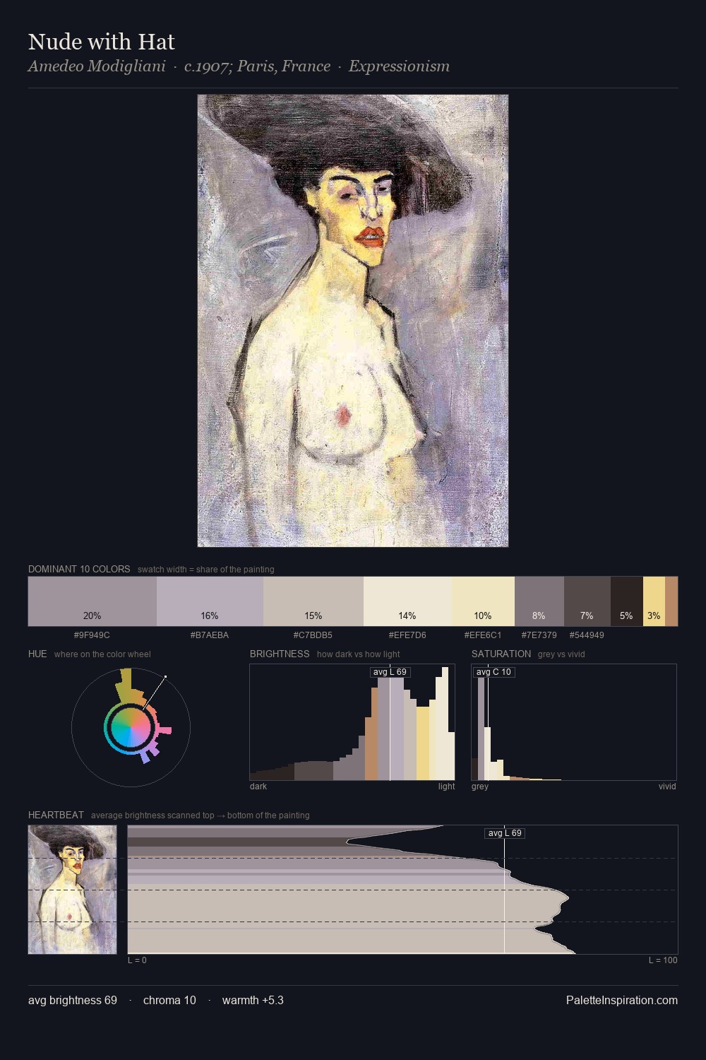
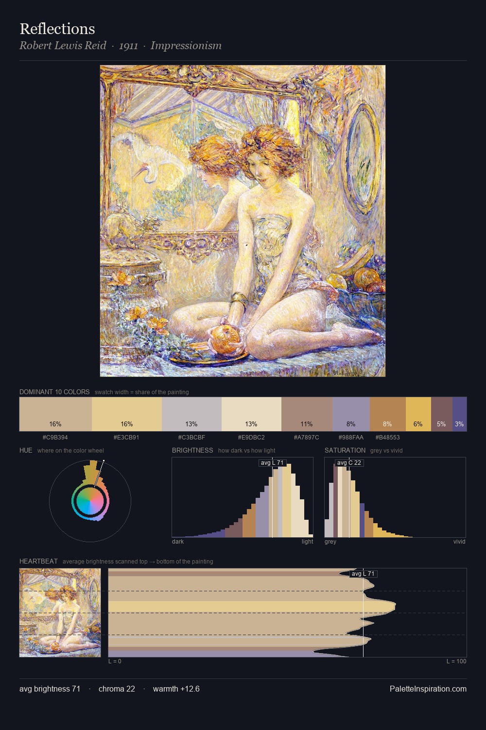
Berthe Morisot Palette 1
Gleaming Cream
Gleaming Bright and polished - high-key, often warm, suggesting reflective or luminous surfaces.
Cream Warm white - slightly yellowed, rich, the color of heavy dairy.

Palette Analysis
Berthe Morisot is high in key: pale, luminous, and filled with optical air. Warm and cool tones are held in careful balance - neither family dominates, creating tension and resolution simultaneously. All colours lean toward grey, building depth through value rather than colour punch. At 35.6%, #DACDBD functions less as a colour accent and more as a complete atmospheric environment. #B38562 delivers the chromatic peak at only 0.9% - a small shot of colour with outsized visual impact. The palette spans 48 value units: a measured range that delivers coherence over drama. Palette 1 sits within the larger chromatic argument that Berthe Morisot's complete body of work advances.
Example use cases
- ceramics & pottery
- boutique hospitality
- menswear
- heritage food brands
- craft & artisan brands
I Love This!
Use This Palette
Copy, export, or download for your project
Copy, export, or download for your project
Copy:
Download:
Share: