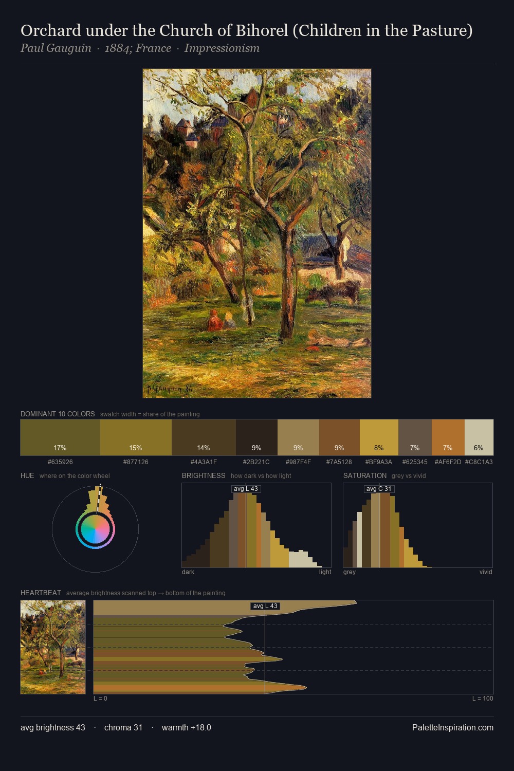
Bertha Wegmann Palette 3
Tenebrous Bister
Tenebrous Dark and murky - low-key values with obscured form, Baroque in temperament.
Bister Dark warm brown - a traditional ink and wash pigment made from wood soot.

Palette Analysis
Bertha Wegmann occupies the comfortable middle of the value scale, avoiding both extremes to hold the eye in a sustained middle grey. Yellow, ochre, sienna: warm hues that Bertha Wegmann deploys as the palette's primary energy. Chroma is kept low across all colours, producing the soft, enveloping quality that characterises tonal painting. The highest-chroma note - #BCA23F - appears at just 3.5%, deployed as a precision accent against the quieter ground. At 57 units of value range, the palette has the tonal breadth to sustain complex spatial readings. Palette 3 sits within the larger chromatic argument that Bertha Wegmann's complete body of work advances.
Example use cases
- music labels
- luxury hospitality
- editorial photography
- leather goods
- premium streaming
I Love This!
Use This Palette
Copy, export, or download for your project
Copy, export, or download for your project
Copy:
Download:
Share: