Benedetta Cappa Master Palette

Palette Analysis
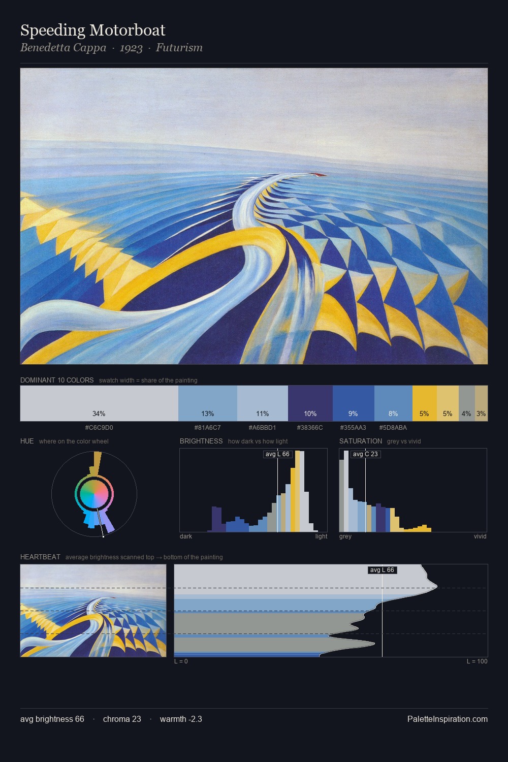
Light floods Benedetta Cappa; the palette keeps values pale and airy across its range. Benedetta Cappa builds on cool foundations: the palette favours the blue-cyan-green arc. Saturation is measured and controlled, giving the palette presence without visual aggression. 30.3% of the palette belongs to #C9CCD1, a concentration that makes it the unmistakable visual centre. The most saturated colour, #3763AA, is reserved to 6.7% of the surface, where it acts as a focal punctuation. At 47 units across the value scale, the palette keeps contrast readable without letting it dominate. The mid-to-high key, cool bias, and moderate chroma point to outdoor observation - sky and diffused daylight as the dominant light source. The palette is a signature: Benedetta Cappa's particular sense of value, warmth, and colour weight made legible.
Example use cases
- publishing
- corporate identity
- consumer apps
- hospitality
- design agencies
I Love This!
Copy, export, or download for your project