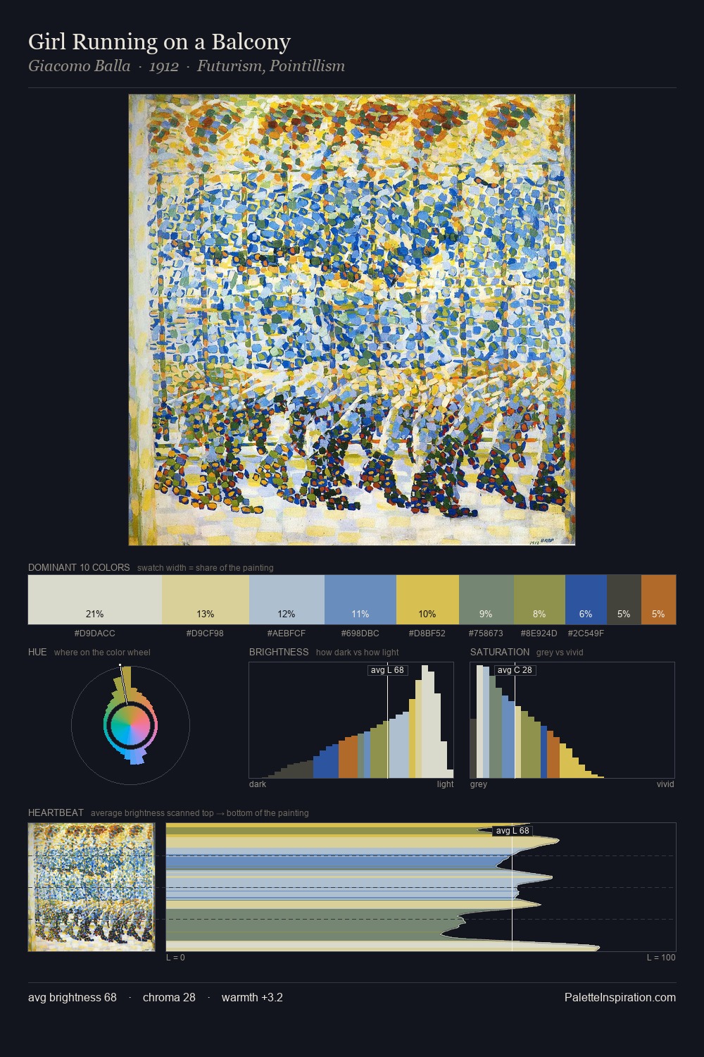
Benedetta Cappa Palette 1

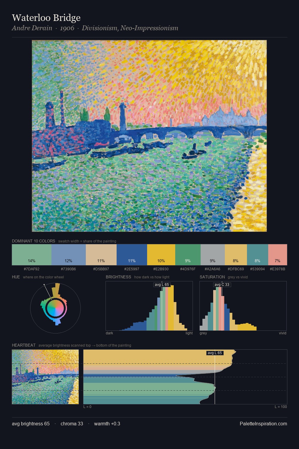
Palette Analysis
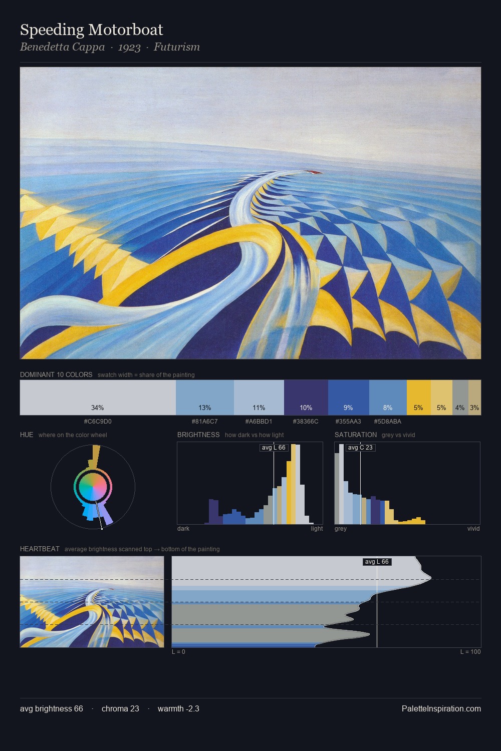
Benedetta Cappa is high in key: pale, luminous, and filled with optical air. Benedetta Cappa builds on cool foundations: the palette favours the blue-cyan-green arc. Chroma is moderate: colours carry enough saturation to be read as colour, but the palette stops well short of garish intensity. At 30.3%, #C9CCD1 functions less as a colour accent and more as a complete atmospheric environment. The saturated accent, #3763AA, registers at 6.7% - sparse enough to feel like a deliberate surprise. At 47 units across the value scale, the palette keeps contrast readable without letting it dominate. The mid-to-high key, cool bias, and moderate chroma point to outdoor observation - sky and diffused daylight as the dominant light source. This is palette 1 of Benedetta Cappa's sequence - a single chapter in a chromatic story told across many works.
Example use cases
- publishing
- corporate identity
- consumer apps
- hospitality
- design agencies
I Love This!
Copy, export, or download for your project