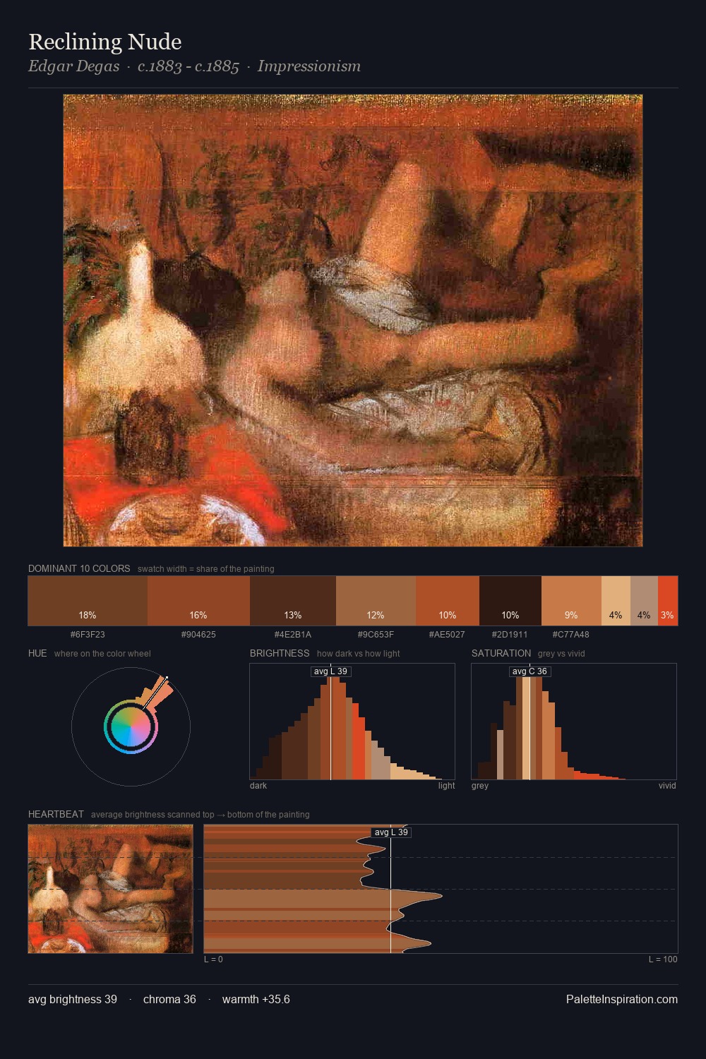
Barent Fabritius Palette 1
Shadowed Caramel
Shadowed Low-key - values weighted toward shadow, the palette of dim interiors and overcast skies.
Caramel Warm mid-brown - the color of cooked sugar, smooth and amber-toned.

Palette Analysis
Values in Barent Fabritius rest in the mid-range - neither dramatically lit nor steeped in shadow. Warmth dominates - the palette of Barent Fabritius leans heavily on the yellow-orange-red arc of the colour wheel. Chroma is moderate: colours carry enough saturation to be read as colour, but the palette stops well short of garish intensity. The saturated accent, #EF6641, registers at 4.1% - sparse enough to feel like a deliberate surprise. A value spread of 56 units gives the palette both depth and air - shadows are genuinely dark, lights genuinely light. Palette 1 sits within the larger chromatic argument that Barent Fabritius's complete body of work advances.
Example use cases
- theater design
- jewelry brands
- tobacco-adjacent retail
- event branding
- film & entertainment
I Love This!
Use This Palette
Copy, export, or download for your project
Copy, export, or download for your project
Copy:
Download:
Share: