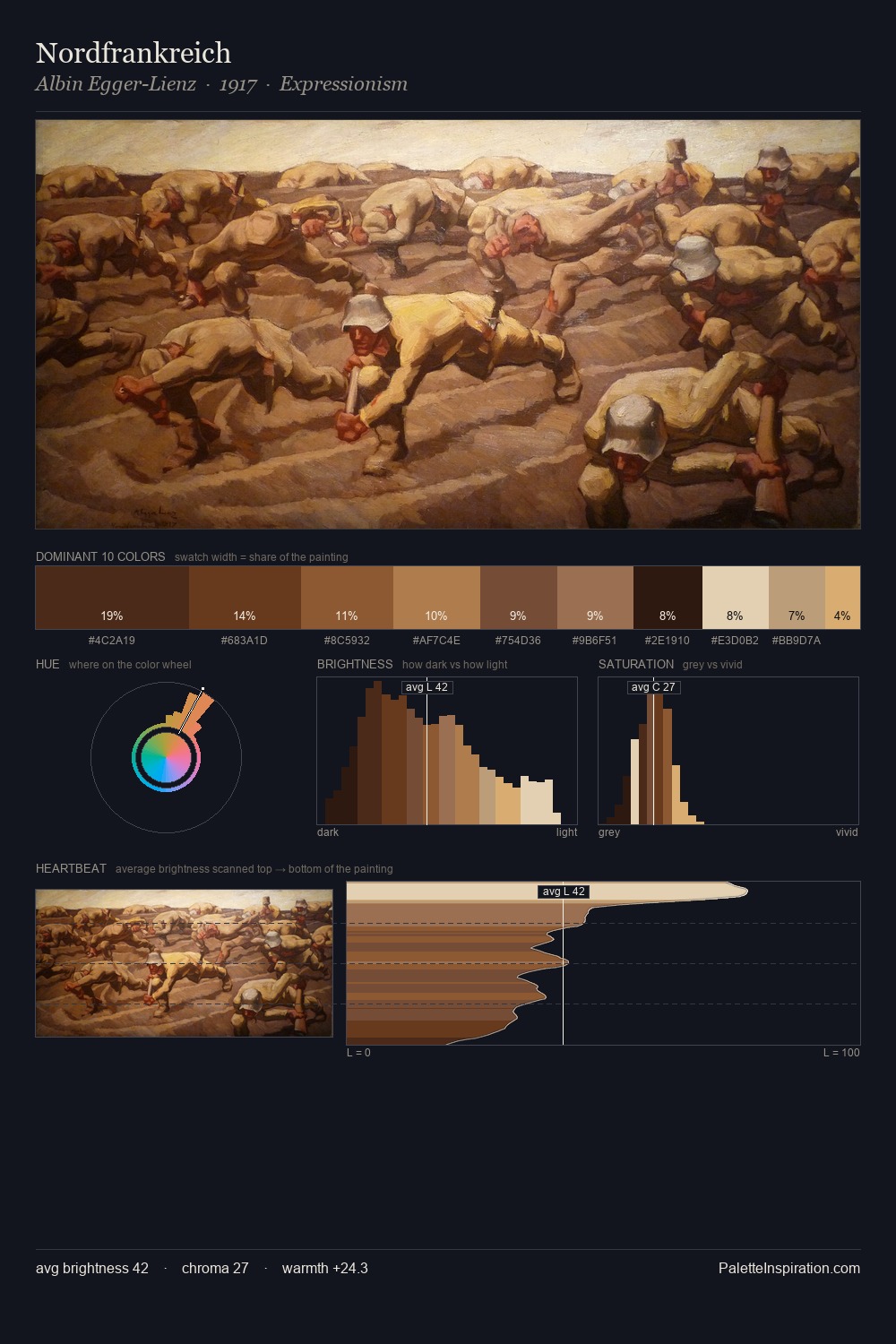
Charles Willson Peale Palette 9

Palette Analysis
Charles Willson Peale distributes its values across the middle register, creating harmony without high contrast. Warmth dominates - the palette of Charles Willson Peale leans heavily on the yellow-orange-red arc of the colour wheel. Saturation is deliberately withheld - the beauty here lies in the near-monochromatic gradations rather than colour difference. The highest-chroma note - #773C22 - appears at just 3.6%, deployed as a precision accent against the quieter ground. The value range spans 57 units across the palette, providing the full gamut from deep shadow to near-white and ensuring clear tonal hierarchy. Charles Willson Peale's palette 9 carries its own internal logic while remaining in conversation with the artist's broader colour intelligence.
Example use cases
- music labels
- luxury hospitality
- editorial photography
- leather goods
- premium streaming
I Love This!
Copy, export, or download for your project