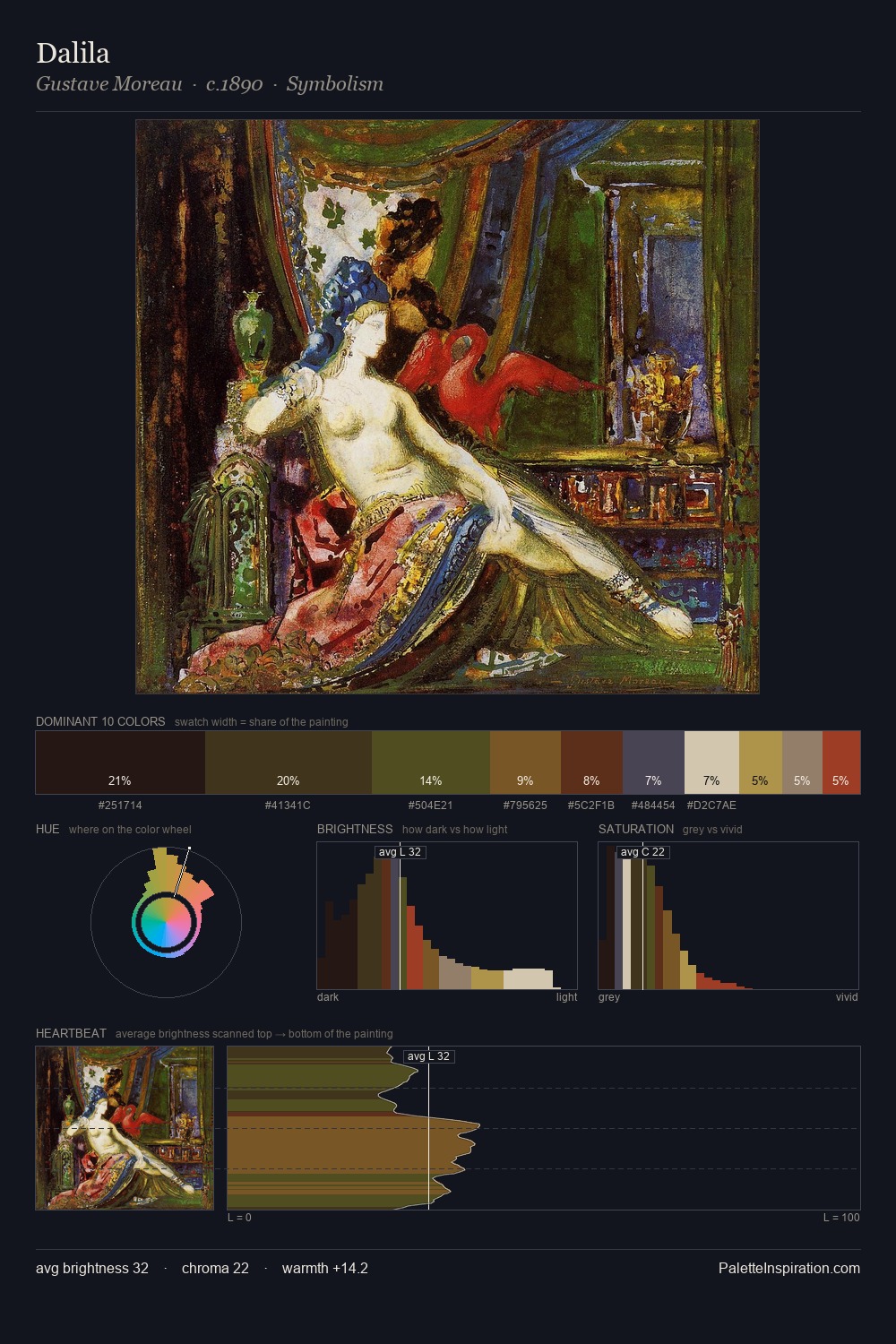
Balthasar van der Ast Palette 3

Palette Analysis
Balthasar van der Ast is built on dark foundations, with values clustered toward shadow. Cool hues prevail: blues, greens, and greys anchor the palette's emotional temperature. Every colour is desaturated; the palette proceeds through near-neutrals and gently-coloured greys. 29.2% of the palette belongs to #2B2619, a concentration that makes it the unmistakable visual centre. #A78A2F delivers the chromatic peak at only 2.0% - a small shot of colour with outsized visual impact. At 59 units of value range, the palette has the tonal breadth to sustain complex spatial readings. This tonal restraint is characteristic of the Balthasar van der Ast approach: colour serves light, not the reverse. In the context of Balthasar van der Ast's full range of palettes, group 3 represents one movement in an ongoing chromatic dialogue.
Example use cases
- theater design
- jewelry brands
- tobacco-adjacent retail
- event branding
- film & entertainment
I Love This!
Copy, export, or download for your project