Balthasar van der Ast Palette 1

Palette Analysis
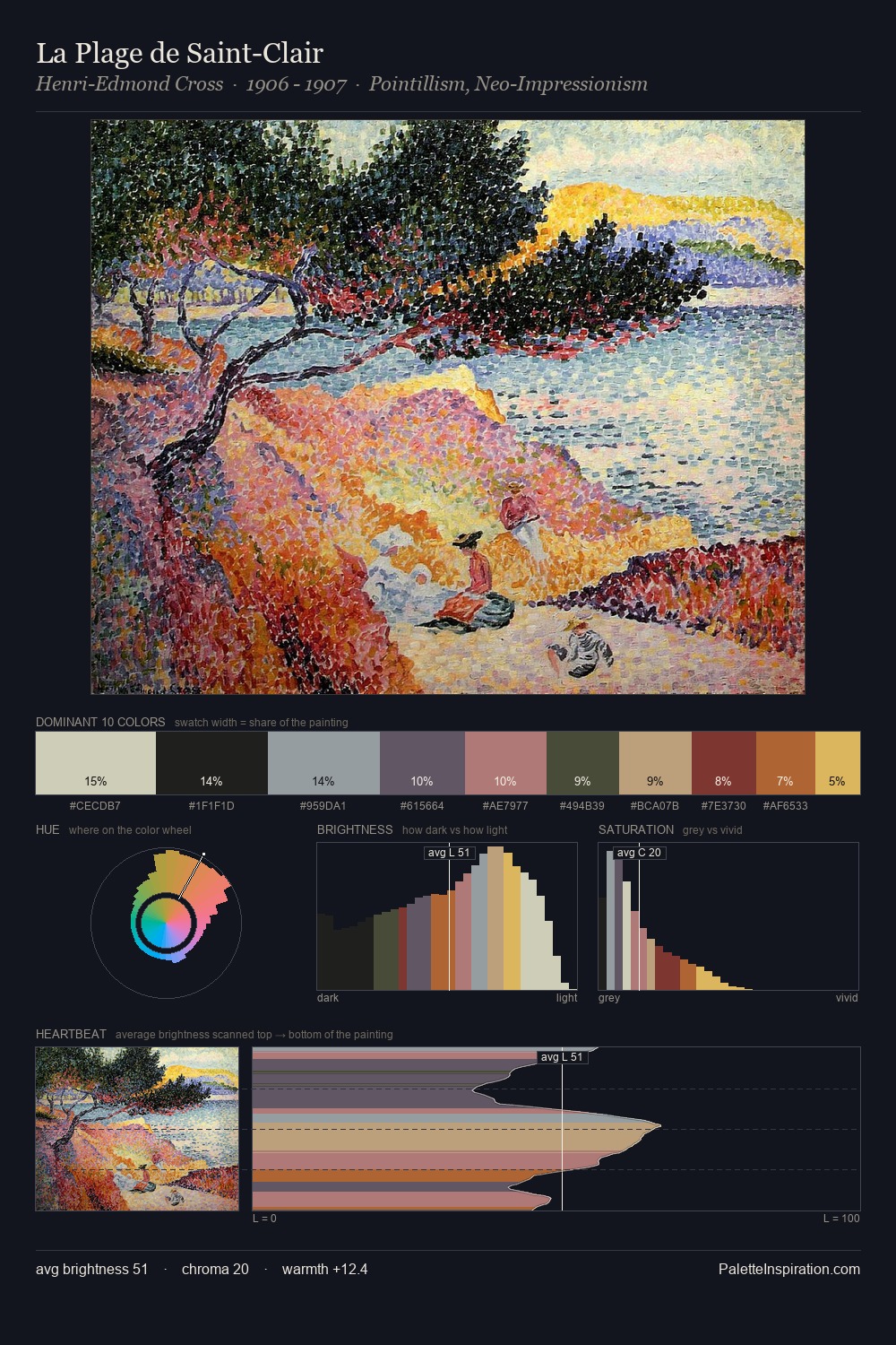
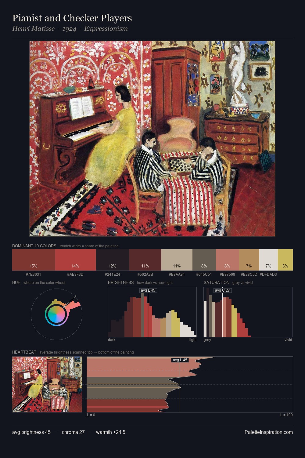
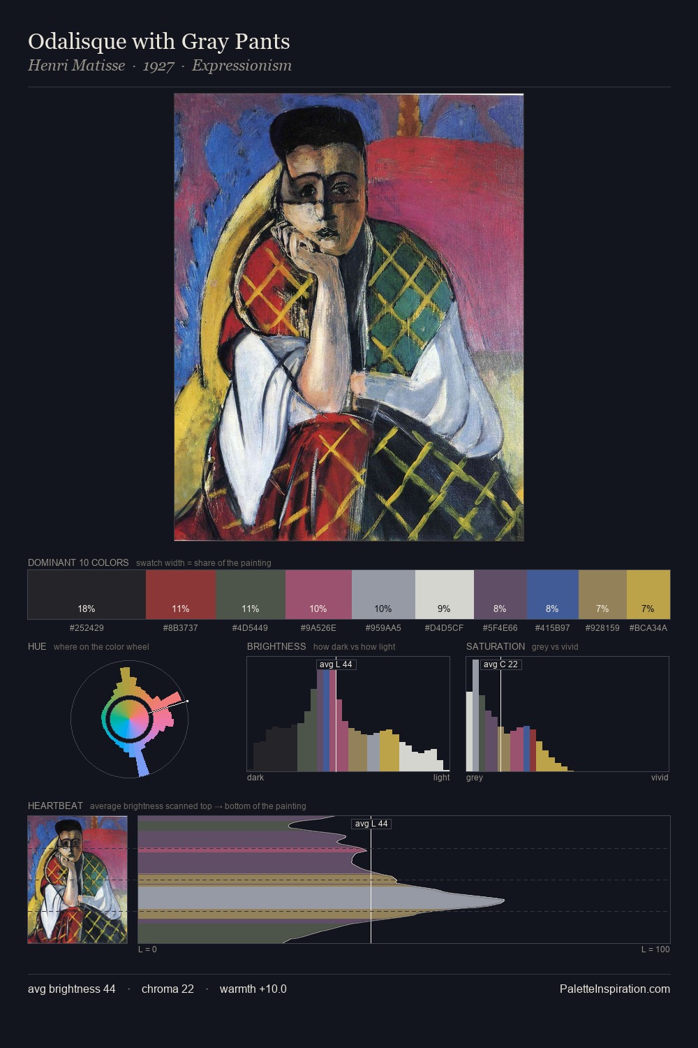
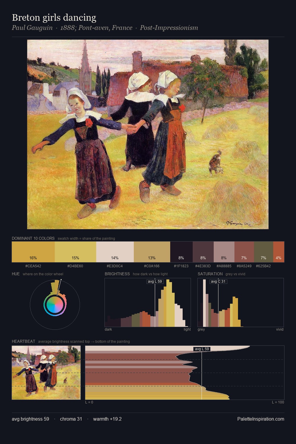
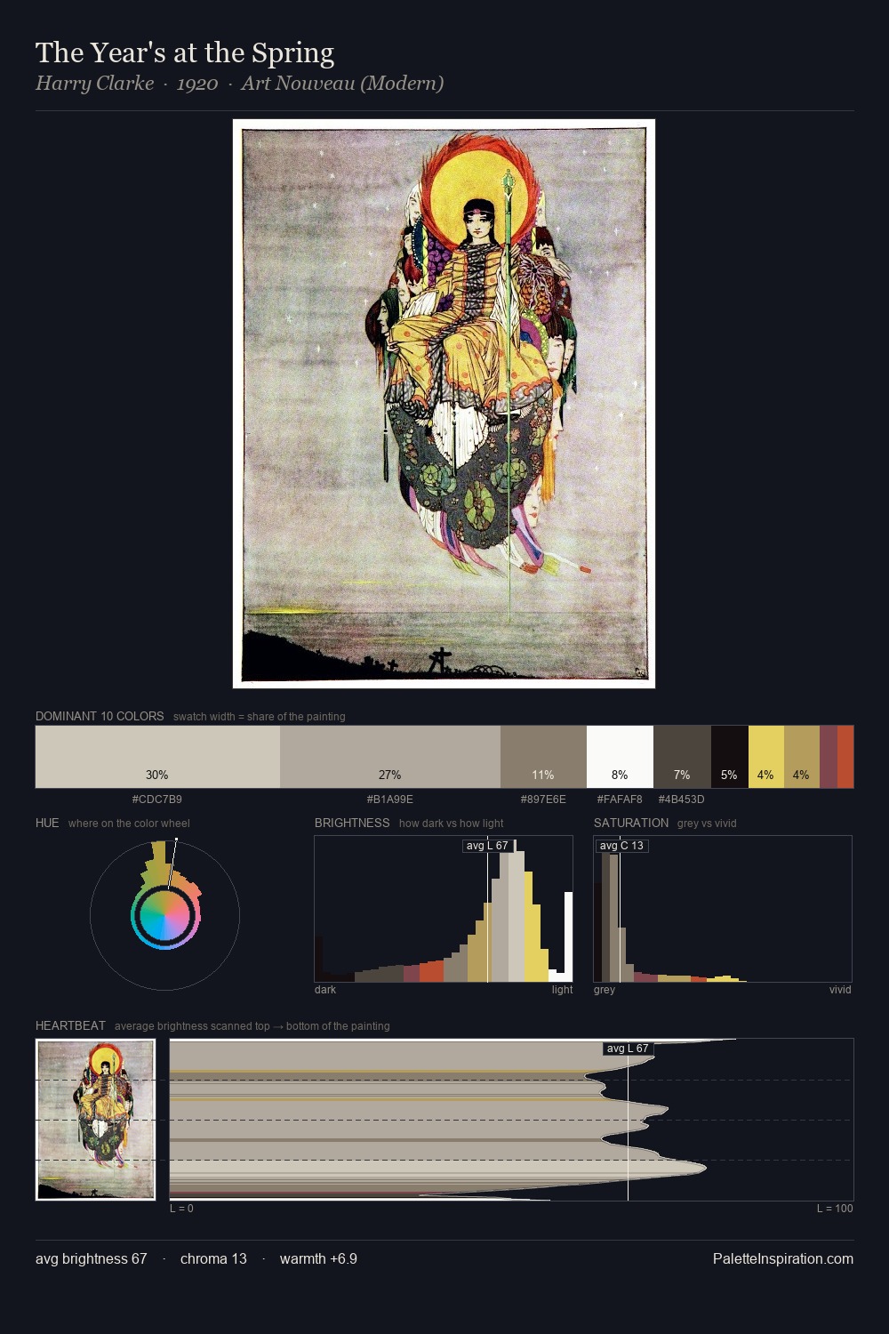
Balthasar van der Ast sits in the centre of the value range, lending the palette a sense of even, sustained light. Warmth dominates - the palette of Balthasar van der Ast leans heavily on the yellow-orange-red arc of the colour wheel. The absence of saturated colour is itself an expressive choice: this is a palette of restraint and atmosphere. At 34.4%, #191517 functions less as a colour accent and more as a complete atmospheric environment. #9A8A50 delivers the chromatic peak at only 1.3% - a small shot of colour with outsized visual impact. 68 units of value range underpin the palette's structural clarity: the eye always knows where light falls. In the context of Balthasar van der Ast's full range of palettes, group 1 represents one movement in an ongoing chromatic dialogue.
Example use cases
- theater design
- jewelry brands
- tobacco-adjacent retail
- event branding
- film & entertainment
I Love This!
Copy, export, or download for your project