Baldassare Verazzi Master Palette
Muted Gamboge
Muted Deliberately desaturated - chroma pulled toward gray, the restraint of tonal painting.
Gamboge Deep golden yellow - a traditional warm pigment, rich amber-gold.

Palette Analysis
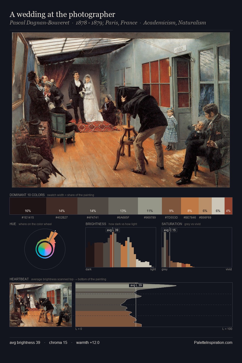
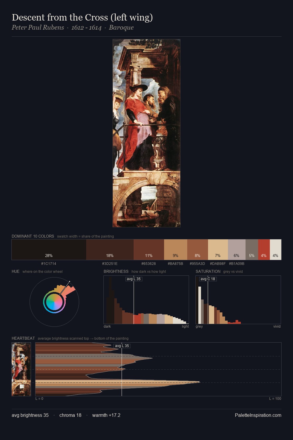
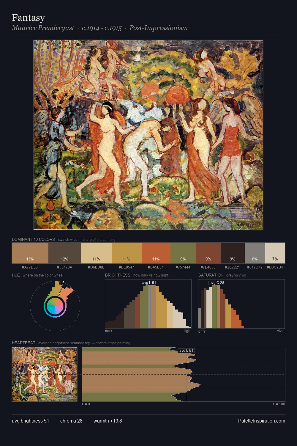
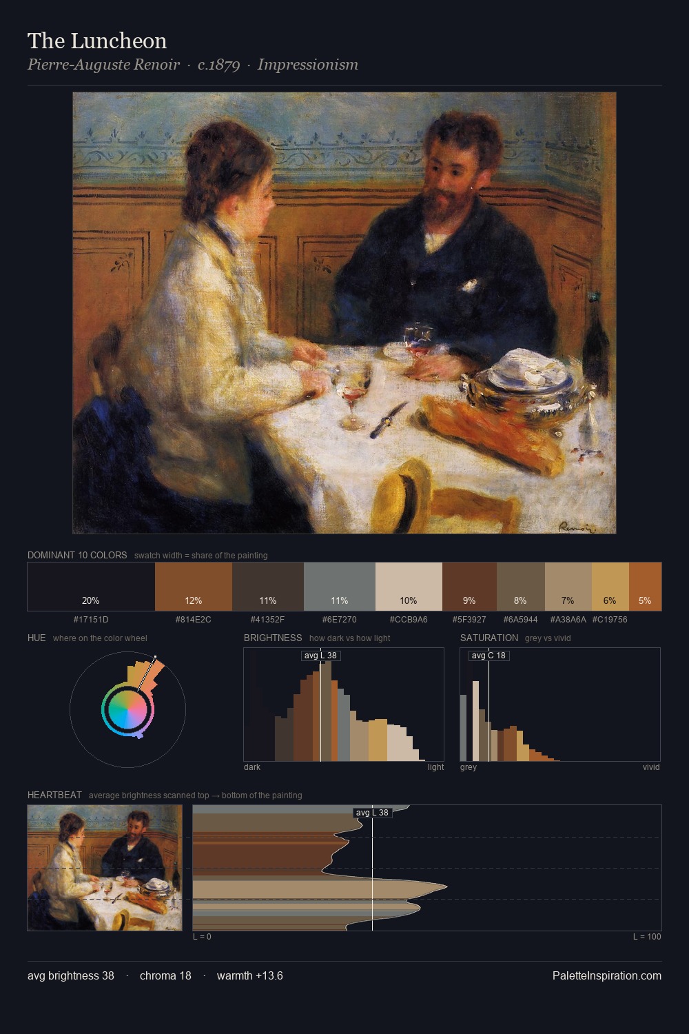
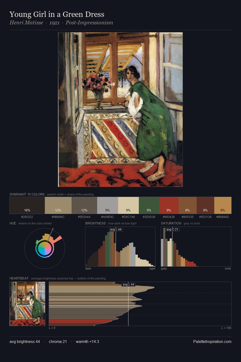
Baldassare Verazzi sits in the centre of the value range, lending the palette a sense of even, sustained light. Baldassare Verazzi orchestrates warmth above all else - reds, ambers, and siennas take the lead. Chroma is kept low across all colours, producing the soft, enveloping quality that characterises tonal painting. #9F4222 functions as the palette's exclamation mark: highest chroma, lowest percentage (6.0%). A value spread of 60 units gives the palette both depth and air - shadows are genuinely dark, lights genuinely light. The palette is recognisably Baldassare Verazzi's own: particular in its temperature, chroma, and the economy of its brightest note.
Example use cases
- ceramics & pottery
- boutique hospitality
- menswear
- heritage food brands
- craft & artisan brands
I Love This!
Use This Palette
Copy, export, or download for your project
Copy, export, or download for your project
Copy:
Download:
Share: