Baldassare Verazzi Palette 3
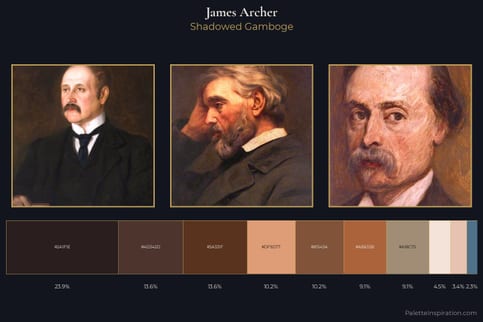
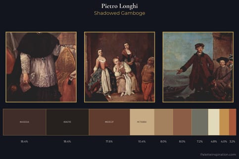
Shadowed Gamboge
Shadowed Low-key - values weighted toward shadow, the palette of dim interiors and overcast skies.
Gamboge Deep golden yellow - a traditional warm pigment, rich amber-gold.
Palette Analysis
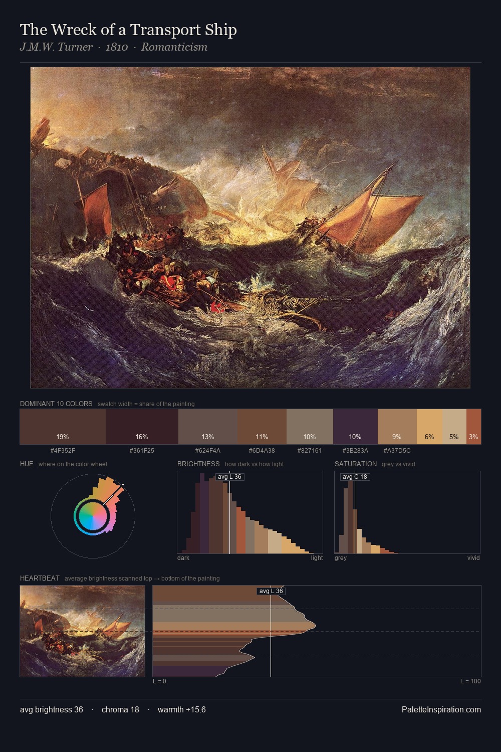
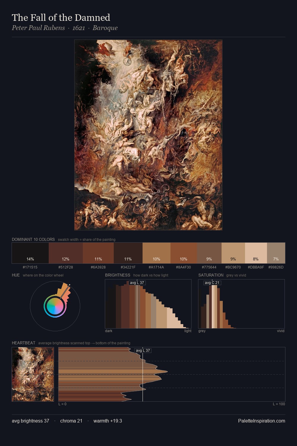
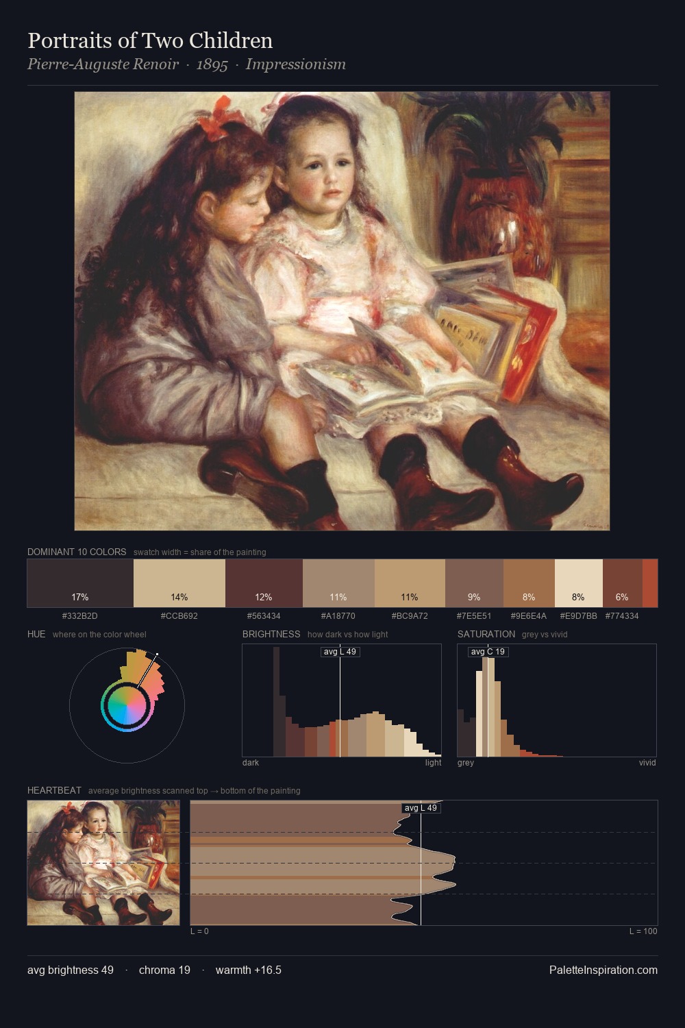
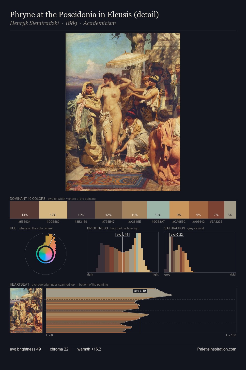
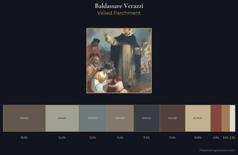
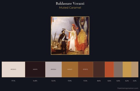
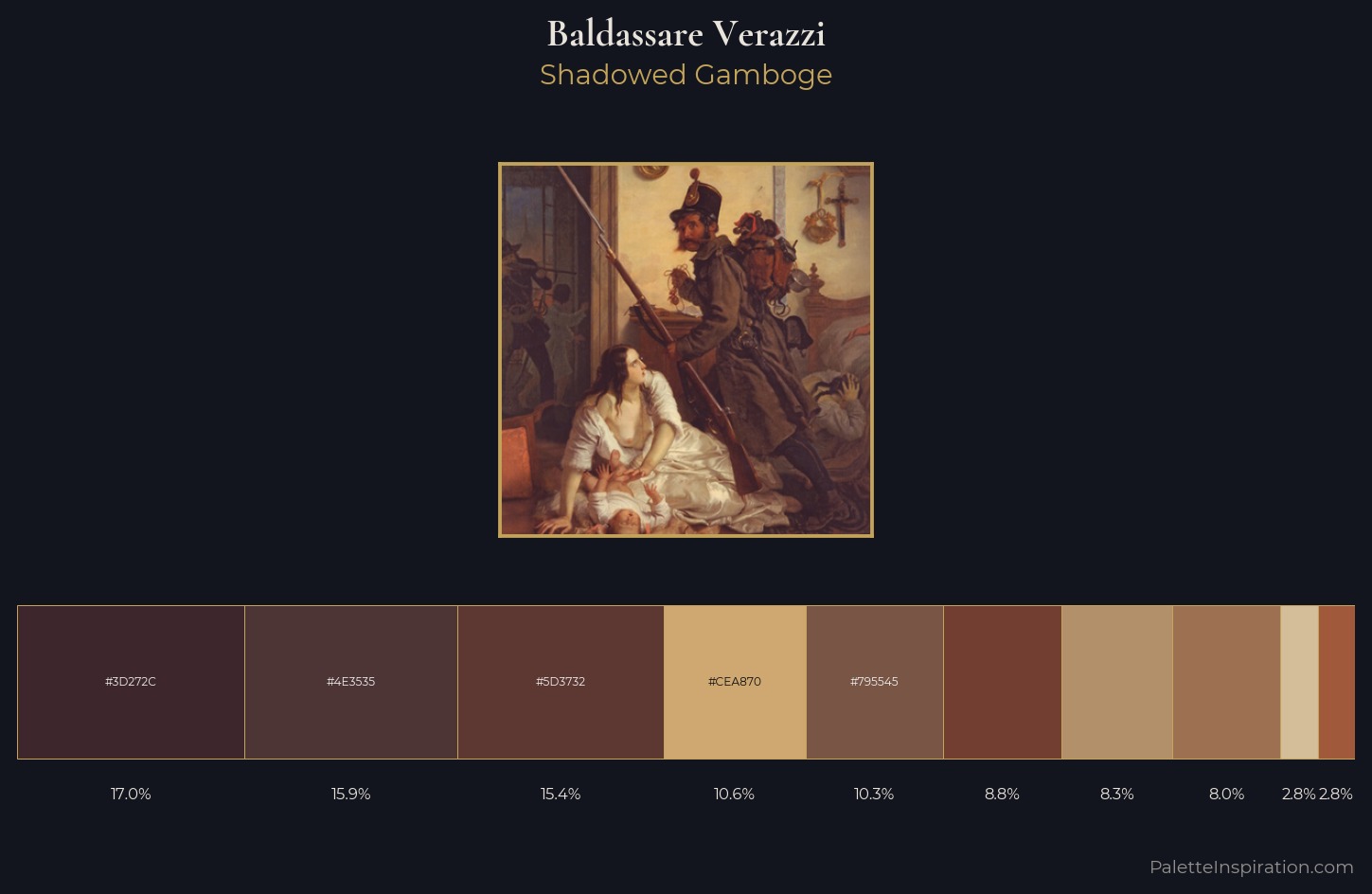
Baldassare Verazzi distributes its values across the middle register, creating harmony without high contrast. The dominant temperature is warm, with earth tones and fire-hues setting the emotional key. All colours lean toward grey, building depth through value rather than colour punch. The saturated accent, #A1593C, registers at 2.8% - sparse enough to feel like a deliberate surprise. 51 units of value spread create a palette that is varied but unified - contrast in the service of harmony. This is palette 3 of Baldassare Verazzi's sequence - a single chapter in a chromatic story told across many works.
Example use cases
- premium streaming
- cocktail bars
- fashion campaigns
- book covers
- music labels
I Love This!
Use This Palette
Copy, export, or download for your project
Copy, export, or download for your project
Copy:
Download:
Share: