Attilio Pratella Master Palette
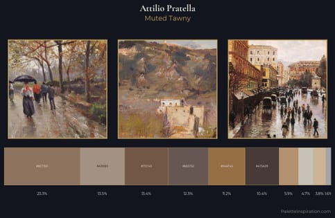
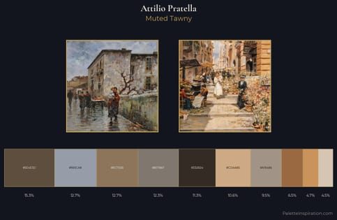
Veiled Tawny
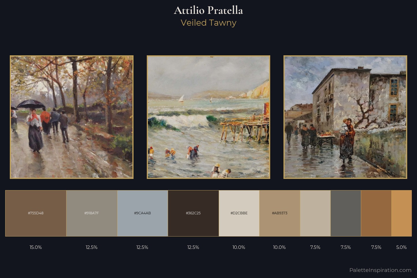
Veiled Partially obscured light - mid-dark with a hazy, scrim-filtered quality.
Tawny Warm orange-brown - a traditional term for the color of tanned leather or lion fur.
Palette Analysis
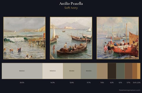
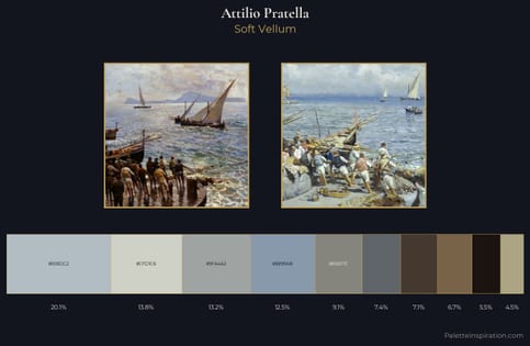
Attilio Pratella distributes its values across the middle register, creating harmony without high contrast. Warm and cool tones are held in careful balance - neither family dominates, creating tension and resolution simultaneously. All colours lean toward grey, building depth through value rather than colour punch. #95683F delivers the chromatic peak at only 7.5% - a small shot of colour with outsized visual impact. The value range of 54 units sits in the comfortable middle: enough depth, enough light, neither extreme. The palette is recognisably Attilio Pratella's own: particular in its temperature, chroma, and the economy of its brightest note.
Example use cases
- exhibition design
- foundation branding
- estate management
- art education
- museums & galleries
I Love This!
Use This Palette
Copy, export, or download for your project
Copy, export, or download for your project
Copy:
Download:
Share: