Attilio Pratella Palette 1
Muted Tawny
Muted Deliberately desaturated - chroma pulled toward gray, the restraint of tonal painting.
Tawny Warm orange-brown - a traditional term for the color of tanned leather or lion fur.

Palette Analysis
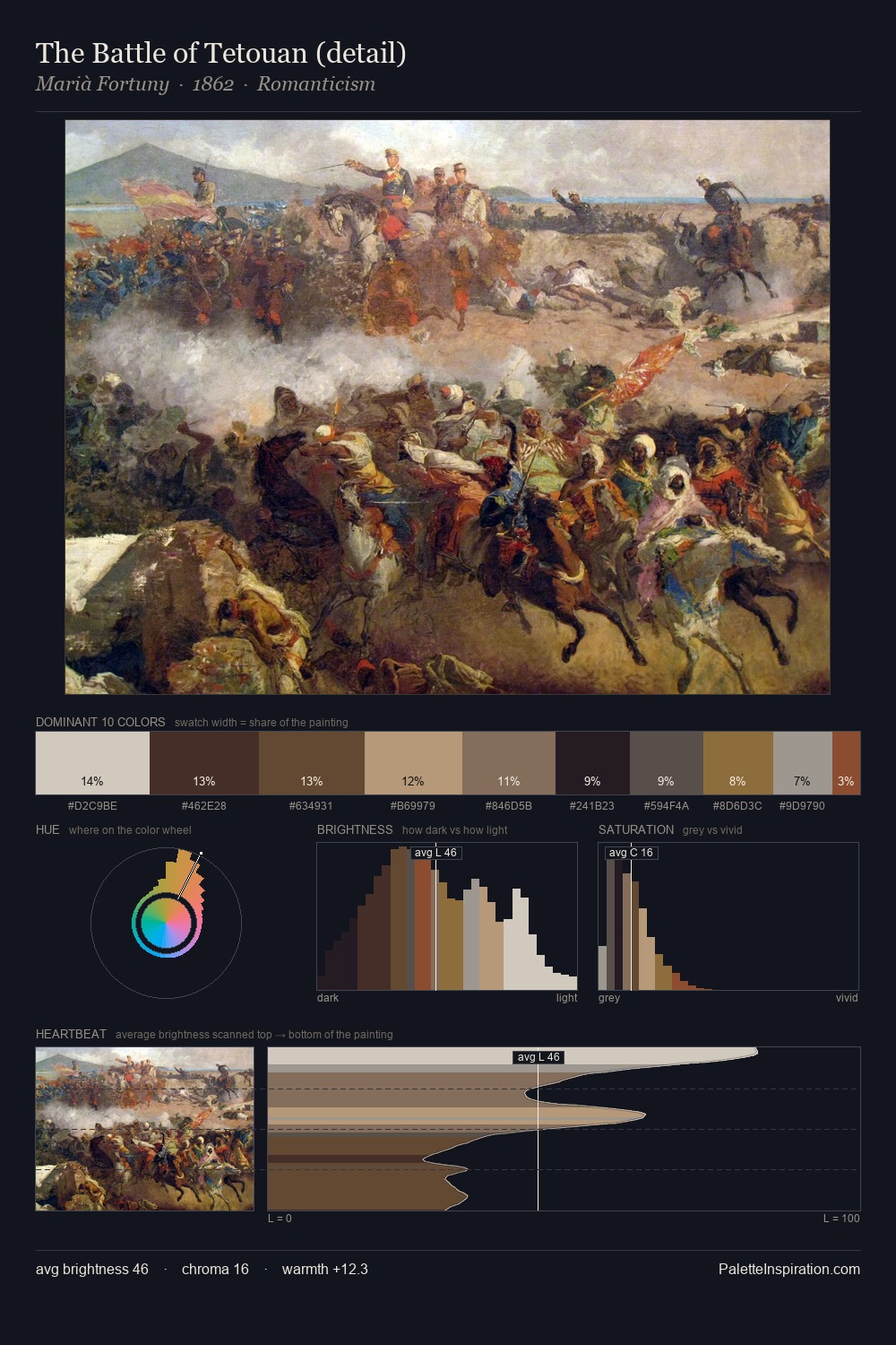
Attilio Pratella distributes its values across the middle register, creating harmony without high contrast. Warmth dominates - the palette of Attilio Pratella leans heavily on the yellow-orange-red arc of the colour wheel. Muted throughout, the palette achieves its effects through value and temperature rather than chromatic force. The saturated accent, #CDB395, registers at 3.8% - sparse enough to feel like a deliberate surprise. 45 units of value spread create a palette that is varied but unified - contrast in the service of harmony. This is palette 1 of Attilio Pratella's sequence - a single chapter in a chromatic story told across many works.
Example use cases
- exhibition design
- foundation branding
- estate management
- art education
- museums & galleries
I Love This!
Use This Palette
Copy, export, or download for your project
Copy, export, or download for your project
Copy:
Download:
Share: