Armando Spadini Palette 2
Penumbral Ash
Penumbral Partial shadow - the transitional zone between light and full dark, soft-edged.
Ash Mid cool-gray - the neutral residue of fire, between white and charcoal.

Palette Analysis
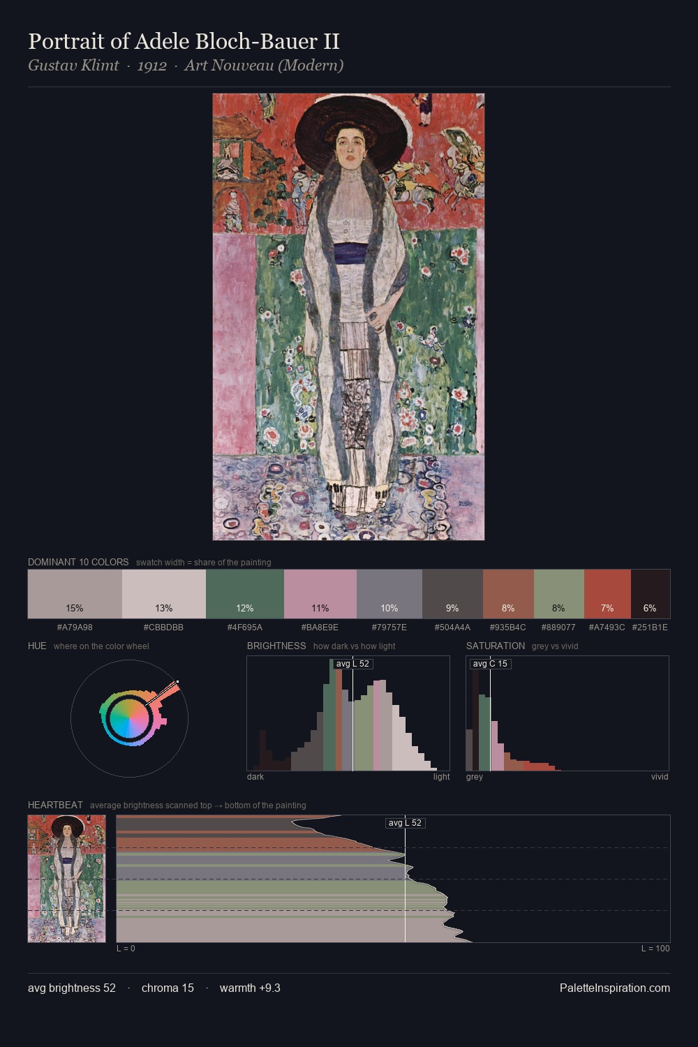
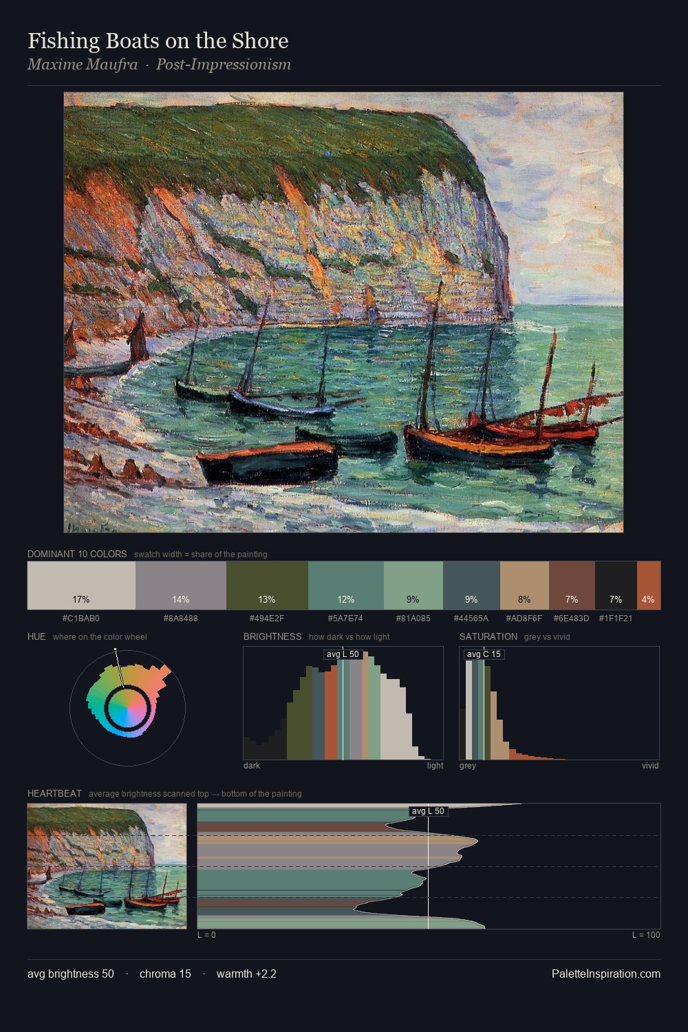
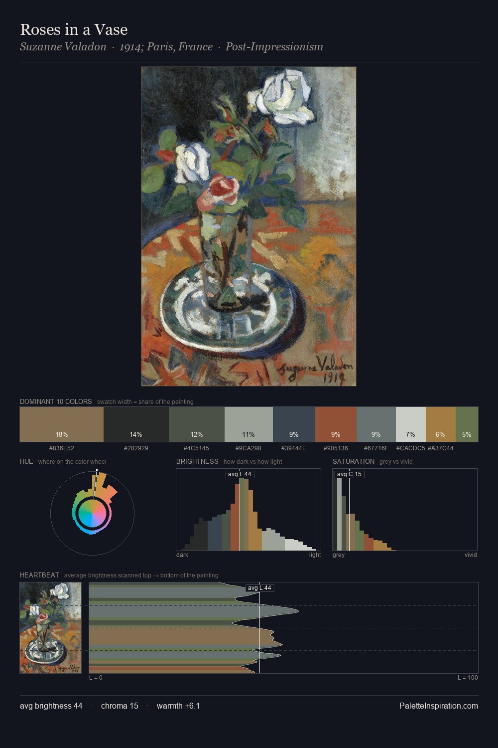
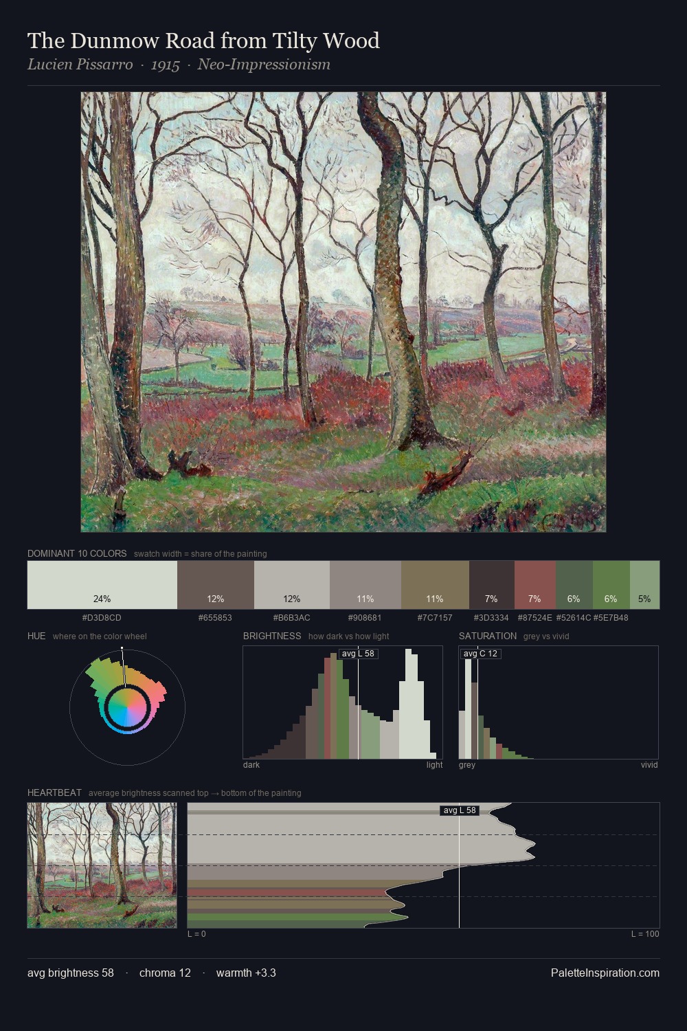
Armando Spadini occupies the comfortable middle of the value scale, avoiding both extremes to hold the eye in a sustained middle grey. Yellow, ochre, sienna: warm hues that Armando Spadini deploys as the palette's primary energy. The absence of saturated colour is itself an expressive choice: this is a palette of restraint and atmosphere. The most saturated colour, #8D503E, is reserved to 3.1% of the surface, where it acts as a focal punctuation. 48 units of value spread create a palette that is varied but unified - contrast in the service of harmony. Palette 2 sits within the larger chromatic argument that Armando Spadini's complete body of work advances.
Example use cases
- museums & galleries
- academic publishing
- heritage brands
- auction houses
- exhibition design
I Love This!
Use This Palette
Copy, export, or download for your project
Copy, export, or download for your project
Copy:
Download:
Share: