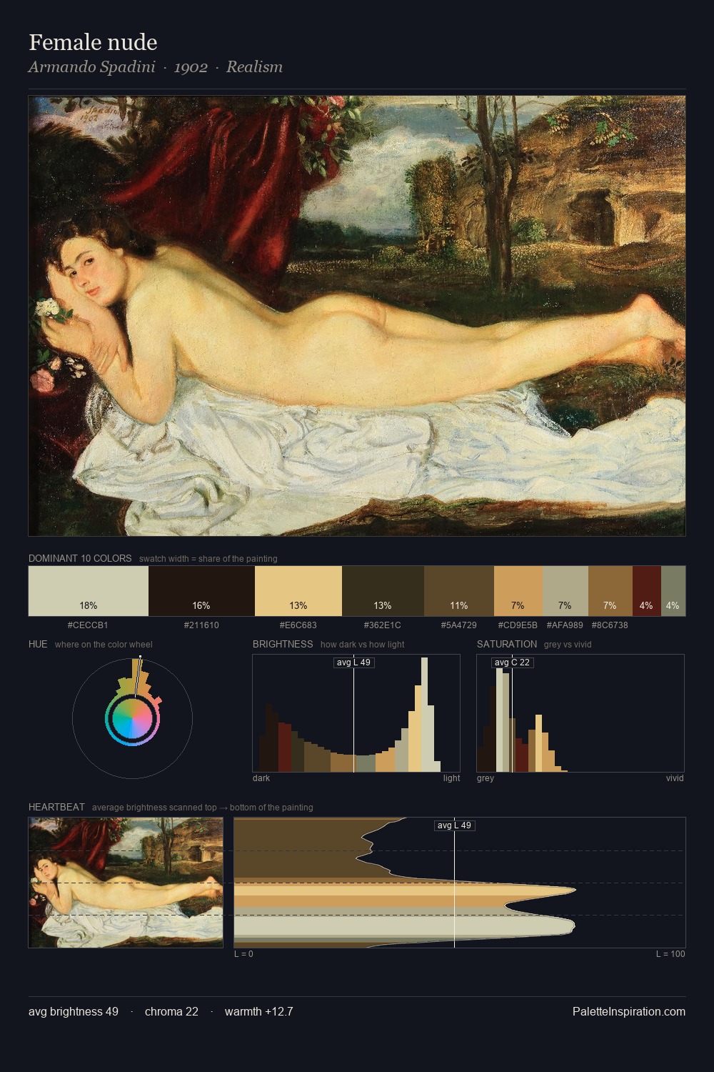
Armando Spadini Palette 1
Veiled Apricot
Veiled Partially obscured light - mid-dark with a hazy, scrim-filtered quality.
Apricot Soft warm orange - peach-adjacent, the color of ripe stone fruit.

Palette Analysis
Values in Armando Spadini rest in the mid-range - neither dramatically lit nor steeped in shadow. Temperature is cool-dominant, with blue and green families claiming the largest areas. All colours lean toward grey, building depth through value rather than colour punch. Only 11.1% is devoted to #27150F, yet that small allocation delivers the palette's entire chromatic tension. 62 units of value range underpin the palette's structural clarity: the eye always knows where light falls. The palette has the character of outdoor light: cool, mid-bright, with colour rendered faithfully rather than expressively. In the context of Armando Spadini's full range of palettes, group 1 represents one movement in an ongoing chromatic dialogue.
Example use cases
- craft & artisan brands
- specialty coffee
- home goods
- lifestyle retail
- ceramics & pottery
I Love This!
Use This Palette
Copy, export, or download for your project
Copy, export, or download for your project
Copy:
Download:
Share: