Andrea Mantegna Palette 8

Palette Analysis
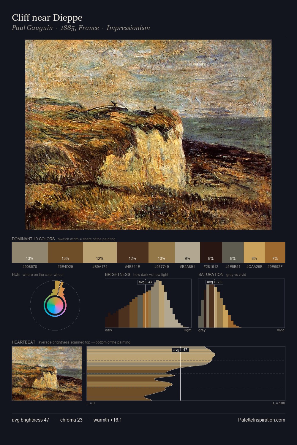
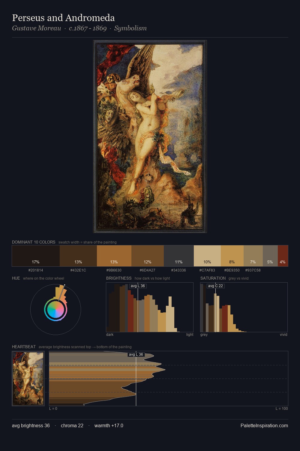
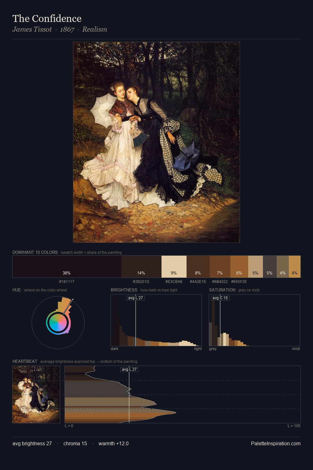
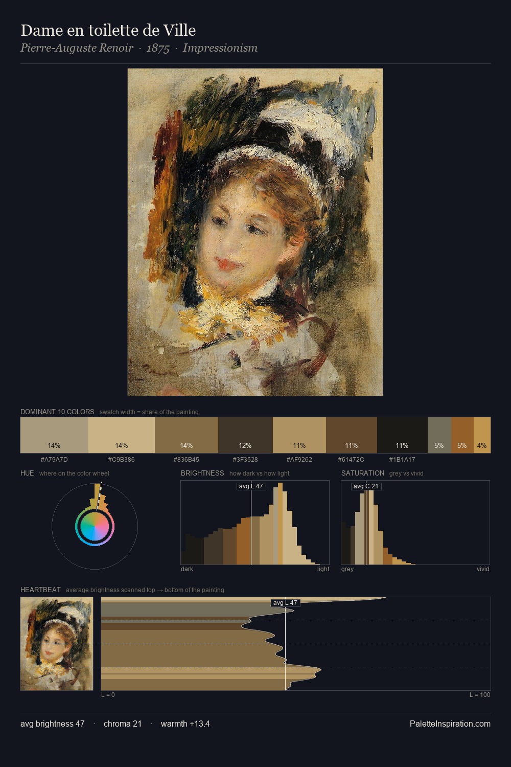
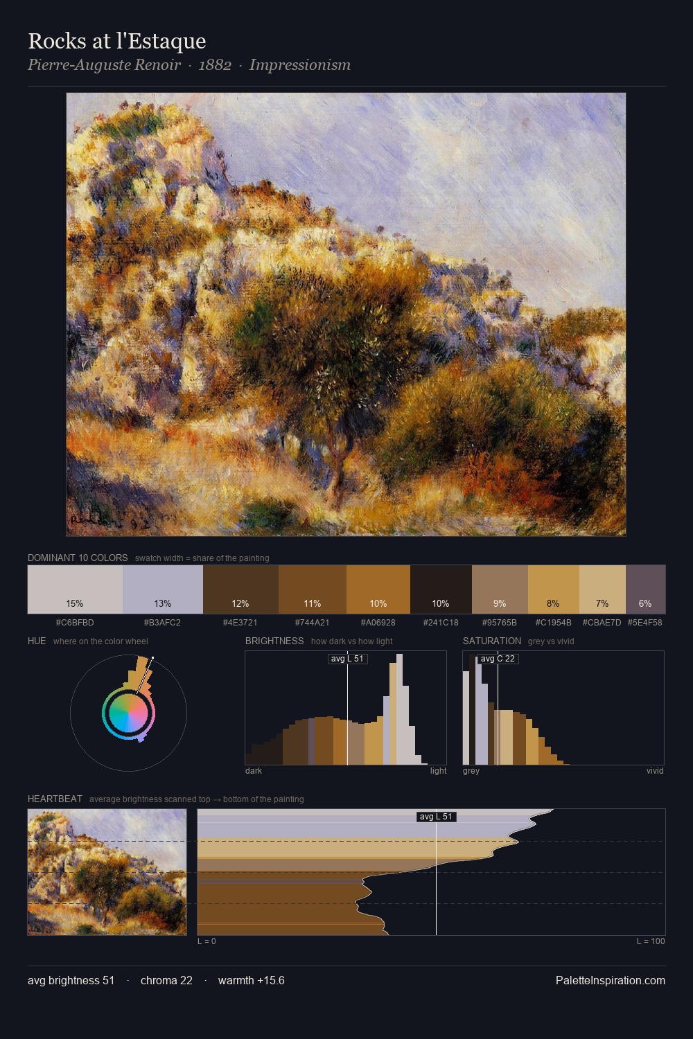
Values in Andrea Mantegna rest in the mid-range - neither dramatically lit nor steeped in shadow. Neither warm nor cool has the upper hand here; the equilibrium between the two generates the palette's visual energy. Chroma is held at a comfortable level - distinct colours, but no single hue is allowed to overwhelm. #CFBD99 at 4.2% is both the most chromatic and one of the largest colours in the palette - chroma as mass rather than as highlight. A value spread of 57 units gives the palette both depth and air - shadows are genuinely dark, lights genuinely light. The palette reads as an Impressionist one - light-biased, chromatically direct, and built on temperature contrast rather than value opposition. This is palette 8 of Andrea Mantegna's sequence - a single chapter in a chromatic story told across many works.
Example use cases
- art galleries
- creative studios
- consumer goods
- lifestyle media
- professional services
I Love This!
Copy, export, or download for your project