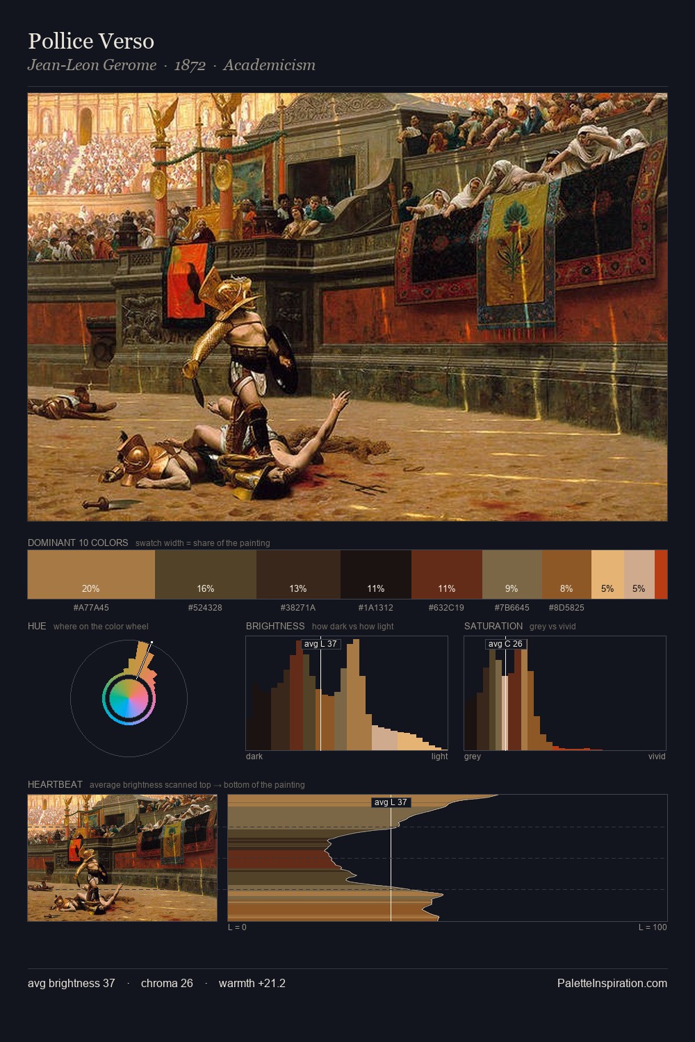
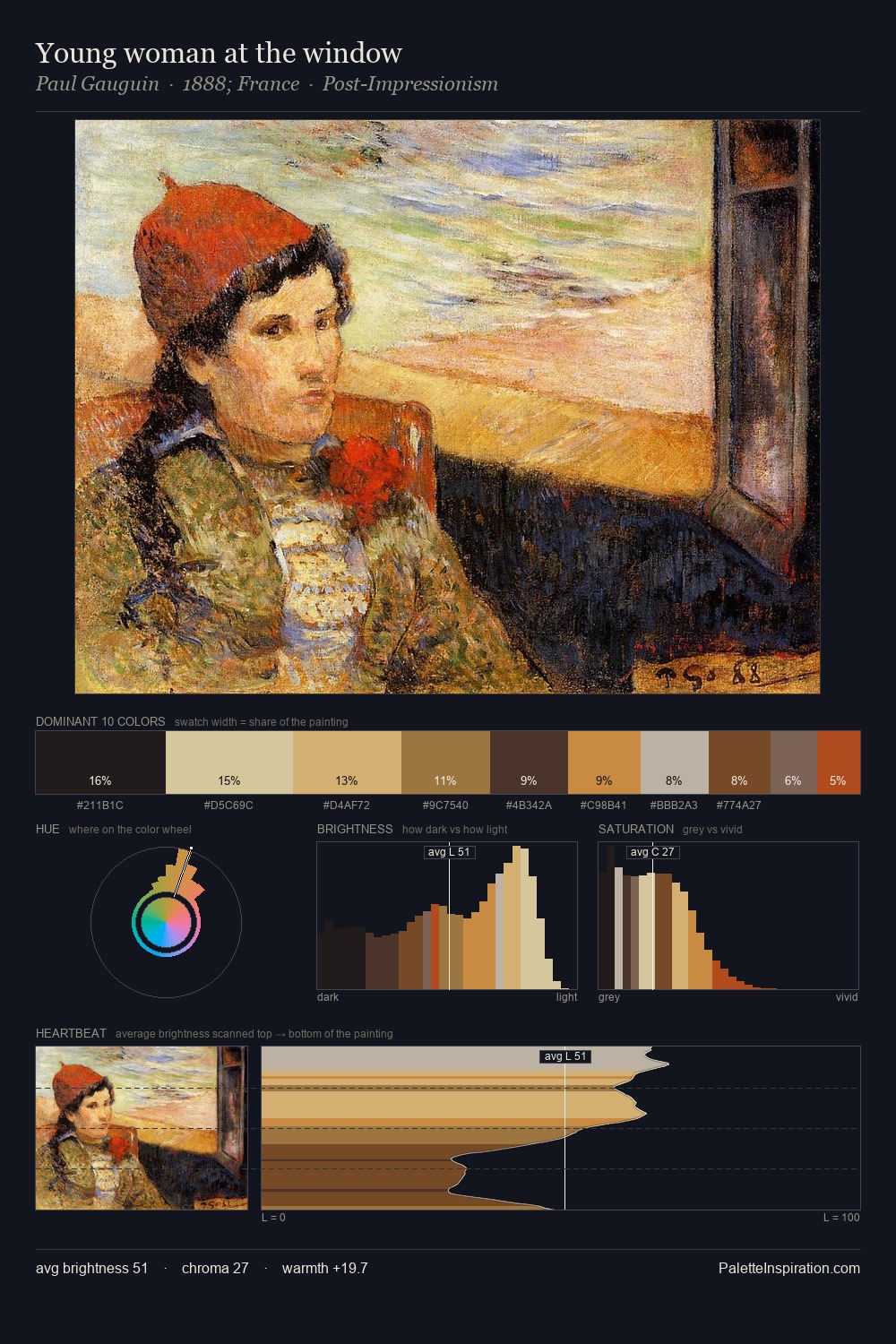
Andrea Mantegna Palette 10
Shadowed Terracotta
Shadowed Low-key - values weighted toward shadow, the palette of dim interiors and overcast skies.
Terracotta Fired clay red-orange - the color of unglazed earthenware pottery.

Palette Analysis
Andrea Mantegna sits in the centre of the value range, lending the palette a sense of even, sustained light. Heat pervades this palette; warm chromatic identities outweigh cool ones at almost every weight. Saturation is deliberately withheld - the beauty here lies in the near-monochromatic gradations rather than colour difference. #834A28 functions as the palette's exclamation mark: highest chroma, lowest percentage (9.8%). From deepest dark to palest light, the palette traverses 66 units of the value scale - a span that creates natural depth. Palette 10 sits within the larger chromatic argument that Andrea Mantegna's complete body of work advances.
Example use cases
- theater design
- jewelry brands
- tobacco-adjacent retail
- event branding
- film & entertainment
I Love This!
Use This Palette
Copy, export, or download for your project
Copy, export, or download for your project
Copy:
Download:
Share: