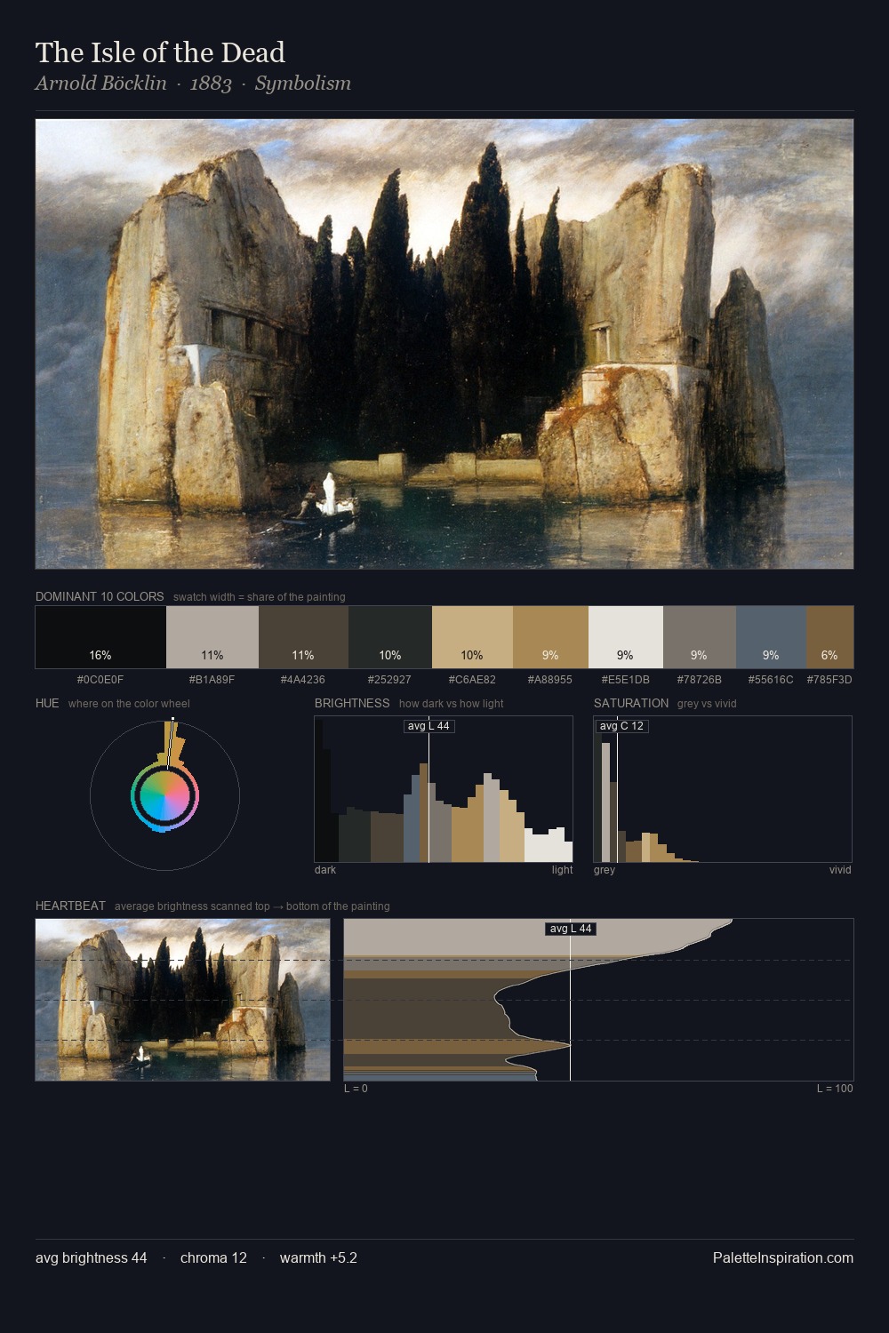
Alfred Downing Fripp Palette 1

Palette Analysis
Light floods Alfred Downing Fripp; the palette keeps values pale and airy across its range. Temperature reads distinctly warm: the reds and earth tones from Alfred Downing Fripp carry the compositional weight. The absence of saturated colour is itself an expressive choice: this is a palette of restraint and atmosphere. #F4EADD at 28.0% of the palette: an overwhelming presence that pulls all other colours into its gravitational field. At 3.9%, #AB8946 carries the palette's sharpest chromatic charge: an accent that earns its place precisely because it is withheld. From deepest dark to palest light, the palette traverses 62 units of the value scale - a span that creates natural depth. Alfred Downing Fripp's palette 1 carries its own internal logic while remaining in conversation with the artist's broader colour intelligence.
Example use cases
- food packaging
- leather accessories
- travel & outdoor
- natural cosmetics
- interior design
I Love This!
Copy, export, or download for your project