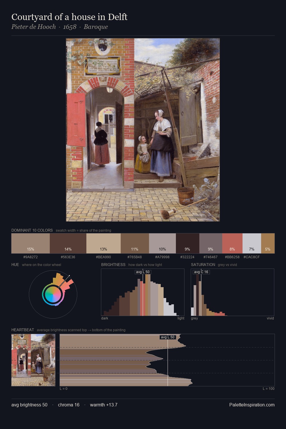
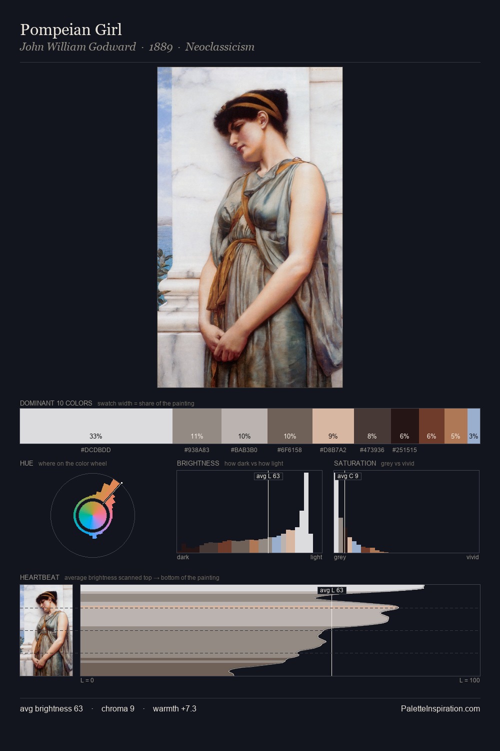
Alexandre Benois Palette 5

Palette Analysis
Values in Alexandre Benois tilt decisively toward white, giving the palette its luminous character. The palette achieves thermal balance - reds and blues, ochres and greens, each holding the other in check. All colours lean toward grey, building depth through value rather than colour punch. The dominant colour, #C4C0C6, takes 31.2% of the total area, establishing the overall mood before any other hue is introduced. The saturated accent, #DBB6A7, registers at 4.7% - sparse enough to feel like a deliberate surprise. 66 units of value range underpin the palette's structural clarity: the eye always knows where light falls. Alexandre Benois's palette 5 carries its own internal logic while remaining in conversation with the artist's broader colour intelligence.
Example use cases
- exhibition design
- foundation branding
- estate management
- art education
- museums & galleries
I Love This!
Copy, export, or download for your project