Adriaen van de Velde Palette 3

Palette Analysis
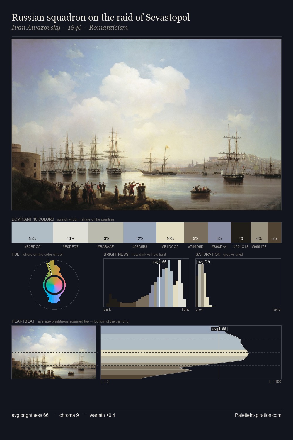
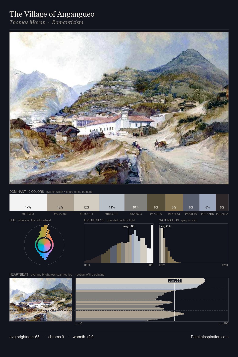
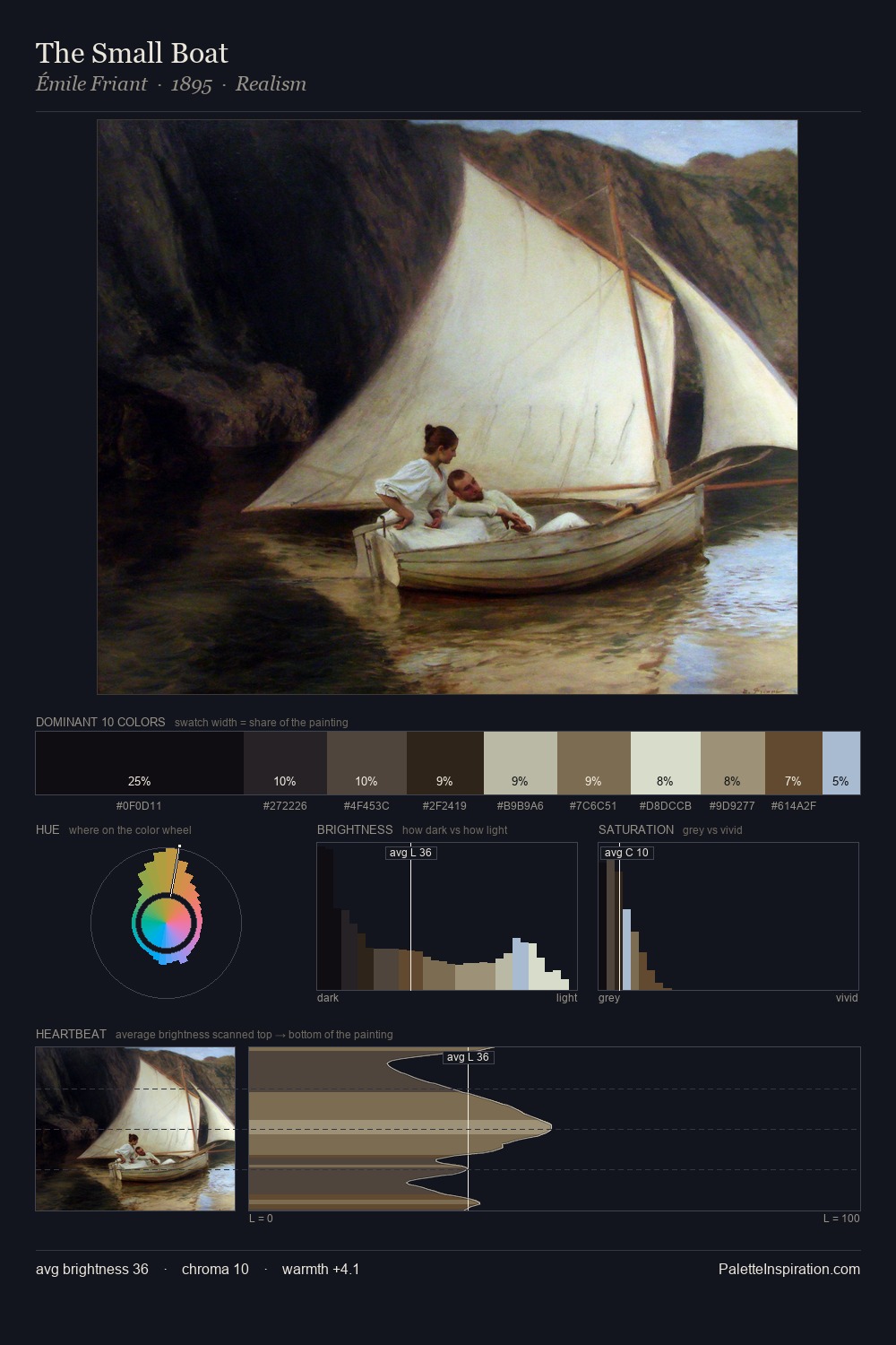
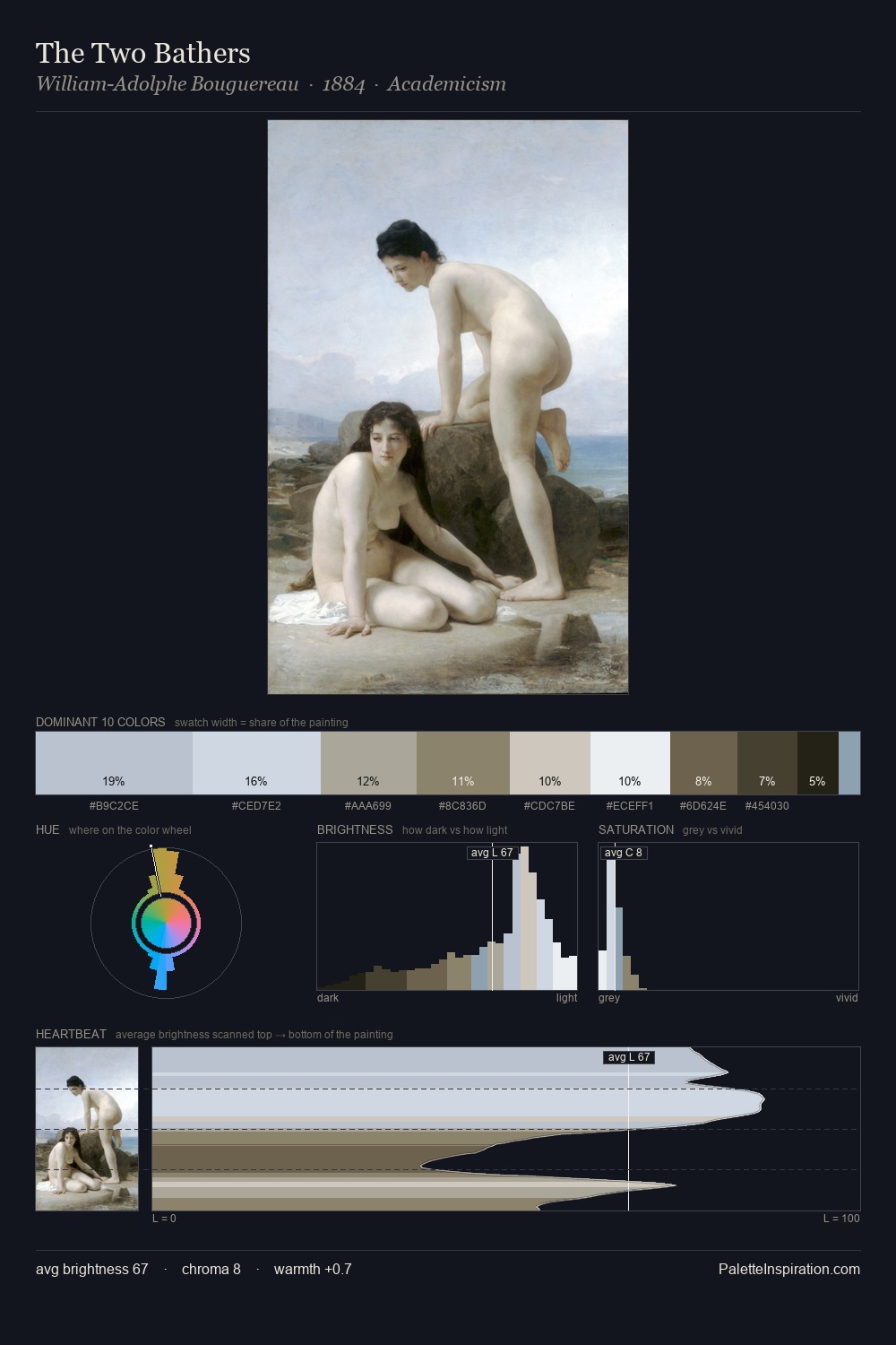
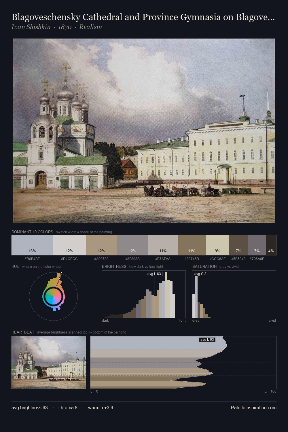
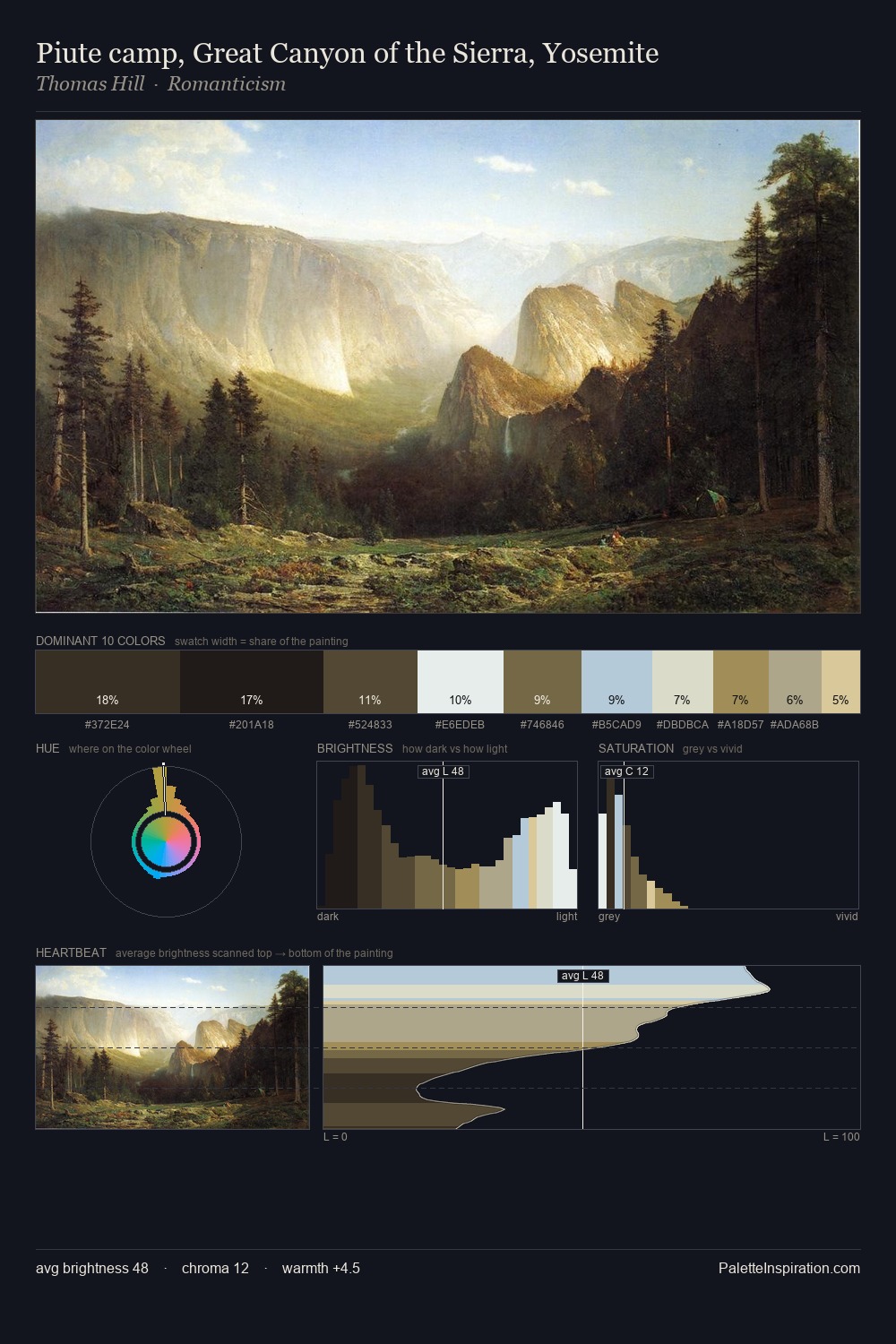
Adriaen van de Velde keeps values measured and balanced, a hallmark of tonal restraint. Adriaen van de Velde builds on cool foundations: the palette favours the blue-cyan-green arc. Every colour is desaturated; the palette proceeds through near-neutrals and gently-coloured greys. #2C1D1A delivers the chromatic peak at only 6.1% - a small shot of colour with outsized visual impact. At 70 units of value range, the palette has the tonal breadth to sustain complex spatial readings. The mid-to-high key, cool bias, and moderate chroma point to outdoor observation - sky and diffused daylight as the dominant light source. Adriaen van de Velde's palette 3 carries its own internal logic while remaining in conversation with the artist's broader colour intelligence.
Example use cases
- museums & galleries
- academic publishing
- heritage brands
- auction houses
- exhibition design
I Love This!
Copy, export, or download for your project