Adolf Wölfli Master Palette
Muted Apricot
Muted Deliberately desaturated - chroma pulled toward gray, the restraint of tonal painting.
Apricot Soft warm orange - peach-adjacent, the color of ripe stone fruit.
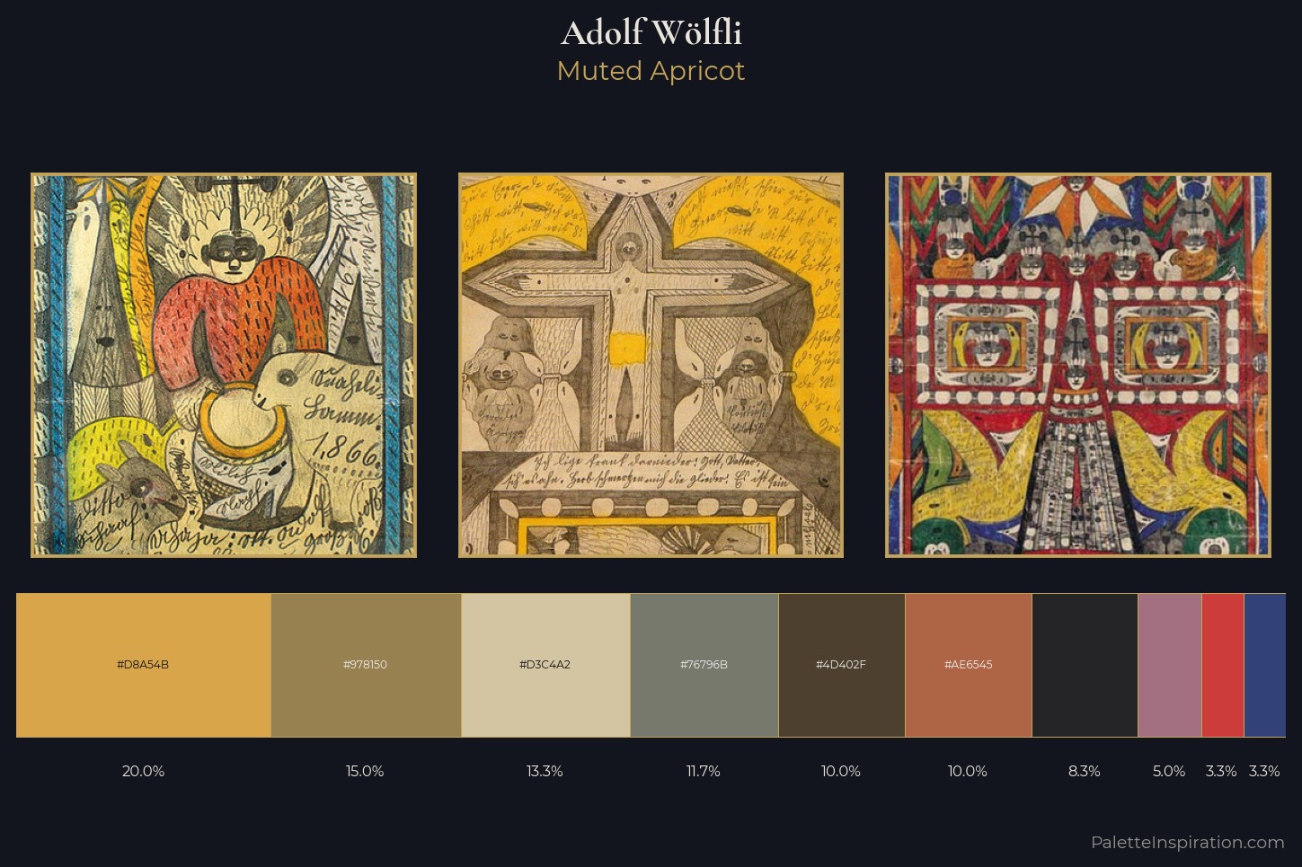
Palette Analysis
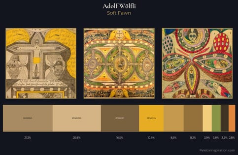
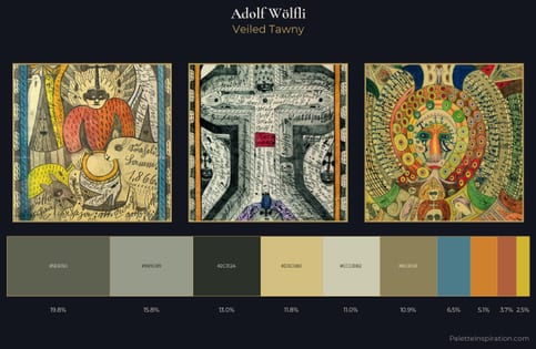
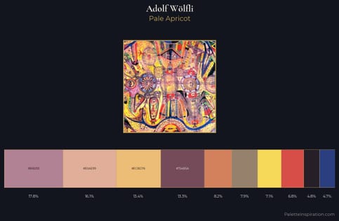
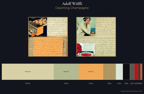
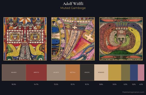
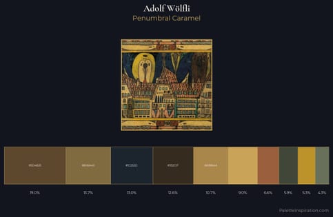
Adolf Wölfli sits in the centre of the value range, lending the palette a sense of even, sustained light. Adolf Wölfli tilts toward cool - blues and silver-greys carry the structural weight. Mid-saturation across the board: the palette has colour character without chromatic excess. The saturated accent, #CC3C3A, registers at 3.3% - sparse enough to feel like a deliberate surprise. At 55 units of value range, the palette has the tonal breadth to sustain complex spatial readings. The mid-to-high key, cool bias, and moderate chroma point to outdoor observation - sky and diffused daylight as the dominant light source. Adolf Wölfli arrived at this balance through long practice; the palette carries the weight of that experience.
Example use cases
- ceramics & pottery
- boutique hospitality
- menswear
- heritage food brands
- craft & artisan brands
I Love This!
Use This Palette
Copy, export, or download for your project
Copy, export, or download for your project
Copy:
Download:
Share: