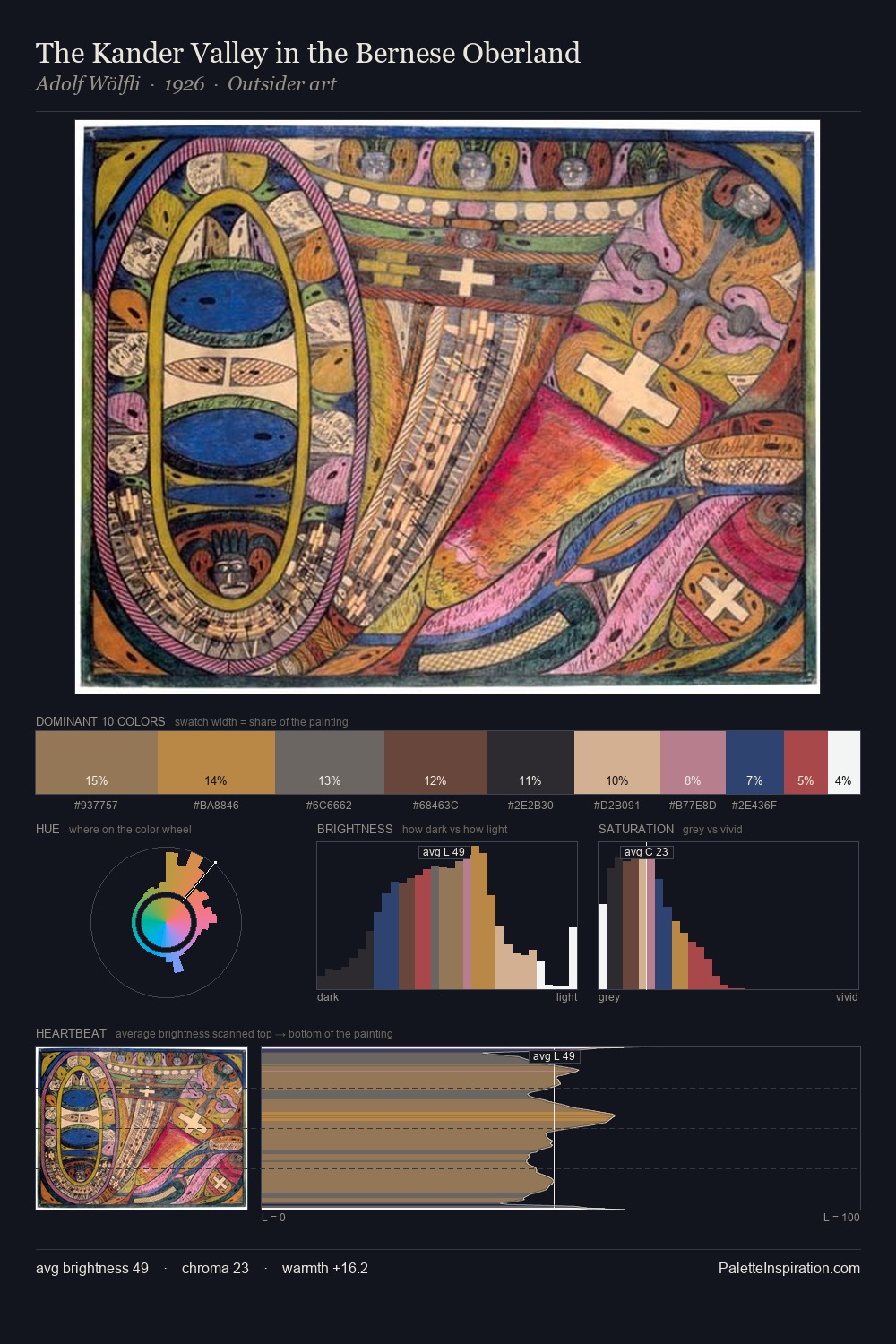
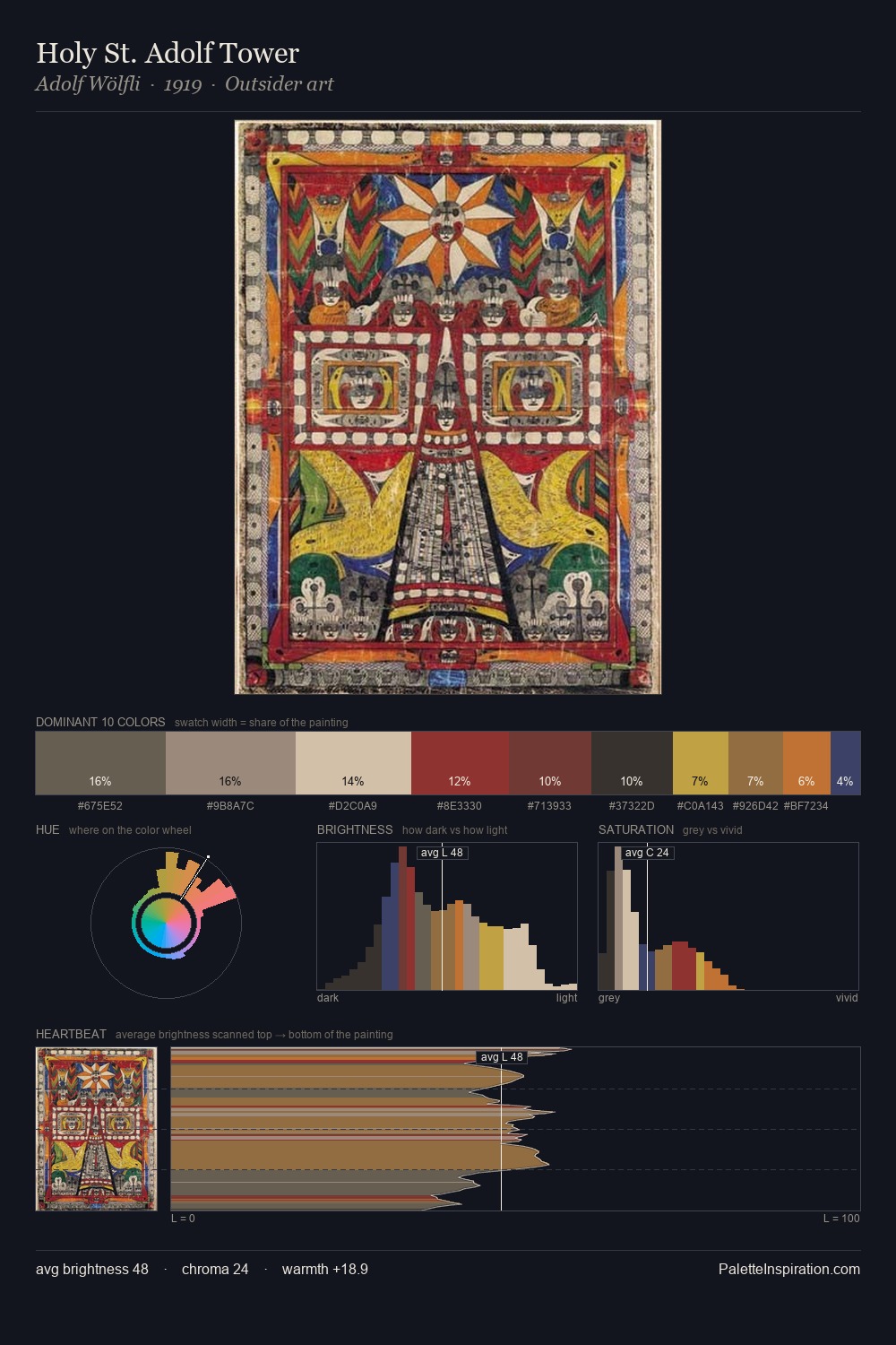
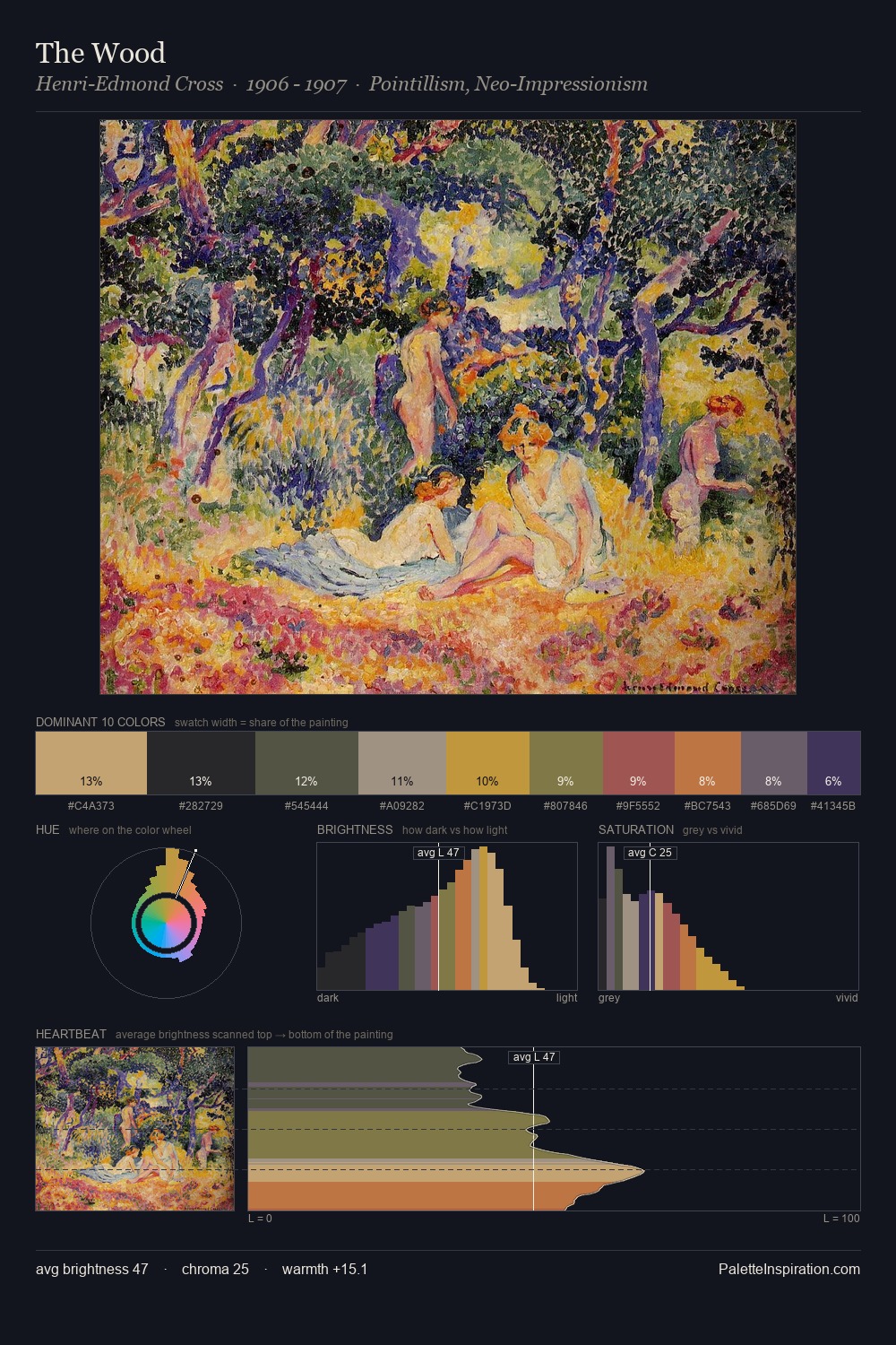
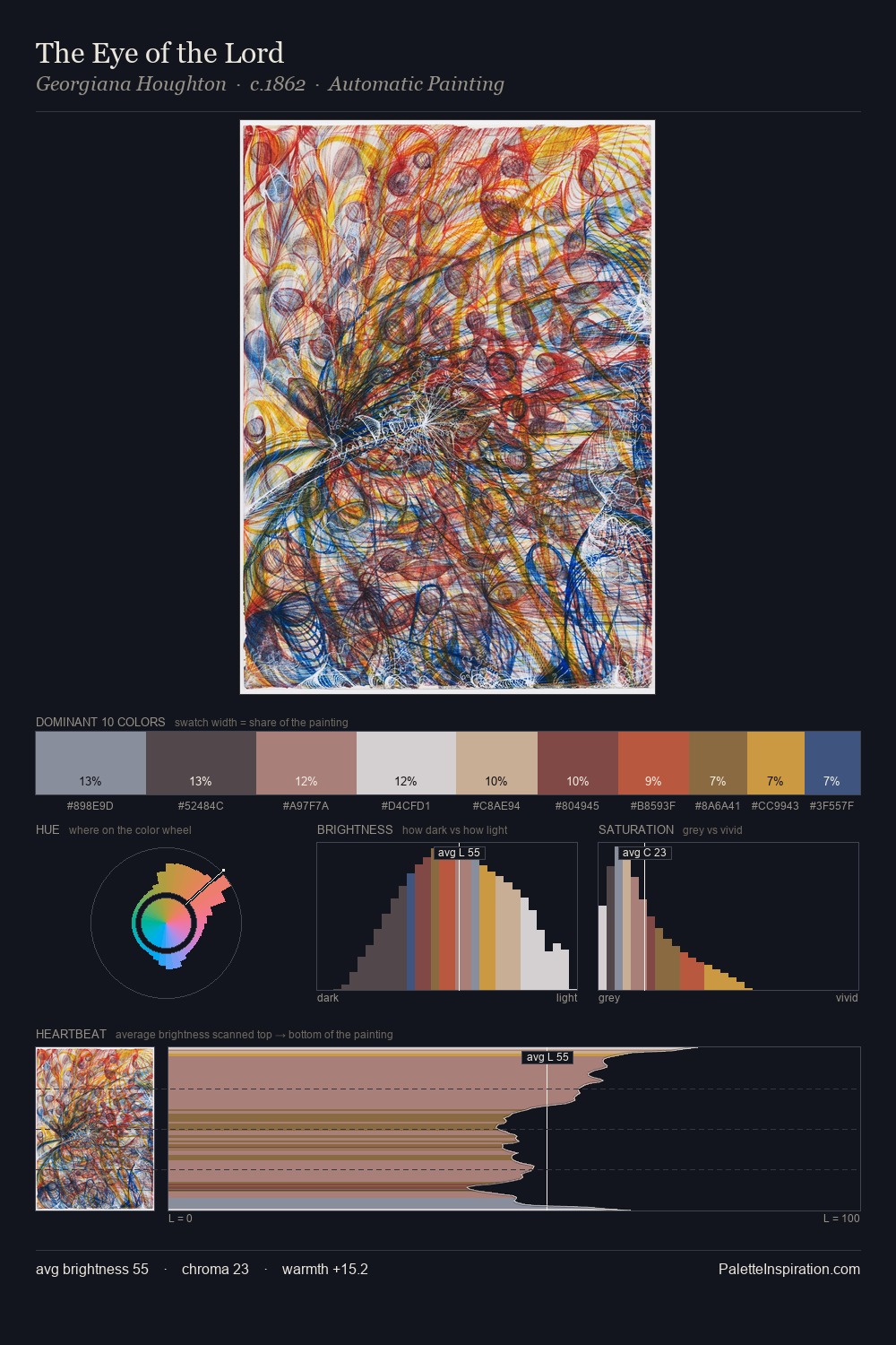
Adolf Wölfli Palette 5
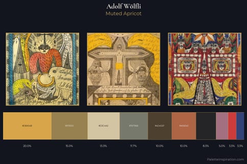
Muted Gamboge
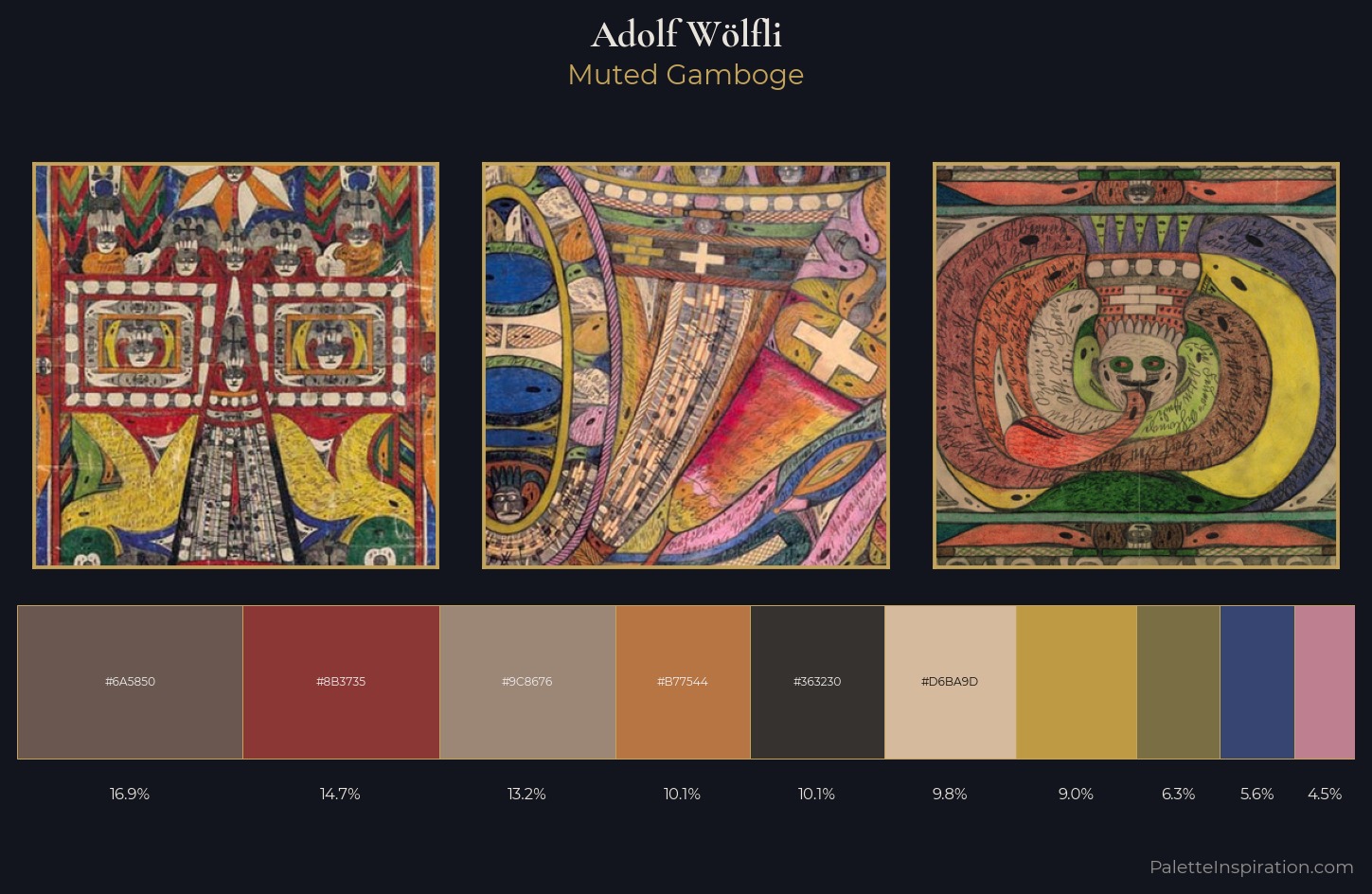
Muted Deliberately desaturated - chroma pulled toward gray, the restraint of tonal painting.
Gamboge Deep golden yellow - a traditional warm pigment, rich amber-gold.
Palette Analysis
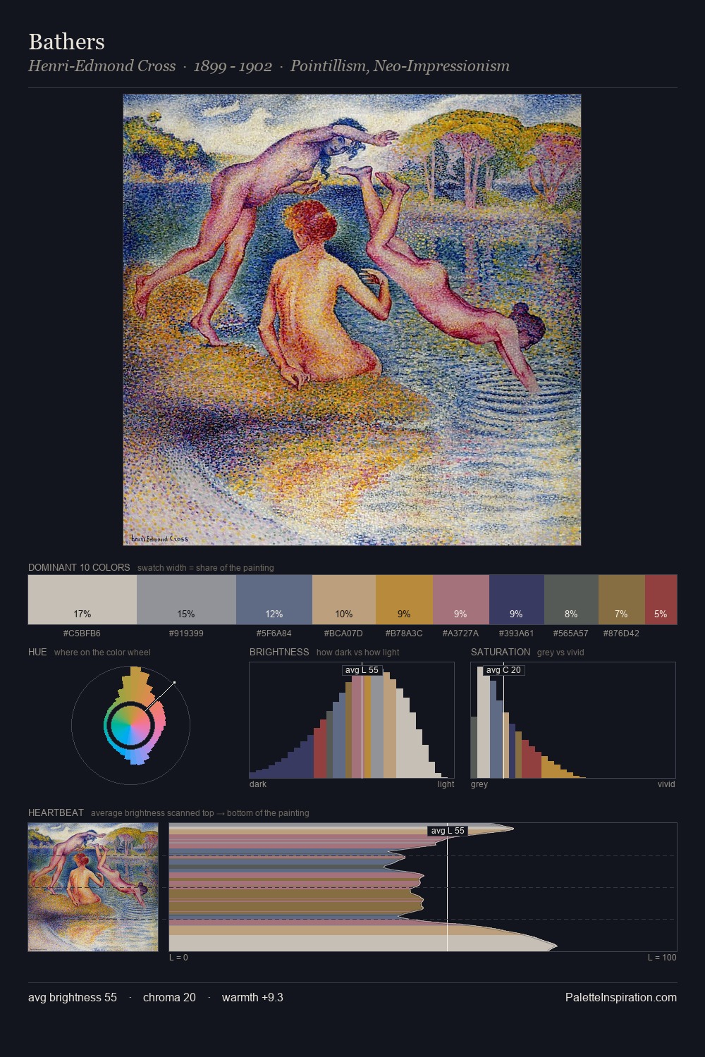
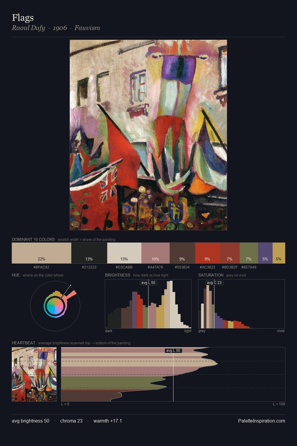
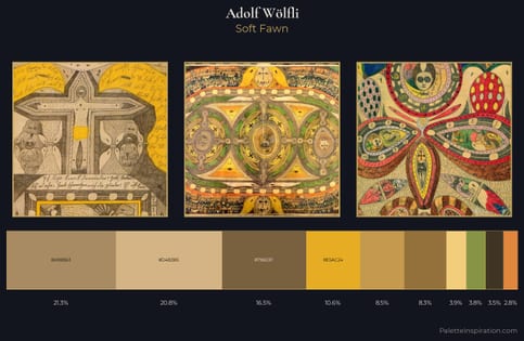
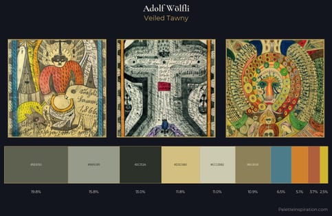
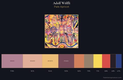
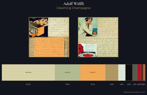
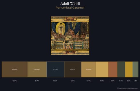
Adolf Wölfli distributes its values across the middle register, creating harmony without high contrast. Temperature reads distinctly warm: the reds and earth tones from Adolf Wölfli carry the compositional weight. A restrained, mid-chroma palette: every hue is present and legible, but nothing shouts. The most saturated colour, #D6BA9D, is reserved to 9.8% of the surface, where it acts as a focal punctuation. 49 units of value spread create a palette that is varied but unified - contrast in the service of harmony. Palette 5 sits within the larger chromatic argument that Adolf Wölfli's complete body of work advances.
Example use cases
- ceramics & pottery
- boutique hospitality
- menswear
- heritage food brands
- craft & artisan brands
I Love This!
Use This Palette
Copy, export, or download for your project
Copy, export, or download for your project
Copy:
Download:
Share: