Abraham Storck Master Palette

Palette Analysis
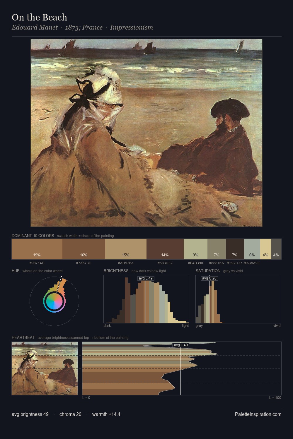
Abraham Storck distributes its values across the middle register, creating harmony without high contrast. Abraham Storck tilts toward cool - blues and silver-greys carry the structural weight. Saturation is deliberately withheld - the beauty here lies in the near-monochromatic gradations rather than colour difference. Only 2.8% is devoted to #D9C78E, yet that small allocation delivers the palette's entire chromatic tension. At 56 units of value range, the palette has the tonal breadth to sustain complex spatial readings. The palette has the character of outdoor light: cool, mid-bright, with colour rendered faithfully rather than expressively. The palette is a signature: Abraham Storck's particular sense of value, warmth, and colour weight made legible.
Example use cases
- exhibition design
- foundation branding
- estate management
- art education
- museums & galleries
I Love This!
Copy, export, or download for your project
![[Unkown] palette card](/cards/0000163.jpg)