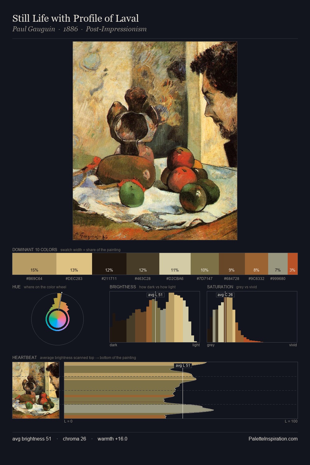
Yov Kondzelevych Palette 4

Palette Analysis
Yov Kondzelevych sits in the centre of the value range, lending the palette a sense of even, sustained light. The palette achieves thermal balance - reds and blues, ochres and greens, each holding the other in check. Saturation is measured and controlled, giving the palette presence without visual aggression. Only 7.7% is devoted to #864D29, yet that small allocation delivers the palette's entire chromatic tension. A value spread of 61 units gives the palette both depth and air - shadows are genuinely dark, lights genuinely light. The palette reads as an Impressionist one - light-biased, chromatically direct, and built on temperature contrast rather than value opposition. Palette 4 sits within the larger chromatic argument that Yov Kondzelevych's complete body of work advances.
Example use cases
- ceramics & pottery
- boutique hospitality
- menswear
- heritage food brands
- craft & artisan brands
I Love This!
Copy, export, or download for your project