Yeghishe Tadevosyan Master Palette

Palette Analysis
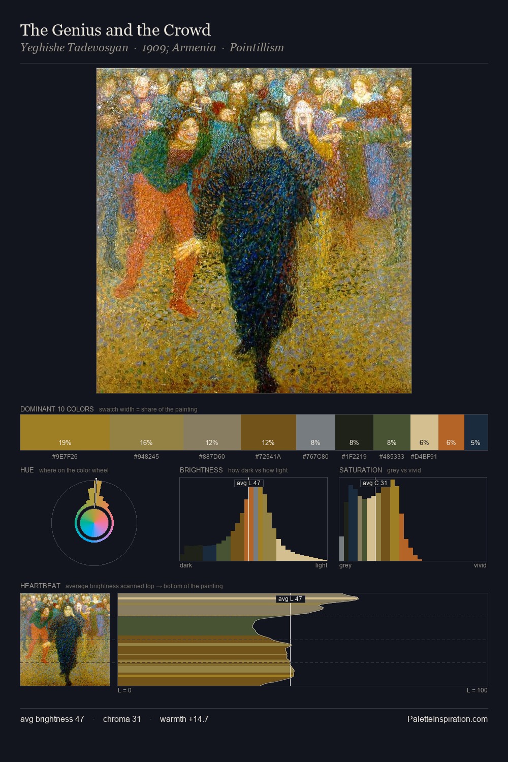
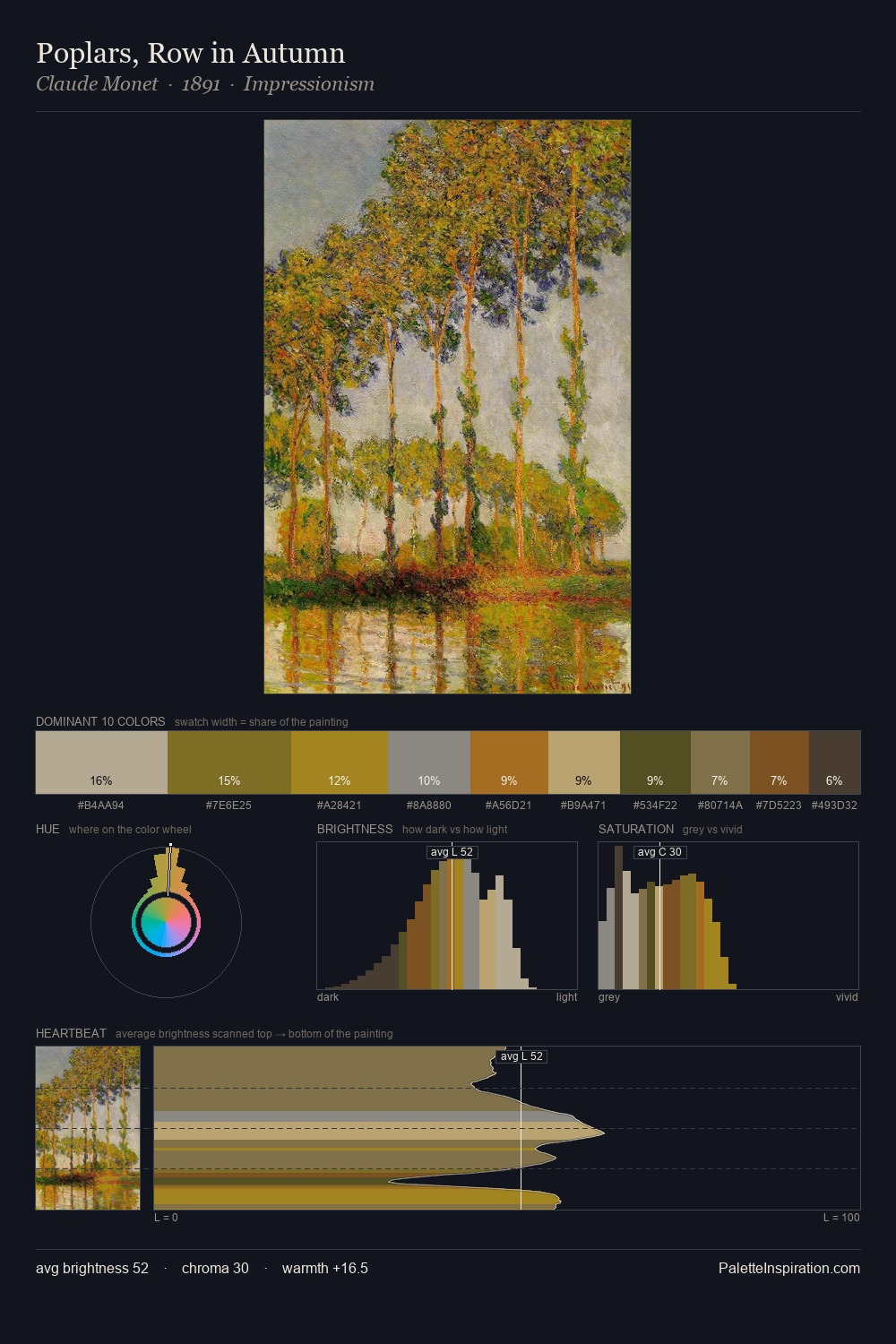
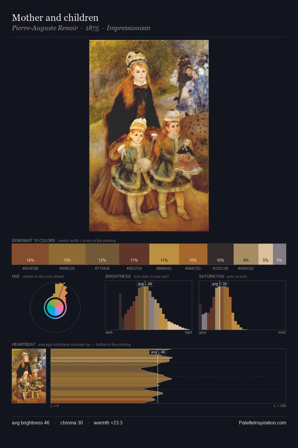
Mid-key values give Yeghishe Tadevosyan its characteristic quietness - nothing blazes, nothing disappears. Blues and teal-greys govern the palette, lending it an aquatic or atmospheric quality. Saturation is deliberately withheld - the beauty here lies in the near-monochromatic gradations rather than colour difference. The most saturated colour, #7D6426, is reserved to 6.7% of the surface, where it acts as a focal punctuation. The palette spans 50 value units: a measured range that delivers coherence over drama. The palette has the character of outdoor light: cool, mid-bright, with colour rendered faithfully rather than expressively. These proportions encode Yeghishe Tadevosyan's instinctive sense of how much of each quality the eye can hold.
Example use cases
- exhibition design
- foundation branding
- estate management
- art education
- museums & galleries
I Love This!
Copy, export, or download for your project