Yeghishe Tadevosyan Palette 1

Palette Analysis
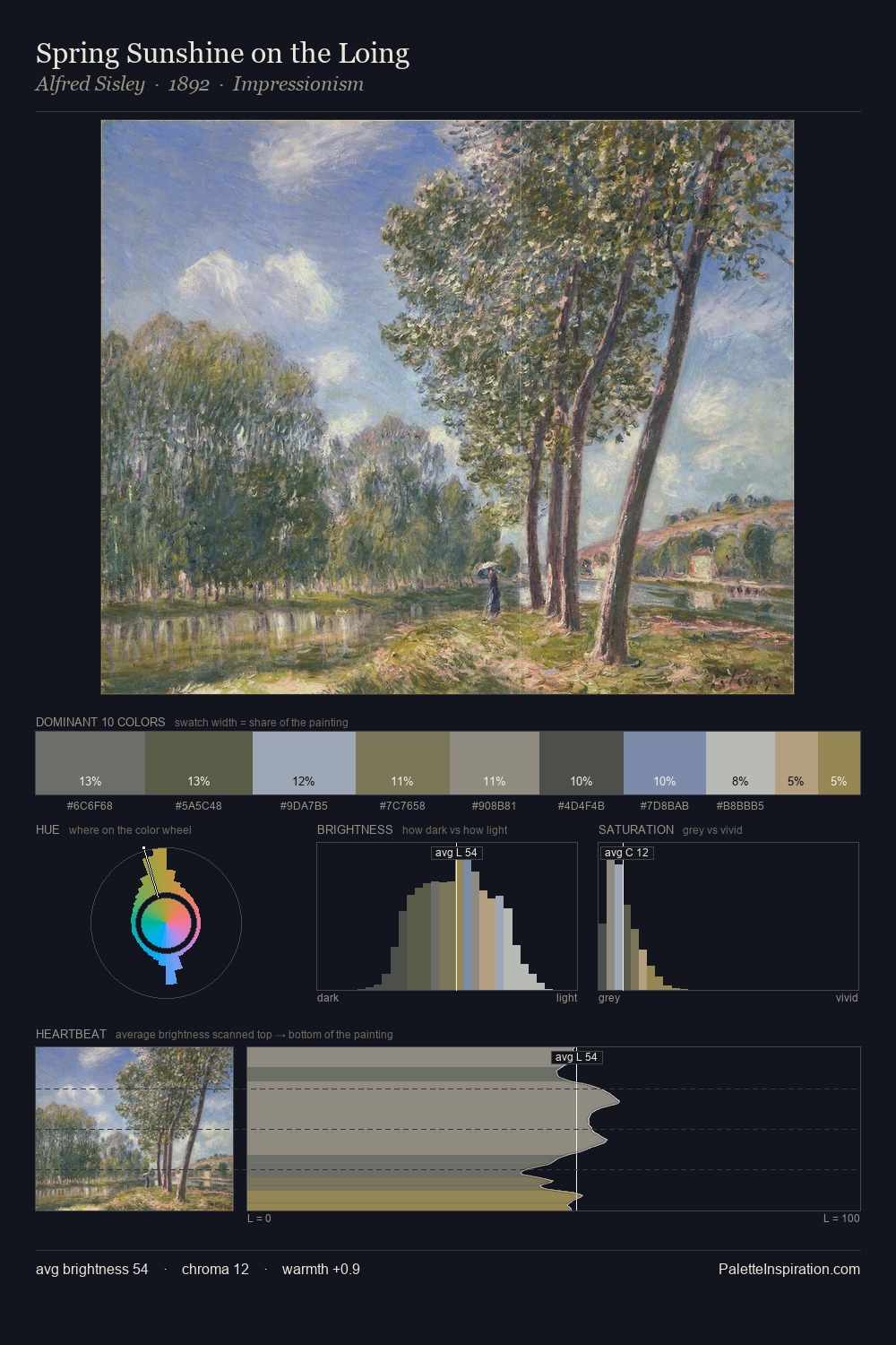
Values in Yeghishe Tadevosyan rest in the mid-range - neither dramatically lit nor steeped in shadow. Yeghishe Tadevosyan builds on cool foundations: the palette favours the blue-cyan-green arc. Chroma is kept low across all colours, producing the soft, enveloping quality that characterises tonal painting. #A29F65 functions as the palette's exclamation mark: highest chroma, lowest percentage (4.8%). At 32 units across the value scale, the palette keeps contrast readable without letting it dominate. The mid-to-high key, cool bias, and moderate chroma point to outdoor observation - sky and diffused daylight as the dominant light source. Palette 1 sits within the larger chromatic argument that Yeghishe Tadevosyan's complete body of work advances.
Example use cases
- archival print
- university identity
- rare books
- cultural institutions
- nonprofit identity
I Love This!
Copy, export, or download for your project