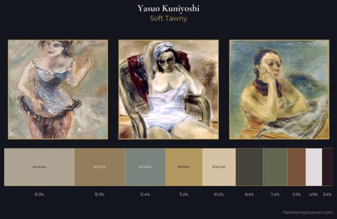
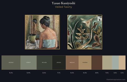
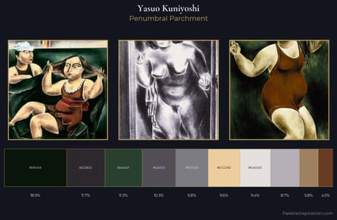
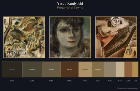
Yasuo Kuniyoshi Master Palette
Muted Tawny
Muted Deliberately desaturated - chroma pulled toward gray, the restraint of tonal painting.
Tawny Warm orange-brown - a traditional term for the color of tanned leather or lion fur.
Palette Analysis
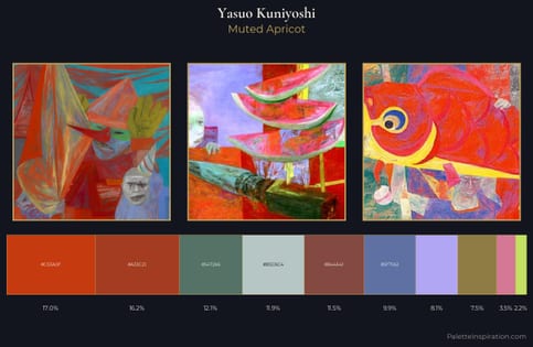
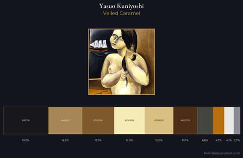
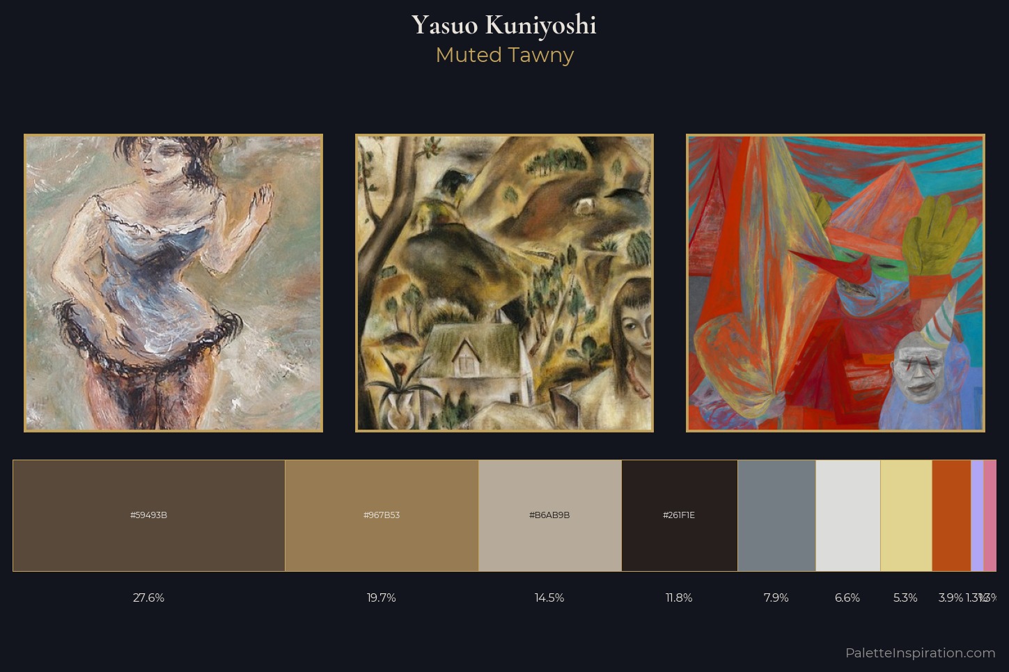
Yasuo Kuniyoshi sits in the centre of the value range, lending the palette a sense of even, sustained light. Warm and cool are kept in productive tension, creating the kind of chromatic harmony that sustains the eye. Muted throughout, the palette achieves its effects through value and temperature rather than chromatic force. A single dominant - #59493B at 27.6% - sets the character of the whole composition. #B0A6F4 functions as the palette's exclamation mark: highest chroma, lowest percentage (1.3%). From deepest dark to palest light, the palette traverses 64 units of the value scale - a span that creates natural depth. This is the light Yasuo Kuniyoshi preferred, made measurable.
Example use cases
- food packaging
- leather accessories
- travel & outdoor
- natural cosmetics
- interior design
I Love This!
Use This Palette
Copy, export, or download for your project
Copy, export, or download for your project
Copy:
Download:
Share: