Yasuo Kuniyoshi Palette 1

Palette Analysis
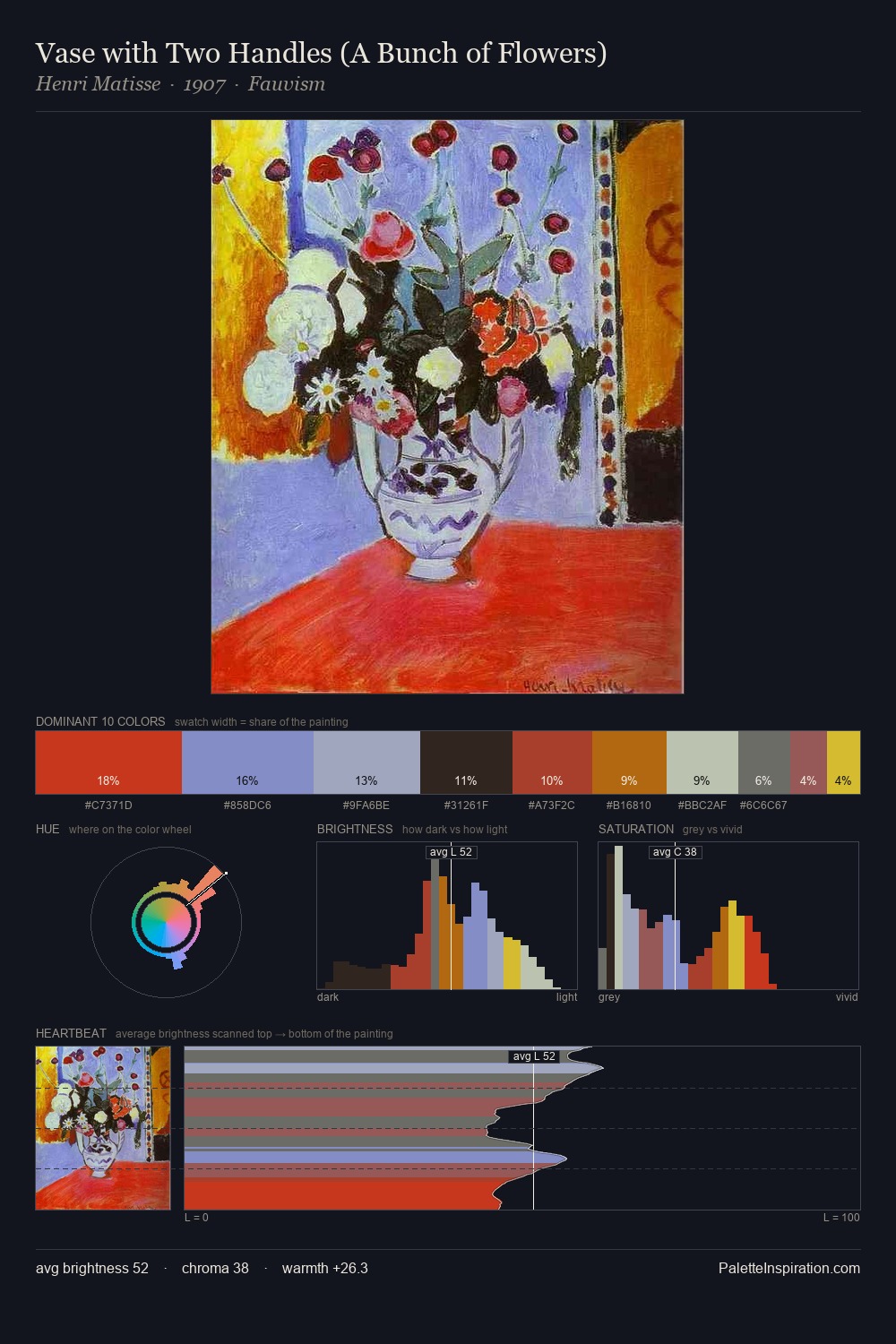
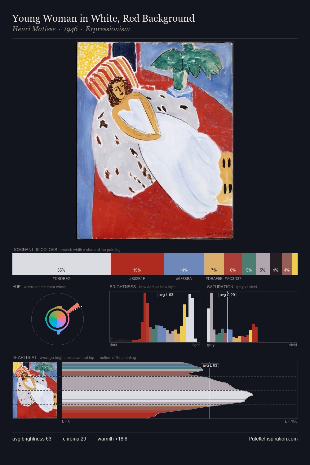
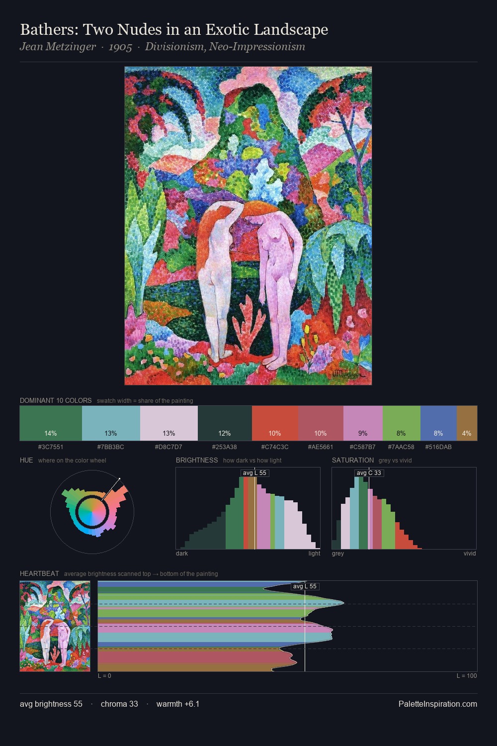
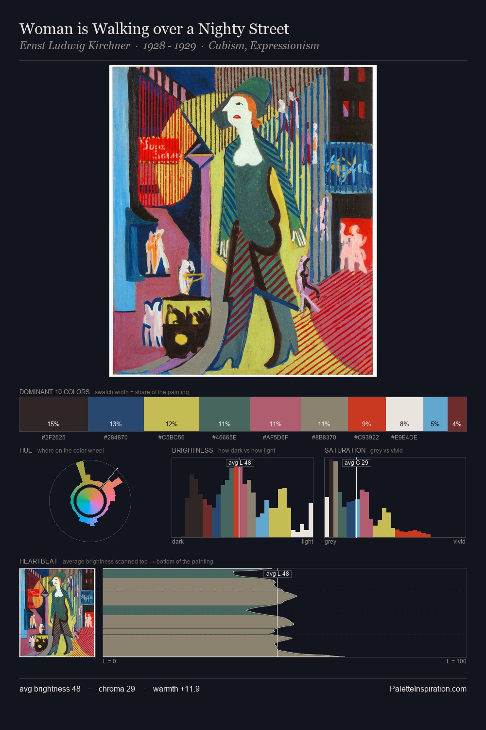
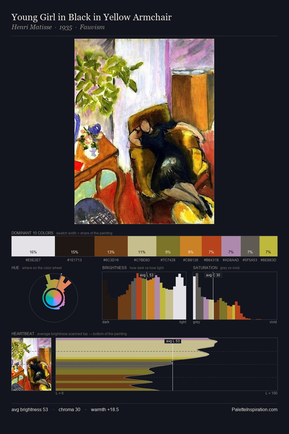
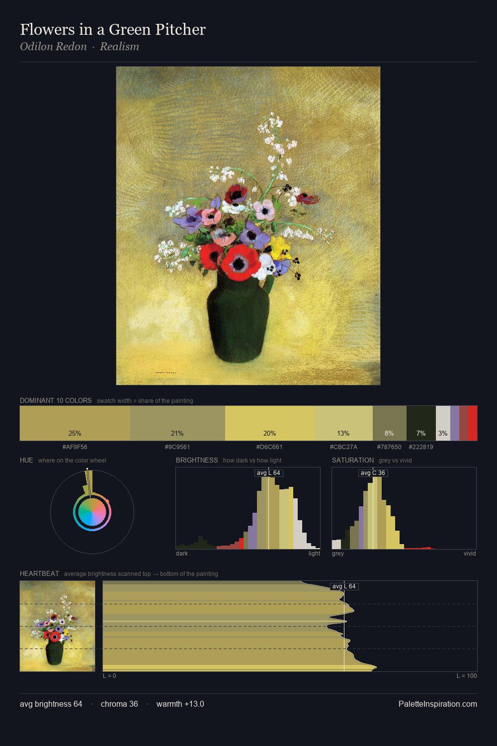
The value structure of Yasuo Kuniyoshi is mid-key: quiet, controlled, and cohesive. Yasuo Kuniyoshi keeps warm and cool in parity, a balance that lends the work a perceptual shimmer. Chroma is moderate: colours carry enough saturation to be read as colour, but the palette stops well short of garish intensity. #C3E062 is not a small accent - at 2.2% it qualifies as a major presence and gives the palette its chromatic identity. Spanning 38 units on the value axis, the palette achieves the balance between tonal flatness and fragmentation. The combination of mid-to-high key, balanced temperature, and elevated chroma is characteristic of Impressionist observation: light broken into its component hues. Yasuo Kuniyoshi's palette 1 carries its own internal logic while remaining in conversation with the artist's broader colour intelligence.
Example use cases
- publishing
- corporate identity
- consumer apps
- hospitality
- design agencies
I Love This!
Copy, export, or download for your project