Winston Churchill Palette 3
Muted Parchment
Muted Deliberately desaturated - chroma pulled toward gray, the restraint of tonal painting.
Parchment Aged warm neutral - the color of old manuscript parchment, tan and slightly yellowed.

Palette Analysis
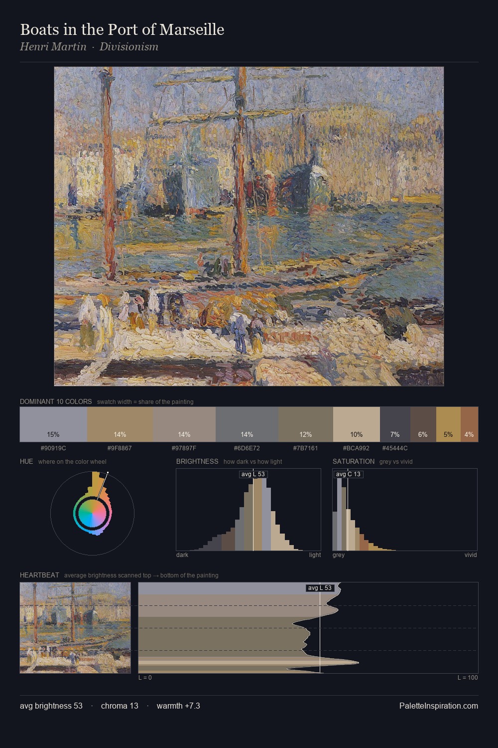
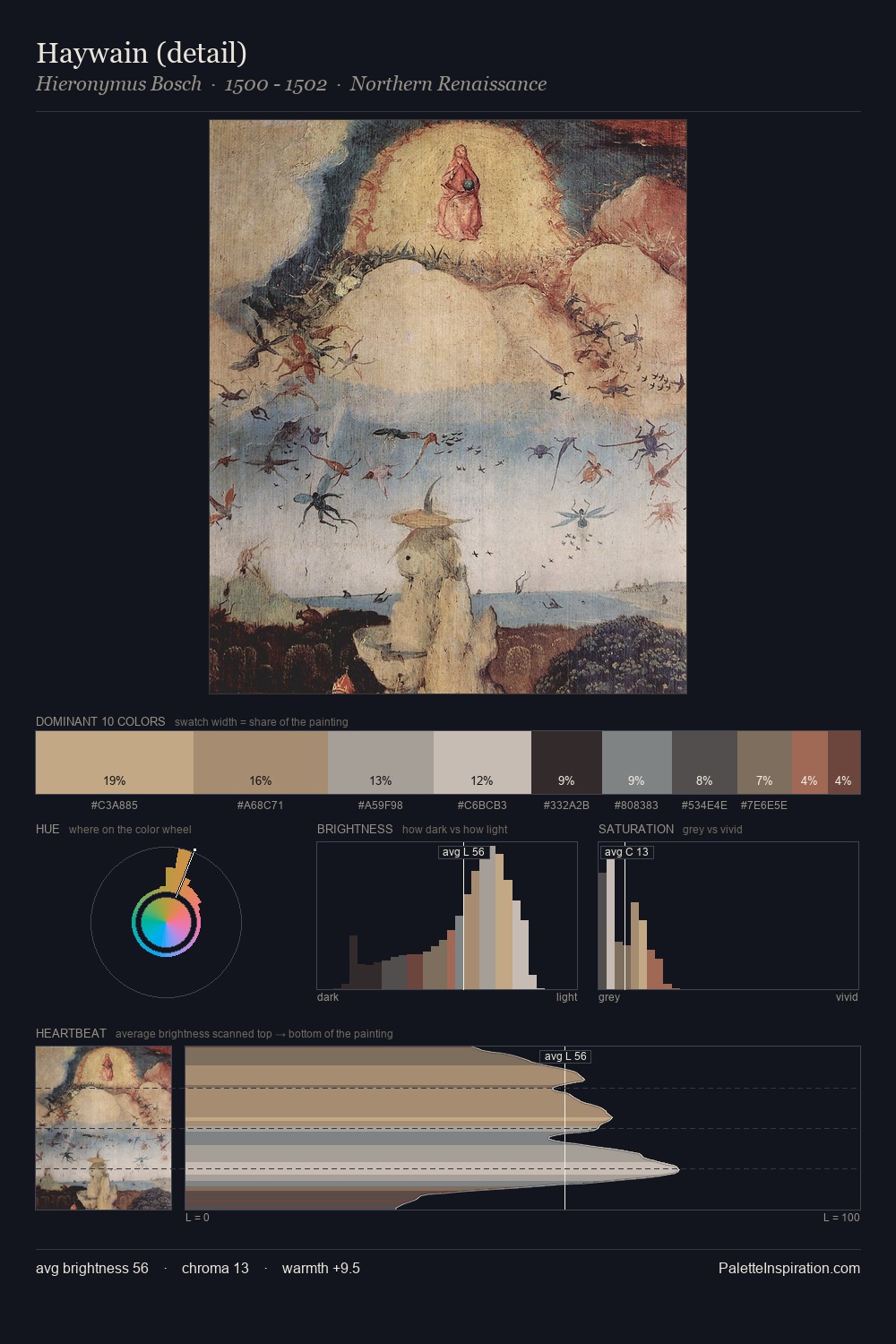
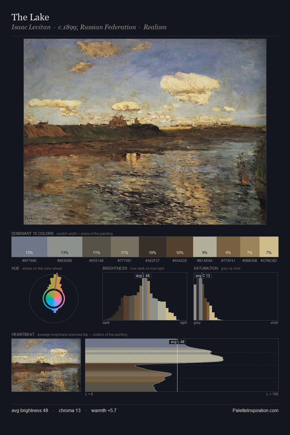
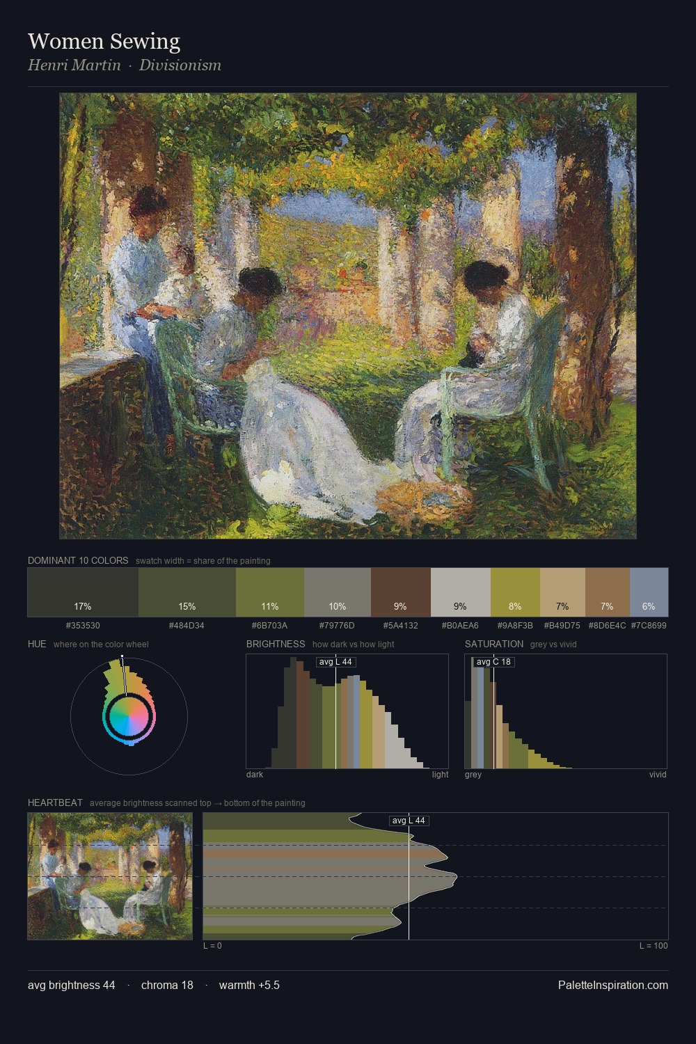
Winston Churchill sits in the centre of the value range, lending the palette a sense of even, sustained light. Winston Churchill keeps warm and cool in parity, a balance that lends the work a perceptual shimmer. All colours lean toward grey, building depth through value rather than colour punch. The highest-chroma note - #C5AC85 - appears at just 3.5%, deployed as a precision accent against the quieter ground. The palette spans 44 value units: a measured range that delivers coherence over drama. Palette 3 sits within the larger chromatic argument that Winston Churchill's complete body of work advances.
Example use cases
- exhibition design
- foundation branding
- estate management
- art education
- museums & galleries
I Love This!
Use This Palette
Copy, export, or download for your project
Copy, export, or download for your project
Copy:
Download:
Share: