William Parrott Palette 2
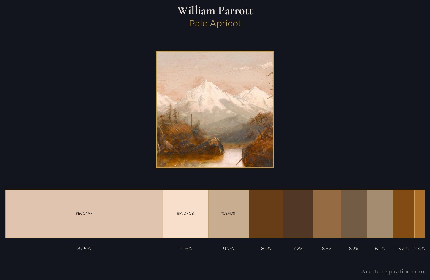
Pale Apricot
Pale High-key and low-chroma - delicate, bleached, washed with light.
Apricot Soft warm orange - peach-adjacent, the color of ripe stone fruit.
Palette Analysis
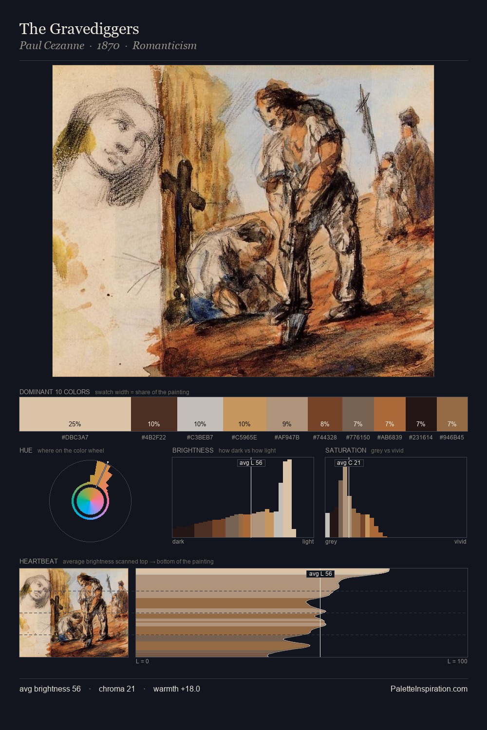
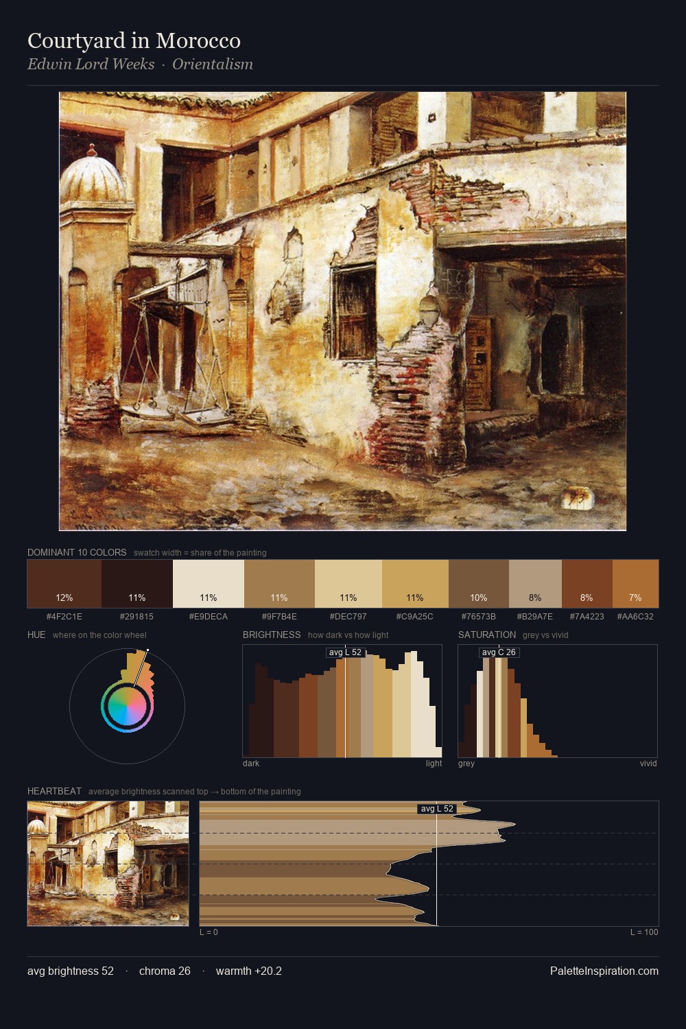
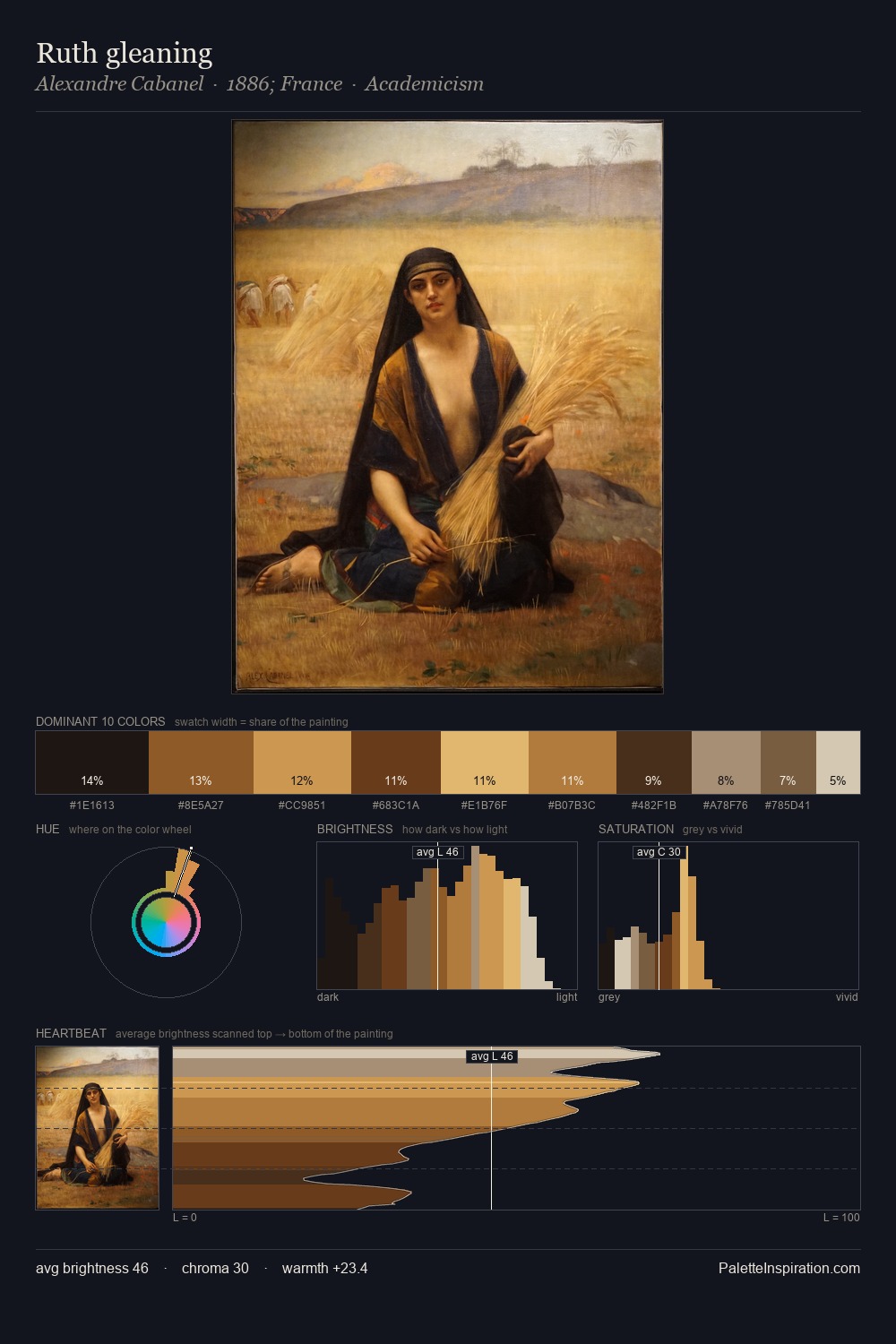
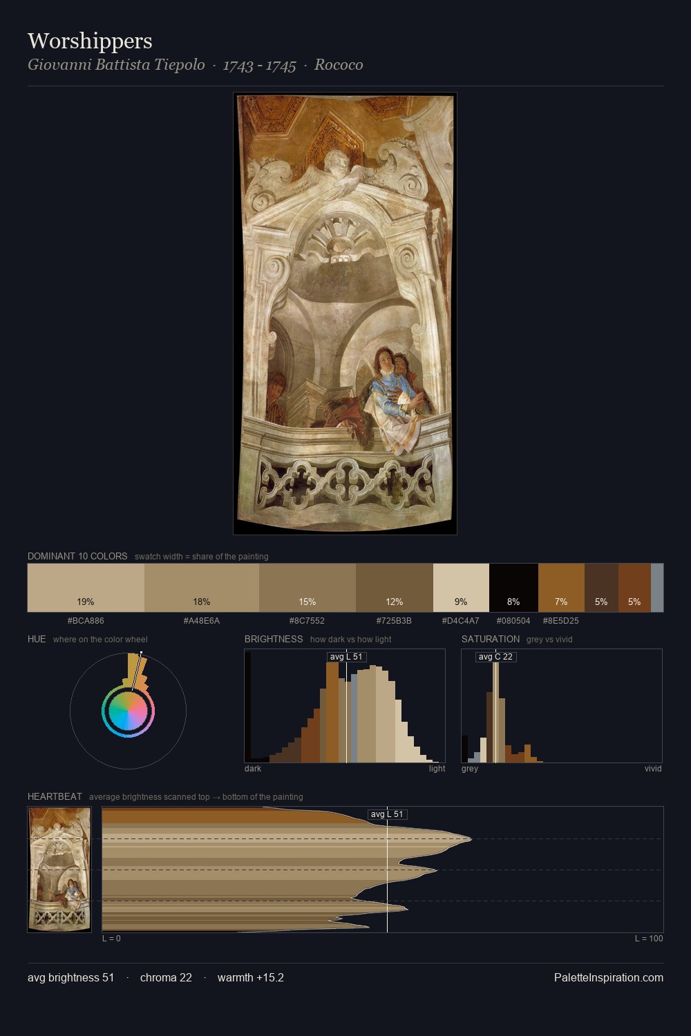
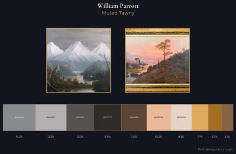
William Parrott is high-key - luminous, open, and weighted toward light. The dominant temperature is warm, with earth tones and fire-hues setting the emotional key. All colours lean toward grey, building depth through value rather than colour punch. #E0C4AF at 37.5% of the palette: an overwhelming presence that pulls all other colours into its gravitational field. Only 2.4% is devoted to #AC6F2A, yet that small allocation delivers the palette's entire chromatic tension. At 56 units of value range, the palette has the tonal breadth to sustain complex spatial readings. Palette 2 sits within the larger chromatic argument that William Parrott's complete body of work advances.
Example use cases
- publishing
- corporate identity
- consumer apps
- hospitality
- design agencies
I Love This!
Use This Palette
Copy, export, or download for your project
Copy, export, or download for your project
Copy:
Download:
Share: