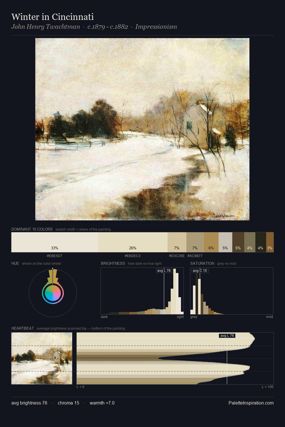
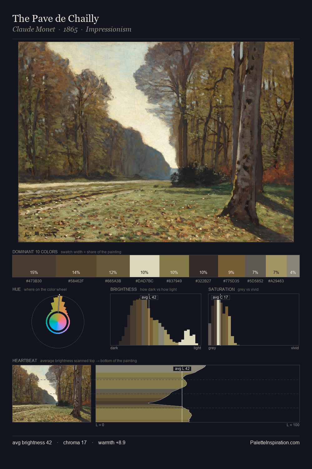
William Henry Mander Palette 3

Palette Analysis
William Henry Mander distributes its values across the middle register, creating harmony without high contrast. Cool tones set the register here - the blues and greens easily outweigh any warm accents. The absence of saturated colour is itself an expressive choice: this is a palette of restraint and atmosphere. At 6.8%, #86703A carries the palette's sharpest chromatic charge: an accent that earns its place precisely because it is withheld. The full value range is 61 units: broad enough to build convincing three-dimensional form. The mid-to-high key, cool bias, and moderate chroma point to outdoor observation - sky and diffused daylight as the dominant light source. This is palette 3 of William Henry Mander's sequence - a single chapter in a chromatic story told across many works.
Example use cases
- ceramics & pottery
- boutique hospitality
- menswear
- heritage food brands
- craft & artisan brands
I Love This!
Copy, export, or download for your project