William Hart Palette 1

Palette Analysis
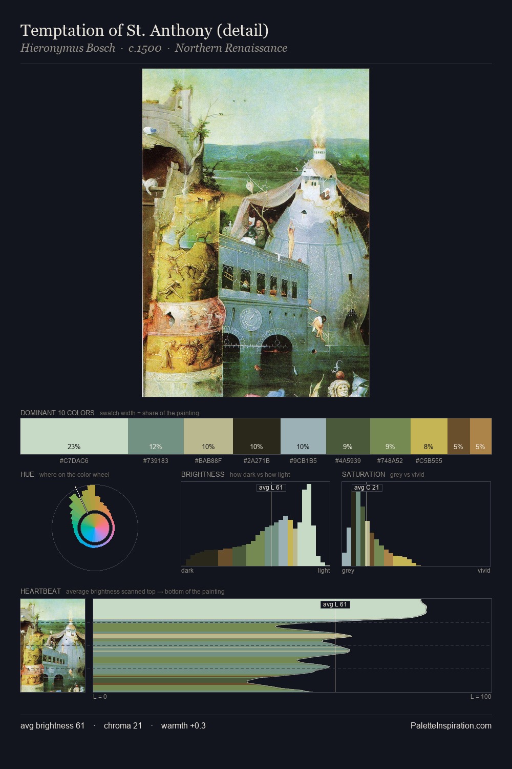
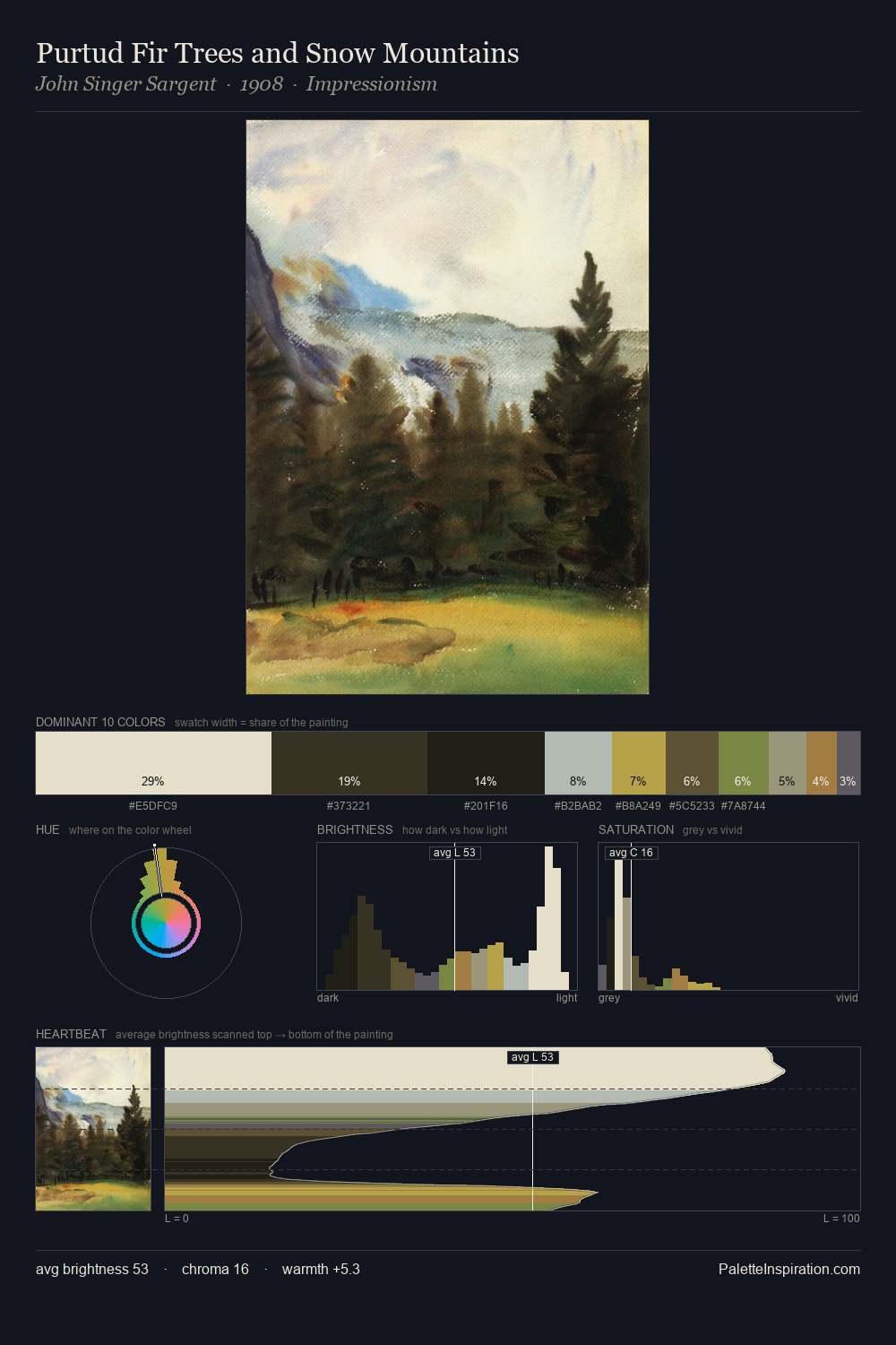
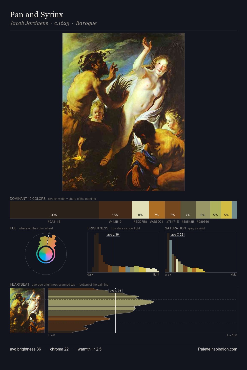
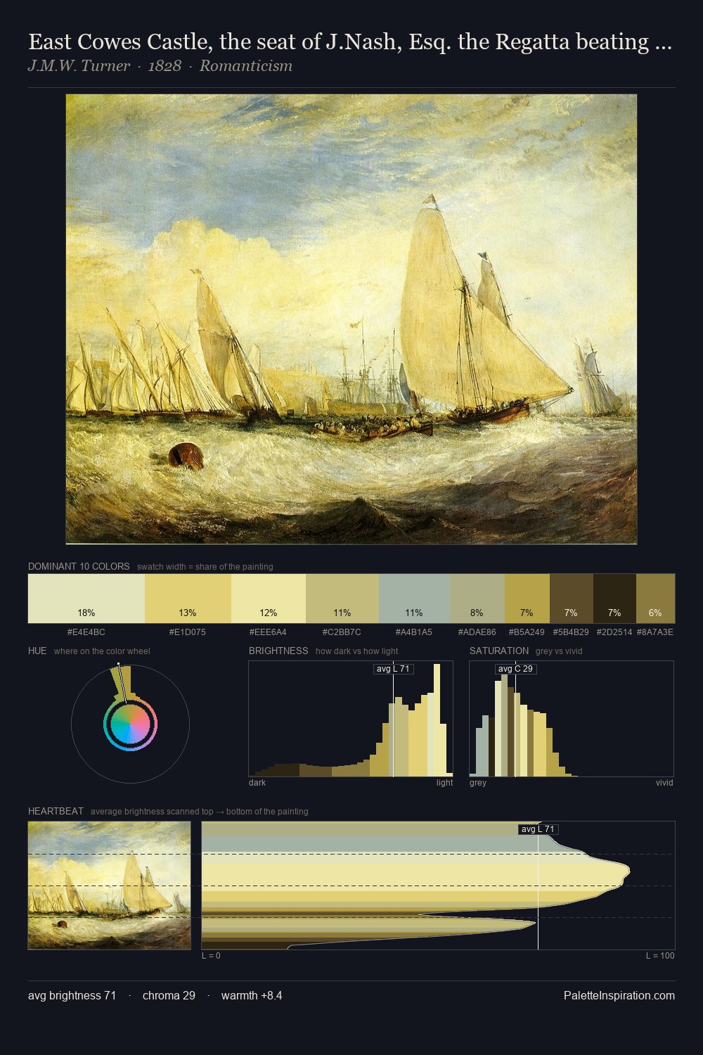
William Hart is strongly light-biased - shadow is suggested rather than declared. Blues and teal-greys govern the palette, lending it an aquatic or atmospheric quality. Chroma is moderate: colours carry enough saturation to be read as colour, but the palette stops well short of garish intensity. The most saturated colour, #BAB863, is reserved to 8.5% of the surface, where it acts as a focal punctuation. At 69 units of value range, the palette has the tonal breadth to sustain complex spatial readings. The mid-to-high key, cool bias, and moderate chroma point to outdoor observation - sky and diffused daylight as the dominant light source. In the context of William Hart's full range of palettes, group 1 represents one movement in an ongoing chromatic dialogue.
Example use cases
- publishing
- corporate identity
- consumer apps
- hospitality
- design agencies
I Love This!
Copy, export, or download for your project